Designing QR codes for digital use means creating scannable codes that work reliably on screens while also matching a brand’s visual style, campaign goal, and user journey. In practice, that requires more than picking colors and adding a logo. A digital QR code has to survive phone glare, screen scaling, compression, dark mode interfaces, social sharing, and the inconsistent camera performance of real devices. I have tested QR codes in email headers, app onboarding flows, landing pages, webinar slides, paid social ads, and digital menus, and the same lesson holds every time: attractive codes only matter if they scan instantly.
QR code design and customization sit at the intersection of usability, branding, and conversion optimization. The core design decisions include code type, contrast, quiet zone, size, data density, error correction, frame copy, logo treatment, and destination experience. For digital use, these decisions carry unique constraints because the code is being displayed by pixels, not ink. A code that looks sharp in Figma can fail after image export, CMS resizing, or compression by an ad platform. That is why this topic matters for any marketer, product team, event organizer, restaurant, educator, or ecommerce brand using QR codes to move users from one screen or setting to another.
This hub article explains how to design QR codes for digital use so they remain readable, on-brand, and measurable. It covers the customization rules that actually affect performance, the technical settings behind reliable scans, and the practical tradeoffs between aesthetics and function. If you are building a repeatable QR code design system under a broader QR Code Creation & Tools strategy, this page provides the foundation and the decision framework needed to customize codes without hurting usability.
Start with the right QR code type and destination strategy
The first design decision is not visual. It is whether you need a static or dynamic QR code and what destination the code should open. Static codes embed the final data directly, such as a URL, Wi-Fi credential, vCard, or plain text. Dynamic codes point to a short redirect URL managed through a QR platform, which lets you change the destination later, track scans, and segment campaigns without replacing the visible code. For most digital marketing use cases, dynamic codes are the better choice because they support analytics, A/B testing, geotargeting, and post-launch updates.
Destination strategy affects design because data density changes the complexity of the QR matrix. Long URLs create denser patterns with smaller modules, which are harder to scan when rendered at small sizes on screens. I routinely shorten campaign URLs or use dynamic redirects specifically to reduce matrix complexity before any visual customization begins. If your goal is to send users to an app download page, a UTM-tagged landing page, a PDF, or a payment flow, use the shortest stable destination possible. A cleaner matrix gives you more freedom to add logos, frames, or custom shapes while preserving scan reliability.
The destination experience also determines whether the QR code should carry instructional text. A code linking to a mobile menu might need a frame saying “Scan to view menu,” while a code inside an app onboarding screen may need “Open on your laptop” or “Continue on another device.” Good QR code design includes this context because many failed campaigns are not technical failures at all; users simply do not understand what happens after scanning. Clear intent improves scan rate as much as visual polish.
Master the technical design rules that protect scannability
The most important rule in QR code customization is contrast. Dark modules on a light background remain the safest standard because phone cameras and scanning libraries detect them fastest. Black on white is ideal, but dark navy, charcoal, or deep brand colors usually work if the background stays very light. Low contrast combinations such as pastel on cream, gradient-on-gradient, or transparent overlays reduce detection speed and increase failure rates, especially on older Android cameras. In digital environments, contrast problems often become worse after platform compression.
Quiet zone is equally critical. A QR code needs clear empty space around all four sides so scanners can separate the symbol from nearby text, borders, or interface elements. The common guideline is at least four modules of quiet zone, though I often give more when a code appears inside busy emails, hero banners, or presentation slides. Tight cropping is a frequent cause of non-scanning codes because designers export the symbol flush to a frame, then a CMS or social platform crops it further.
Error correction helps a QR code remain scannable after visual modification or partial obstruction. The four levels are L, M, Q, and H, with H offering the highest recovery capacity. When placing a logo in the center or using custom eyes and rounded modules, higher error correction is usually worth the added density. However, it is not a free pass. More correction data increases matrix complexity, which can make very small on-screen codes harder to scan. The correct approach is to balance customization level, expected display size, and test results across devices.
File format matters in digital use. SVG is often the best export choice because it scales cleanly across responsive layouts and high-density displays. PNG works well too, especially when an ad platform or email builder handles raster images more predictably, but it should be exported at sufficient resolution to avoid soft edges. JPEG is usually the wrong format because compression artifacts blur module boundaries. In testing, I have seen otherwise valid QR codes fail simply because a marketing automation platform recompressed a small PNG or converted it poorly. Always test the final deployed asset, not just the source file.
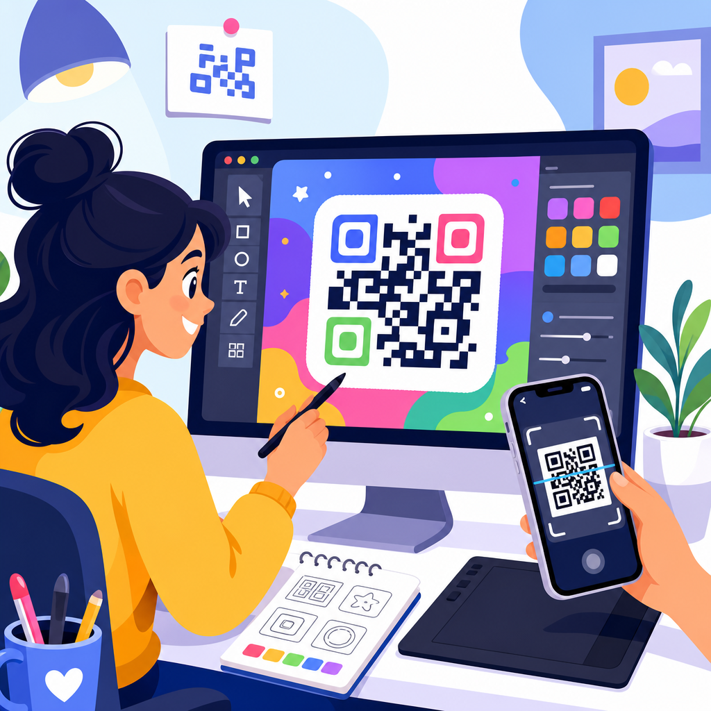
Customize visual elements without breaking the code
Brand customization should support recognition, not overwhelm the symbol. The safest customization sequence is simple: generate a low-density code, apply an appropriate error correction level, preserve quiet zone, then add restrained brand styling. Logo placement is the most common request. A centered logo can work well if it stays modest in size and is surrounded by enough clear space to preserve the finder patterns and internal data modules. As a practical rule, smaller logos usually outperform ambitious ones, especially for codes displayed below 200 pixels wide in responsive layouts.
Color customization should prioritize luminance difference over exact hex matching. Many brands try to force mid-tone corporate colors that look consistent in a style guide but scan poorly on screens. A better method is to choose the darkest usable brand color for modules and a very light neutral background. If the code appears on a colored interface, place it inside a white or near-white container card. This isolates the symbol from visual noise and keeps the background from interfering with edge detection.
Custom shapes, rounded dots, and stylized eyes can work, but they require discipline. Rounded modules are generally safer than highly decorative shapes because they preserve the center of each data cell. Overly thin lines, disconnected patterns, and ornamental finder eyes reduce machine readability. Gradient fills can work in controlled cases, yet gradients across the modules themselves are riskier than solid module colors with a gradient frame around the code. Whenever teams ask how far they can push creativity, my answer is consistent: customize the frame and surrounding card more aggressively than the matrix.
| Design element | Best practice for digital use | Common mistake | Effect on scans |
|---|---|---|---|
| Color | Dark modules on a very light background | Low-contrast pastel combinations | Slower detection or scan failure |
| Logo | Small centered mark with high error correction | Large logo covering core data area | Reduced readability on smaller screens |
| Quiet zone | At least 4 modules, often more in busy layouts | Tight crop or border too close to code | Scanner cannot isolate symbol |
| Format | SVG or high-resolution PNG | Compressed JPEG export | Blurred edges and inconsistent scanning |
| Shape styling | Subtle rounded modules and clear finder patterns | Decorative or fragmented module shapes | Lower recognition accuracy |
Design for specific digital placements and screen behaviors
A QR code on a website hero, in an email, inside a mobile app, and on a webinar slide are not the same design problem. Screen environment changes how the code is perceived and scanned. On websites, responsive resizing is the main risk. A code that appears adequately large on desktop may shrink below practical scanning size on mobile or tablet breakpoints. For web placement, set minimum rendered dimensions, prevent CSS from shrinking the image too aggressively, and verify that surrounding elements do not crowd the quiet zone.
Email creates another set of constraints. Many email clients block images by default, resample image assets, or render dark mode inversions unpredictably. To protect scan performance, use a sufficiently large code, avoid transparent backgrounds, and include descriptive alt text plus a visible fallback link. Since some recipients read email on the same phone they would use to scan, the QR code should not be the only route. Give them a tappable CTA beneath it.
Presentation slides and digital signage demand distance-aware design. The question is not only whether a nearby phone can scan the code, but whether attendees at the back of a room can frame it quickly. Increase size, maximize contrast, simplify styling, and keep the destination short through dynamic redirects. For webinar slides shared over screen recording, image compression and video resolution can degrade fine detail, so conservative customization is the wiser choice. I generally avoid elaborate logos and gradients in that context.
In-app and cross-device flows require special thought because users may scan from one device to continue on another. Here, speed is everything. A clean, plain code with clear instructions often outperforms a heavily branded one. Pair the code with concise microcopy such as “Scan with your phone to sign in on TV” or “Open this page on desktop.” This is also where session-based dynamic QR codes are useful, because they can securely connect a temporary code to a user action without exposing long parameters in the visual symbol.
Test, measure, and maintain QR codes as living assets
The final and most overlooked part of QR code design is validation in real conditions. Do not assume that a code that scans once from a design file is production-ready. Test on iPhone and Android devices, in bright and dim environments, at expected viewing distances, and after upload to the actual platform where the code will appear. Scan using both native camera apps and common QR scanning libraries because detection performance varies. If a code will be used in paid ads, preview it after platform processing, not before.
Measurement matters because QR code performance is not only about readability; it is about outcomes. Dynamic QR tools let you track scan count, time, device type, and sometimes location or referral context. Pair those reports with analytics tags on the destination page so you can see bounce rate, conversion rate, and downstream actions. This reveals whether a design issue exists before the scan, such as low visibility or unclear framing, or after the scan, such as a slow page or poor mobile landing experience. In audits I have run, weak post-scan pages often explain disappointing campaign results more than the code design itself.
Maintenance is part of customization strategy as well. If your brand updates its palette, logo lockup, or campaign messaging, review existing dynamic QR codes and their templates rather than generating disconnected one-off assets. Establish a design system that defines approved colors, minimum size, quiet zone rules, logo limits, frame language, export formats, and testing procedures. Named tools can help here, including Adobe Illustrator or Figma for layout control and QR platforms such as Bitly, Flowcode, QR Code Generator, Beaconstac, or Uniqode for dynamic management and analytics. Consistency lowers error rates and makes performance easier to improve over time.
Well-designed QR codes for digital use are functional interface elements, not decorative afterthoughts. The best codes begin with the right destination and code type, use high contrast and adequate quiet zone, keep customization disciplined, and account for the realities of websites, email, apps, slides, and digital signage. They are tested in the environments where people will actually scan them, then measured against real business goals such as sign-ups, downloads, orders, or registrations.
If you are building out QR Code Design & Customization as part of a broader QR Code Creation & Tools program, start by standardizing the fundamentals: dynamic codes where appropriate, short destinations, SVG or high-resolution PNG exports, restrained logo use, strong contrast, and a repeatable testing checklist. From there, create templates for your most common digital placements so every new campaign starts from a proven base instead of guesswork.
The main benefit is simple: a QR code that looks branded and scans instantly removes friction between attention and action. Audit your current digital QR codes, fix the technical issues first, and then refine the visual layer. That sequence will give you better scan rates, cleaner user journeys, and more reliable campaign performance.
Frequently Asked Questions
What makes a QR code different when it is designed for digital use instead of print?
Designing a QR code for digital use is fundamentally different from designing one for print because the code has to perform inside changing screen environments rather than on a fixed physical surface. A printed code is affected mostly by paper quality, size, and lighting in the room. A digital QR code, by contrast, has to remain scannable through screen glare, brightness shifts, dark mode interfaces, responsive layouts, image compression, social platform previews, and the uneven camera quality of real smartphones. That means a code that looks sharp in a design file may still fail once it is placed inside an email banner, app screen, webinar slide, mobile landing page, or shared image on social media.
Another major difference is scaling behavior. On screens, QR codes may be resized automatically by responsive templates, cropped by content blocks, or softened by export settings. If the code becomes too small, loses edge clarity, or has its quiet zone trimmed away, scan performance drops quickly. Digital contexts also introduce layered distractions such as background gradients, animated elements, UI overlays, and competing calls to action. A well-designed digital QR code needs enough contrast, visual separation, and placement priority to stand out without fighting the surrounding interface.
Branding still matters, but digital success comes from balancing style with technical reliability. You can customize colors, embed a logo, and align the code with your campaign aesthetic, but every visual decision should be tested under realistic viewing conditions. In other words, digital QR design is not just about making the code attractive. It is about making sure it scans consistently across devices, platforms, screen sizes, and user journeys while still feeling native to the brand experience.
What are the most important design rules for making a QR code easy to scan on screens?
The most important rule is contrast. A QR code should have a dark foreground and a light background, with a clear visual difference between the two. This is especially important on screens, where glare, reflections, and reduced brightness can wash out subtle color combinations. Stylish palettes may look on-brand, but if the scanner cannot clearly distinguish the modules from the background, performance suffers. In most cases, high contrast will outperform creative but low-visibility color choices.
The next critical rule is preserving the quiet zone, which is the empty margin around the QR code. This border helps scanning software identify the code’s boundaries. In digital layouts, the quiet zone is often accidentally violated by buttons, text, borders, background graphics, or tight image crops. That can make the code much harder to read, especially on smaller screens. The code should also be rendered at a sufficient size for the placement. A tiny QR code in a crowded email header or sidebar may technically be visible but still too small for a phone camera to lock onto comfortably.
You also need to protect the code from over-stylization. Rounded modules, decorative frames, gradients, shadows, and large center logos can all reduce readability if pushed too far. Error correction can help a QR code survive some customization, but it is not a license to overload the design. Clean edges, adequate module spacing, and simple surrounding layouts usually produce better scan results than heavily embellished treatments. Finally, always test the code in the exact environment where users will encounter it. A QR code can pass on a desktop mockup and fail inside an actual compressed email, scaled app interface, or dimly lit webinar presentation. Good digital QR design is part visual design, part real-world usability testing.
Can you add brand colors and a logo to a digital QR code without hurting performance?
Yes, but only if branding is handled with restraint and technical discipline. Adding brand colors and a logo is one of the most common ways to make a QR code feel intentional rather than generic, and in many campaigns it improves trust because users can immediately connect the code to a known brand. However, every customization changes the scanner’s margin for error. If brand styling reduces contrast, obscures key data areas, or makes the code feel too decorative, scan reliability can drop fast, especially on lower-quality phone cameras or under difficult screen conditions.
The safest approach is to use dark brand colors for the modules and a very light, uncluttered background. Avoid low-contrast combinations such as mid-tone colors on black, pastel-on-white, or gradients that shift too much across the code. If you place a logo in the center, keep it modest in size and make sure the QR code uses a strong enough error correction level to tolerate that interruption. Even then, the logo should not dominate the code or cover critical data patterns. Decorative frames and shapes can also work, but they should never interfere with the corner detection patterns or shrink the quiet zone.
Most importantly, branding should be validated through device testing rather than approved on appearance alone. Test on iPhones and Android devices, on older cameras as well as newer ones, at full brightness and lower brightness, and in the actual placement where the code will live. A branded QR code that scans instantly in a clean design tool preview may struggle after being compressed in an email client or embedded in a social post. The best branded digital QR codes look polished, match the campaign, and still scan with almost no effort from the user.
Where should a QR code be placed in digital content like emails, landing pages, apps, or webinar slides?
Placement should always support user intent and scanning behavior. In digital environments, a QR code works best when it appears at a moment where the user has a clear reason to take the next step. In an email, that might be near a strong call to action for downloading an app, joining an event, or viewing a product demo on another device. On a landing page, it often makes sense beside copy that explains the benefit of scanning, especially if the user is likely browsing on desktop and can use their phone as the second device. In app onboarding, the code should appear only when cross-device continuation makes sense, not as a decorative element that interrupts the flow.
Visibility matters just as much as relevance. A QR code buried in a footer, squeezed into a cluttered sidebar, or placed over a busy background image will underperform. On webinar slides, for example, the code needs enough on-screen time, enough physical size, and enough surrounding whitespace for attendees to notice it, aim their camera, and complete the scan before the slide changes. In emails, avoid placing the code so high that image blocking or mobile cropping hides it, and avoid placing it so low that few users ever reach it. On social graphics, be aware that platform interfaces may overlay icons, crop previews, or compress images in ways that affect readability.
The best placements also include context. Users are far more likely to scan when the code is paired with a short explanation of what they will get and why it is worth doing now. A simple instruction such as “Scan to join the webinar,” “Scan to download the app,” or “Scan to view the interactive demo” removes ambiguity and improves response. Placement is not just about where the QR code fits visually. It is about where it makes sense in the user journey, where it remains clearly visible, and where the scan action feels natural rather than forced.
How should you test a QR code before using it in a digital campaign?
Testing should be treated as a required step, not an optional quality check. Start by validating the destination itself. Make sure the URL or action behind the QR code is correct, loads quickly, works on mobile devices, and matches the campaign promise. A perfectly scannable QR code still fails if it sends users to a broken page, a slow experience, or a destination that is awkward on the device they are using. If possible, use a dynamic QR code setup so you can update the destination later and track engagement without replacing the creative.
Next, test the QR code in its final digital environment rather than only as a standalone asset. That means checking it inside the real email template, webinar slide deck, app screen, landing page, ad creative, or social post export. View it on different screen sizes and display types, including high-resolution monitors, laptops with lower brightness, and mobile screens. Try scanning from multiple distances and angles. Test under conditions users actually experience, including glare, reduced brightness, compressed images, and dark mode interfaces. It is also smart to compare performance across several phones, because camera speed and QR detection quality vary more than many teams expect.
Finally, evaluate both scan success and user experience after the scan. Ask whether the code is easy to notice, whether the instruction is clear, whether the scan completes quickly, and whether the landing experience feels seamless. If users hesitate because the code is too small, the branding is too aggressive, or the purpose is unclear, the problem is not just technical. It is strategic. Strong testing combines visual review, device-based scan testing, and post-scan journey checks. That is how you make sure a digital QR code does not just look good in the design phase, but performs reliably in the real world.