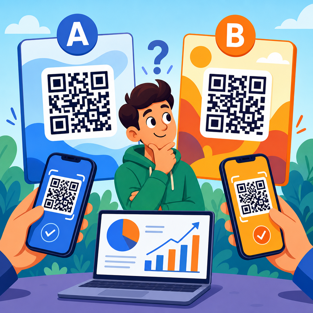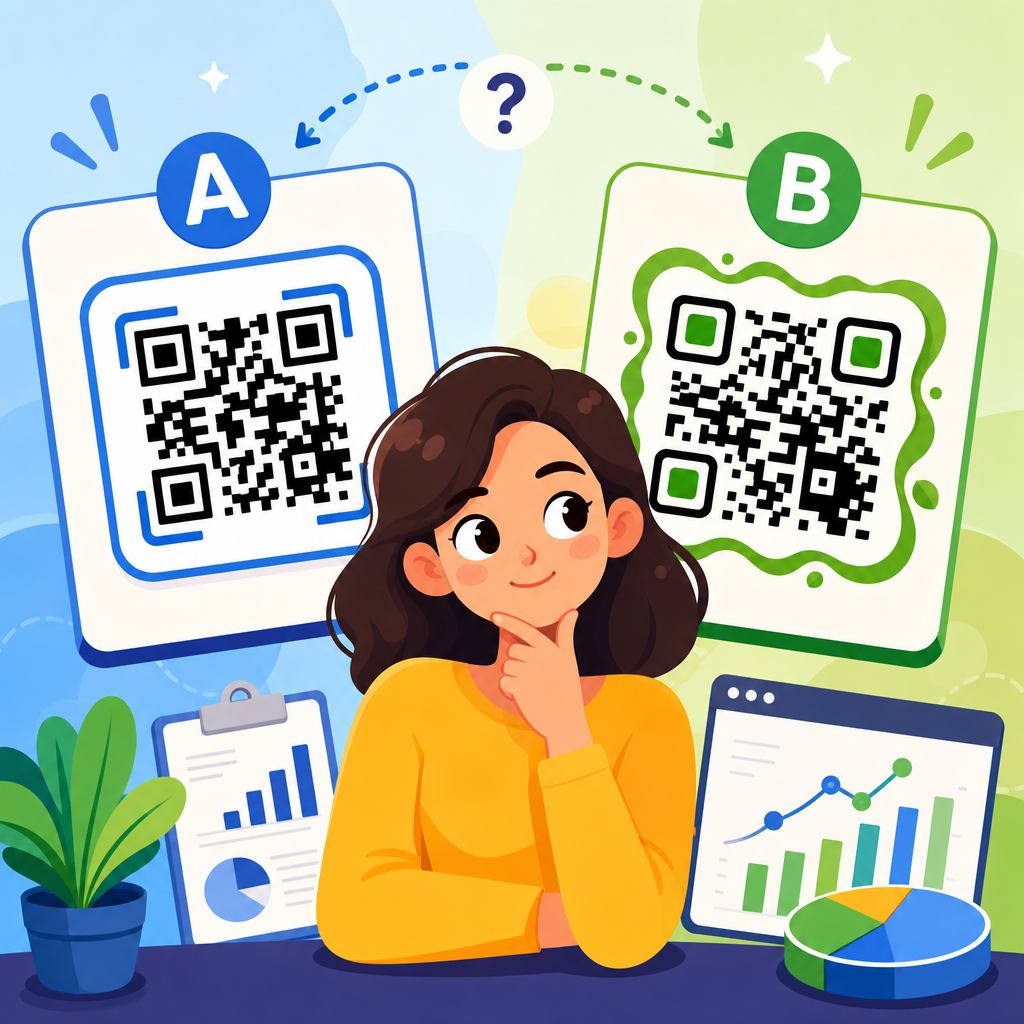
QR codes do not fail because the technology is weak; they fail because the call to action is vague, passive, or disconnected from what the user expects after the scan. In QR code marketing, a CTA, or call to action, is the short prompt that tells someone what they will get and why they should scan now. Conversion optimization is the discipline of increasing the percentage of scans that become meaningful outcomes, such as purchases, sign-ups, bookings, app installs, form submissions, or in-store visits. When I audit QR campaigns, the strongest gains rarely come from redesigning the code itself. They come from tightening the promise around the scan, matching that promise to the landing page, and placing the CTA where context makes the decision easy.
This matters because QR codes compress a full marketing journey into a moment. A person sees a code on packaging, a menu, a mailer, a retail shelf, a trade show banner, or a paid ad extension, and has only seconds to decide whether scanning is worth the effort. The CTA is the bridge between curiosity and action. A generic phrase like “Scan me” leaves too much unanswered. A specific phrase like “Scan to claim 15% off today” answers the user’s first questions immediately: what do I get, and why should I do it now. That clarity improves scan rate, but it also improves downstream conversion because the user arrives with a defined expectation. For a sub-pillar on conversion optimization within QR code marketing strategy, the central principle is simple: the best CTAs reduce uncertainty, increase relevance, and prepare the user for a landing experience that fulfills the promise without friction.
What makes a QR code CTA convert
The best CTAs for QR codes share four traits: specificity, relevance, urgency, and continuity. Specificity means naming the benefit. Relevance means the benefit fits the environment, audience, and stage of intent. Urgency gives the user a reason to act now rather than later. Continuity means the message on the QR code, the linked page, and the final conversion step all align. If any one of these is weak, conversion drops. I have seen restaurant table tents with “View menu” outperform “Scan here” by a wide margin because diners want immediate utility, not an abstract instruction. I have also seen direct mail pieces double response when “See your personalized rate” replaced “Learn more,” because it implied tailored value and reduced ambiguity.
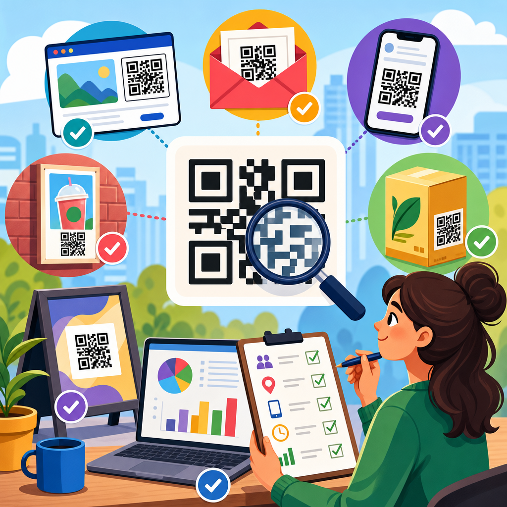
Context is the real multiplier. On product packaging, customers want setup help, warranty registration, ingredients, how-to content, or replenishment offers. In retail aisles, they want reviews, demos, comparisons, and coupons. At events, they want schedules, lead capture, resource downloads, and meeting bookings. The CTA should reflect the moment. “Watch a 30-second demo” works on shelves where buyers need confidence fast. “Book a live walkthrough” works better on B2B booth signage where the user expects a higher-commitment next step. Good QR CTA writing always answers three questions in plain language: what will happen after the scan, what benefit will I receive, and how quickly can I get it.
Best CTA formulas by conversion goal
Conversion optimization starts by matching the CTA to the desired outcome. For purchase-focused campaigns, direct-response language performs best: “Scan to save 20%,” “Buy now with free shipping,” or “Unlock today’s bundle.” These CTAs work because the value is immediate and measurable. For lead generation, users need a stronger exchange of value: “Get the pricing guide,” “Scan for a custom quote,” or “Download the checklist.” For retention and loyalty, the strongest prompts usually combine account value with convenience, such as “Join rewards in 30 seconds” or “Activate your member perks.”
Informational goals need utility-centered CTAs. If the scan leads to support content, the CTA should reduce anxiety and promise a quick answer: “Scan for setup steps,” “Troubleshoot your device,” or “See care instructions.” For local conversion, use location-based intent cues like “Claim your in-store offer,” “Check today’s availability,” or “Book your table.” In healthcare, financial services, and other regulated sectors, wording must remain accurate and compliant. A strong CTA can still be clear without making unsupported promises. “Check eligibility” is safer than “Get approved now” when qualification criteria apply. Precision matters because trust is part of conversion.
| Conversion Goal | High-Performing CTA Example | Why It Works |
|---|---|---|
| Purchase | Scan to get 15% off today | Clear benefit, immediate value, built-in urgency |
| Lead generation | Scan for your custom quote | Signals personalization and next-step relevance |
| Product education | Watch a 30-second demo | Low effort and specific time commitment |
| Loyalty | Join rewards in 30 seconds | Fast completion lowers resistance |
| Support | Scan for setup help | Immediate utility at the point of need |
| Events | Book your demo slot | Action-oriented and tied to event intent |
CTA examples that work in real QR code placements
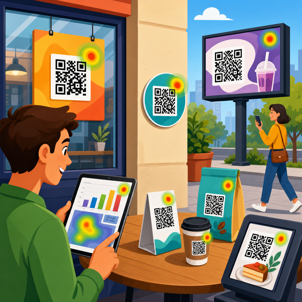
The placement of a QR code changes what users are willing to do. On packaging, customers are often post-purchase, so activation and education CTAs outperform generic engagement prompts. Good examples include “Register your product,” “See assembly video,” “Refill in two taps,” and “Get recipes with this product.” These connect to known post-purchase behaviors. On restaurant menus, utility wins. “See the full menu,” “Order and pay from your phone,” and “View allergen information” outperform decorative brand phrases because they shorten the path to a practical task.
In out-of-home advertising, attention is brief and conditions are imperfect, so the CTA must be instantly legible and compelling. “Scan for tickets,” “Get the route map,” and “Claim your commuter discount” are stronger than “Discover more.” On retail signage, comparison and proof content often move hesitant buyers. I have seen “Compare models” and “Read verified reviews” generate more qualified sessions than discount CTAs for premium products, because users at that stage need confidence more than price cuts. At trade shows, “Get the spec sheet,” “Enter to win,” and “Book a consultation” each serve a different lead quality level. The best choice depends on whether the goal is volume, qualification, or immediate sales follow-up.
How to write QR CTAs that increase scan rate and post-scan conversion
Strong QR copywriting is concise, but it is not minimal for its own sake. Short CTAs work when they still answer the core user question. The most reliable formula is verb plus benefit plus qualifier. For example: “Scan to compare plans,” “Scan to claim your sample,” or “Scan to watch the install video.” The verb creates momentum, the benefit explains the payoff, and the qualifier adds clarity or urgency. Numbers improve comprehension because they make the next step concrete. “Watch a 45-second demo” usually outperforms “Watch a demo” because users can quickly judge the effort required.
Language should also match audience sophistication. A first-time consumer may respond better to “Get started” than “Configure your deployment.” A technical B2B audience may prefer exact language because it signals relevance and competence. Avoid friction words unless they are required. “Submit,” “register,” and “apply” can feel heavy compared with “get,” “check,” “see,” or “book,” though there are cases where formal verbs are appropriate. The key is not to soften the action so much that it becomes vague. “Explore possibilities” sounds polished but converts poorly when compared with “See pricing” or “Book a demo.” Concrete beats clever almost every time.
Design and placement factors that influence CTA performance
A strong CTA can underperform if presentation gets in the way. The prompt must be close enough to the QR code that the relationship is obvious, and the code must be large enough to scan quickly from the intended distance. As a working rule, a code meant to be scanned from ten feet away needs substantially more size and contrast than one printed on product packaging held in the hand. The CTA should sit above or beside the code, not buried in surrounding copy. White space matters because visual clutter reduces both noticeability and trust.
Color, branding, and custom frames can lift attention, but scan reliability comes first. High contrast between foreground and background remains essential. Error correction helps when logos are embedded, yet too much visual decoration can reduce readability, especially in low light or on curved surfaces. Instructional microcopy can also improve performance when the audience is not fully comfortable with QR behavior. A small line such as “Open your camera and point at the code” is useful for older demographics and some in-store environments. In most campaigns, the code itself should not compete with the CTA. The message sells the scan; the code simply enables it.
Testing QR code CTAs with the right metrics
Conversion optimization requires measurement beyond raw scans. Scan rate is only the top of the funnel. The real evaluation should include landing page view rate, bounce rate, click-through to the primary action, form completion rate, revenue per scan, and assisted conversions where the scan starts a journey completed later on another device. Dynamic QR platforms such as Bitly, QR Code Generator PRO, Uniqode, and Flowcode make it possible to change destinations and track engagement without reprinting assets. Pair those tools with analytics platforms such as Google Analytics 4 and CRM attribution to see which CTA actually drives business results.
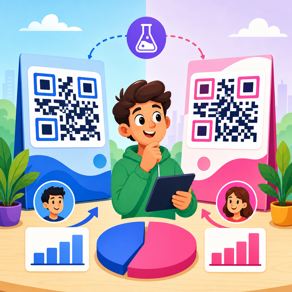
Testing should isolate one major variable at a time. If you change the CTA wording, keep design and landing page stable. If you change the offer, keep the wording structure stable. In practice, I start with a high-intent control like “Scan to get 10% off” and test alternatives that emphasize speed, personalization, or proof, such as “Scan for your instant discount” or “See why customers switch.” Results often reveal intent differences by placement. A shelf tag may respond to proof-led messaging, while packaging may respond to support-led messaging. Statistical discipline matters here. Small sample sizes can produce misleading winners, so run tests long enough to capture normal traffic patterns.
Common QR CTA mistakes that reduce conversion
The most common mistake is asking for action without stating the value. “Scan me” is not a strategy. Another frequent problem is mismatch between CTA and destination. If the code says “Get 20% off” but lands on a generic homepage, trust drops immediately and abandonment rises. Slow mobile pages are another silent killer. Even the best CTA cannot rescue a page burdened by pop-ups, heavy scripts, or a long form. Mobile-first performance is nonnegotiable because QR traffic is overwhelmingly smartphone traffic.
Marketers also hurt conversion by asking for too much too soon. If the user scans from a poster in a public place, a lengthy lead form is unrealistic. A better sequence is lightweight value first, deeper conversion second. Accessibility is often overlooked as well. Low contrast instructions, tiny type, and code placement that is hard to physically approach all reduce engagement. Finally, many teams fail to segment by environment. The best CTAs for QR codes that drive action are not universal slogans. They are context-specific prompts tied to audience intent, a clear offer, and a mobile experience that completes the promise with minimal friction.
The practical lesson is straightforward: QR code conversion optimization begins with the words around the code, not the pattern inside it. The best CTAs tell users exactly what they will get, why it matters now, and what level of effort is required. They match the placement, fit the user’s stage of intent, and lead to a landing page that delivers the promised value immediately. When those elements align, scan rate improves, but more importantly, the percentage of scans that become revenue, leads, and repeat engagement improves as well.
As the hub page for conversion optimization in QR code marketing strategy, this topic connects to every downstream decision: offer design, landing page UX, analytics, testing methodology, audience segmentation, and campaign placement. Start by auditing every existing QR code in your marketing for CTA clarity, destination match, and mobile friction. Replace vague prompts with specific benefit-led language, track the full funnel, and test against a defined conversion goal. Small wording changes on a QR code can produce outsized results when the promise is clear and the next step is easy. Review your current campaigns, rewrite the CTA first, and measure what happens next.
Frequently Asked Questions
What makes a QR code CTA effective enough to actually drive scans and conversions?
An effective QR code CTA works because it removes uncertainty and gives people a clear reason to act immediately. Most underperforming QR codes are not a technology problem; they are a messaging problem. If a code simply appears beside generic text like “Scan Me,” the user has no idea what will happen next, whether the effort is worth it, or if the destination is even relevant. A strong CTA answers those questions before the scan happens. It tells the user what they will get, why it matters, and often why they should do it now.
The best QR code CTAs are specific, benefit-driven, and aligned with user intent. Instead of using a vague prompt, effective examples say things like “Scan to Get 20% Off Today,” “Scan to Book Your Free Demo,” “Scan to See the Menu,” or “Scan to Download the App.” Each of these sets a clear expectation about the outcome. That expectation matters because conversion optimization starts before the landing page loads. The CTA shapes motivation, filters interest, and improves the quality of the traffic generated by the scan.
Context also plays a major role. A CTA that works on product packaging may not work on an event sign, a retail display, a direct mail piece, or a restaurant table tent. Effective QR code CTAs match the environment, the audience, and the moment of interaction. Someone standing in a store aisle may respond to “Scan to Compare Features” or “Scan for Today’s Deal,” while someone at a trade show may prefer “Scan to Get the Brochure” or “Scan to Schedule a Consultation.” The strongest CTAs feel like a natural next step, not an interruption.
Finally, the CTA must accurately reflect the post-scan experience. If the message promises a discount, the destination should deliver that discount immediately. If it promises fast booking, the booking page should be simple and mobile-friendly. When the CTA and landing experience are tightly connected, users are more likely to complete meaningful actions such as purchases, sign-ups, app installs, bookings, or form submissions.
Is “Scan Me” ever a good QR code CTA, or should brands always use something more specific?
In most cases, “Scan Me” is too weak to perform well on its own. It tells the user what to do, but it does not tell them why they should do it. From a conversion standpoint, that is a major gap. People are constantly filtering information, especially in physical environments where they may be walking, shopping, commuting, or multitasking. A QR code CTA has only a moment to earn attention, and generic language rarely creates enough motivation to drive action.
More specific CTAs usually outperform “Scan Me” because they communicate value. For example, “Scan to Get a Free Sample,” “Scan to Watch the Demo,” or “Scan to Join the Waitlist” gives the user a concrete outcome to evaluate. That clarity increases scan intent because people understand what they are exchanging their time for. It also reduces friction by setting expectations upfront. Users are more likely to scan when they know the destination is relevant and useful.
That said, there are limited situations where “Scan Me” can still be acceptable, especially when the surrounding design already does most of the explanatory work. If a QR code is placed directly under a product image with the text “Exclusive launch offer” or beside a clearly labeled digital menu prompt, “Scan Me” may function as a supplemental instruction rather than the primary CTA. Even then, it usually performs better when paired with a benefit statement, such as “Scan Me to View the Menu” or “Scan Me for Member Pricing.”
For brands focused on results, the smarter approach is to treat the CTA as conversion copy, not filler text. The QR code itself is only a bridge. The CTA is what persuades people to cross it. If the goal is more scans that lead to meaningful business outcomes, specific, relevant, and value-led wording is almost always the better choice.
What are the best examples of high-converting CTAs for QR codes in different marketing situations?
The best QR code CTAs depend on the audience’s immediate need and the action the business wants them to take. High-converting CTA language is usually direct, outcome-focused, and tailored to the setting. In retail, strong examples include “Scan for Today’s Discount,” “Scan to See Available Sizes,” “Scan to Compare Models,” or “Scan to Unlock Member Pricing.” These work because shoppers are often making decisions in real time and need information or incentives that help them act quickly.
In hospitality and restaurants, effective CTAs often focus on convenience and speed. Examples include “Scan to View the Menu,” “Scan to Order and Pay,” “Scan to Reserve Your Table,” or “Scan for Weekend Specials.” These prompts reduce effort and make the next step feel immediate and useful. In event marketing, strong CTAs include “Scan to Register,” “Scan to Get the Speaker Schedule,” “Scan to Enter the Giveaway,” or “Scan to Download Event Details.” The common thread is that each CTA promises a practical benefit tied to the user’s current context.
For B2B and service businesses, the best CTAs often emphasize expertise, access, or problem-solving. Examples include “Scan to Book a Free Consultation,” “Scan to Get the Case Study,” “Scan to See Pricing,” “Scan to Watch the Product Demo,” or “Scan to Request a Quote.” These work especially well when the audience is already evaluating options and needs a low-friction next step. In app marketing, “Scan to Download the App,” “Scan to Start Your Free Trial,” or “Scan to Get Started in Minutes” tends to perform better than broad, generic prompts.
The most effective examples also align closely with the destination experience. If the CTA says “Scan to Claim Your Coupon,” the landing page should immediately display the offer. If it says “Scan to Book Now,” users should arrive at a streamlined booking page, not a generic homepage. Great QR code CTAs are not just clever phrases. They are promises, and the highest-converting campaigns are the ones that fulfill those promises without delay or confusion.
How can businesses optimize QR code CTAs for higher conversion rates, not just more scans?
Getting more scans is useful only if those scans turn into valuable actions. That is where conversion optimization matters. Businesses should start by defining the exact outcome they want from the QR code campaign. Depending on the use case, that might be a purchase, a sign-up, a booking, an app install, a form completion, or an in-store action. Once the goal is clear, the CTA should be written to attract users who are likely to complete that action, not just anyone curious enough to scan.
One of the most effective optimization tactics is specificity. A CTA like “Scan to Book Your Free Estimate” will usually produce better downstream conversion quality than “Learn More,” because it pre-qualifies interest and sets expectations. Urgency and incentive can also improve performance when used honestly. Phrases such as “Scan to Claim Today’s Offer,” “Scan to Reserve Your Spot,” or “Scan Before It Ends” can encourage immediate action, but they should match a real deadline or limited opportunity. Empty urgency often damages trust.
Testing is essential. Businesses should experiment with different CTA wording, design placement, supporting visuals, and landing page experiences to see what drives not just scan volume but final conversion rate. For example, one version may generate more scans with “Scan to Learn More,” while another may generate fewer scans but more purchases with “Scan to Get 15% Off Your First Order.” In many cases, the second version is more valuable because it produces stronger intent and better business outcomes.
Optimization also includes practical details. The QR code should be easy to scan, placed where people naturally look, and accompanied by enough visual context to feel trustworthy. The destination page must be mobile-first, fast-loading, and tightly matched to the CTA message. If users face delays, irrelevant content, or too many form fields, conversion rates will drop. The most successful campaigns treat the CTA, QR code, placement, and landing page as one connected conversion system rather than separate elements.
What mistakes should marketers avoid when writing CTAs for QR codes?
The most common mistake is being too vague. Generic prompts like “Scan Here,” “Learn More,” or “Check It Out” rarely communicate enough value to motivate action. They may generate occasional curiosity scans, but they often fail to convert because users do not know what they are getting. In QR code marketing, uncertainty is friction. A good CTA reduces friction by making the next step obvious and worthwhile.
Another major mistake is creating a mismatch between the CTA and the landing experience. If the QR code says “Scan to Get 10% Off,” but the user lands on the homepage with no visible offer, trust drops immediately. The same problem happens when a CTA promises speed or convenience, but the destination is slow, cluttered, or difficult to use on mobile. A CTA is not just an attention device; it is a promise that needs to be fulfilled instantly after the scan.
Marketers should also avoid writing CTAs without considering context. A message that sounds compelling in an email may not work on packaging, posters, shelf displays, or outdoor signage. Physical distance, lighting