High-traffic areas for QR code placement determine whether a code gets ignored, scanned once, or becomes a reliable conversion point. In practical terms, QR code placement means choosing the exact physical location, height, angle, surrounding space, lighting conditions, and user context that make scanning easy. It sits at the intersection of design, printing, signage, customer behavior, and operations. I have seen well-designed campaigns fail because a code was placed behind reflective glass, too low on a shelf, or where people had no time to stop. I have also seen modest campaigns outperform expectations because the code appeared at a natural pause point, paired with a clear reason to scan. For brands managing packaging, posters, menus, displays, vehicles, or event signage, placement is the variable that most often separates measurable performance from wasted print space.
Why does this matter so much? A smartphone camera needs more than a technically valid symbol. It needs enough distance, contrast, stability, and intent from the user. People scan when the action feels quick, relevant, and low effort. In stores, transit hubs, stadiums, campuses, and hospitality venues, attention is fragmented and movement patterns are predictable. That makes placement a strategic decision, not an afterthought. A QR code near a checkout line can capture waiting time. A code on a restaurant table can reduce ordering friction. A code on product packaging can extend the customer journey into setup videos, registration, reordering, or loyalty enrollment. This article is the hub for QR code placement, covering where codes work best, how different environments change the rules, what technical standards govern readability, and how to evaluate performance in the field so every printed code earns its place.
What makes a QR code placement high traffic and high performing
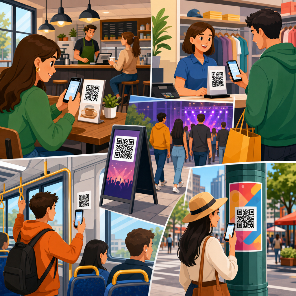
A high-traffic area is not simply a place with many people. It is a place where the right people can notice the code, understand the value, and scan without physical friction. In retail, store entrances, aisle endcaps, fitting rooms, queue lines, and checkout counters often outperform generic wall signage because shoppers naturally slow down there. In offices and campuses, elevator lobbies, reception desks, break rooms, and event registration areas work because people have dwell time. In restaurants, host stands, table tents, pickup shelves, and window decals serve different moments in the journey. The key principle is behavioral fit: place the code where users already pause, wait, compare, or decide.
Environmental conditions matter just as much as footfall. I typically assess five variables on site: viewing distance, angle of approach, lighting, motion, and competing visuals. A code placed in a bright concourse may still underperform if it faces direct sunlight or sits among cluttered graphics. A code at a bus stop can work well because riders wait, but only if the sign is positioned within comfortable scanning distance and not blocked by glare. The cleanest mental model is this: the best placement creates a short path from noticing to scanning to completing the action. If any step feels awkward, response drops quickly.
Best high-traffic locations by environment
Different environments produce different scanning behaviors, so one placement rule never covers every use case. In retail stores, endcaps and point-of-purchase displays are proven locations because they align with product consideration. A cosmetics display can link to shade matching, reviews, or ingredient details right where the decision happens. Grocery shelf talkers can connect to recipes or sourcing information, especially for premium goods. Apparel stores often benefit from fitting-room placement, where shoppers want size guidance, alternate colors, or online inventory checks. At checkout, codes can drive loyalty sign-ups, digital receipts, financing options, or app downloads during unavoidable wait time.
Hospitality and food service use cases are equally context driven. Window decals attract passersby before entry, especially for menus, reservations, and ordering. Host stands and waiting areas are effective because guests are stationary and receptive. Tabletop signage remains strong when the destination is obvious, such as menu access, payment, reviews, or Wi-Fi. Pickup counters are useful for post-purchase actions like reorder links, feedback requests, and rewards enrollment. In hotels, elevator interiors, room key sleeves, lobby signage, and in-room collateral can support check-in instructions, amenities, spa booking, or local recommendations. Placement works when it matches the guest’s immediate task, not when it interrupts it.
| Location | Why it works | Best use case | Primary risk |
|---|---|---|---|
| Checkout line | Captures dwell time while customers wait | Loyalty, app downloads, offers | Visual clutter near payment prompts |
| Store endcap | Supports active product comparison | Reviews, demos, product details | Insufficient quiet zone on printed display |
| Restaurant table | Users are seated and ready to act | Menus, payment, reorder, feedback | Wear, spills, poor sanitization durability |
| Transit shelter | Waiting passengers have scanning time | Timetables, ticketing, promotions | Glare, weather exposure, motion nearby |
| Event entrance | High volume with clear intent | Registration, schedules, maps | Network congestion and crowd bottlenecks |
Placement rules for visibility, scanability, and safety
The most important placement rule is that a QR code must be easy to scan from a natural standing position. ISO/IEC 18004 defines the symbol specification, but field performance depends on more practical factors. Maintain a clear quiet zone around the code, use strong contrast, and avoid glossy surfaces that create reflections. As a rule of thumb, the farther away the code will be scanned, the larger it must be printed. Many practitioners use a scanning distance ratio near 10:1, meaning a code intended to be scanned from ten feet away should be about one foot tall, though actual performance varies by phone camera, error correction level, and environmental conditions. For hand-held, close-range scanning on packaging or table signage, much smaller sizes are acceptable if print quality is sharp.
Height and angle are common failure points. For most indoor public applications, chest-to-eye-level placement is best because users can frame the code without bending or reaching awkwardly. Codes placed too low are often ignored, especially in crowded spaces. Codes placed too high can be visible but impossible to scan. Curved surfaces, heavily textured materials, tinted glass, and moving objects create additional complications. Vehicle wraps, for example, can succeed when parked at events or curbside pickup zones, but they perform poorly when viewers are in motion or cannot approach closely. Safety also matters. Never place a code where scanning would require users to stop in traffic paths, stand on stairs, or step into drive lanes. Convenience increases scans; unsafe placement destroys them.
How goals change the right placement strategy
The best QR code placement depends on the action you want after the scan. If the goal is immediate transaction completion, such as ordering, payment, or ticket retrieval, place the code at the point of need: restaurant tables, payment counters, self-service kiosks, or event gates. If the goal is education, move placement upstream into consideration zones like product displays, museum labels, showroom signage, or trade show booths. If the goal is post-purchase engagement, attach the code to packaging inserts, receipts, thank-you cards, assembly guides, and warranty materials. Placement should mirror the customer journey stage rather than forcing every code into the same visual template.
I recommend mapping QR placement to one of four intent categories: discover, decide, transact, or retain. Discover placements reach people before commitment, such as window posters, sidewalk signs, and campus bulletin boards. Decide placements help comparison, like shelf signage, menus, and product packaging. Transact placements remove friction at checkout, check-in, or payment. Retain placements support onboarding, support, loyalty, and reordering after the sale. This framework helps teams avoid a common problem: putting an awareness message where users expect a utility action, or placing a long-form educational destination where users only have a few seconds. When placement and intent match, conversion quality improves, not just scan volume.
Materials, mounting, and durability in busy spaces
High-traffic environments are hard on printed materials, and durability directly affects placement performance over time. In restaurants, laminate can resist spills but may introduce glare under overhead lighting. Matte finishes usually scan more reliably in mixed lighting. In retail, foam board may be fine for short promotions, while rigid PVC, acrylic with non-glare finishing, or corrugated plastic works better for extended campaigns. Floor graphics can attract attention in queue lines, but they must use slip-rated materials and are generally less scan-friendly because users need to aim downward. On packaging, flexible films, folds, seams, and curved containers can distort the symbol, so the code should sit on the flattest possible panel.
Outdoor placements add weather, UV exposure, dirt, vandalism, and variable cellular connectivity. Transit shelters, storefront windows, and campus wayfinding signs often need fade-resistant inks, durable adhesives, and regular inspection schedules. In manufacturing or warehouse settings, labels may face abrasion, oil, or cleaning chemicals, making synthetic label stock and thermal transfer printing preferable to basic paper labels. Material choice is not separate from placement; it is part of placement. A perfect location fails if the printed code degrades, peels, warps, or becomes unreadable after a week of real use.
Testing, tracking, and optimizing placement over time
Good QR code placement is rarely guessed correctly on the first try. The most reliable process is to test placements in the field, measure scan behavior, and iterate. Dynamic QR codes make this possible because the destination can change without reprinting the symbol, and scan analytics can be segmented by location using unique codes, UTM parameters, or campaign labels. I usually recommend assigning a distinct code to each placement, even when the landing page is similar, so teams can compare entrance signage versus counter cards, or packaging front panel versus insert card. Tools from Bitly, QR Code Generator, Beaconstac, Uniqode, and enterprise analytics platforms can track scans by time, device, and geography.
Optimization should include both quantitative and observational data. Scan counts show what happened, but site walks explain why. Watch whether people notice the sign, whether they have space to stop, whether glare appears at certain hours, and whether the call to action is specific enough. “Scan for menu” is clearer than “Learn more.” “Scan to check stock” beats a generic brand message in-store. Also review downstream metrics, not just scans. A placement generating fewer scans may still be better if it produces more completed orders, registrations, or support resolutions. The aim is operational performance, not vanity numbers.
Common placement mistakes and how to avoid them
The most common mistake is treating the QR code as a decorative add-on instead of a functional interface. Teams often shrink it to preserve layout, place it near reflective surfaces, or surround it with dense text that hides its purpose. Another frequent issue is using one code everywhere without considering context. A poster at street level and a package insert inside the box serve different user needs and should usually lead to different destinations or at least different campaign tracking. Placement also fails when the landing page is poorly matched to the moment, such as sending mobile users to a slow desktop page or requiring logins for a simple action.
There are also operational mistakes. Staff may move counter signs, seasonal displays may block a code, or cleaning crews may damage printed materials. In multi-location businesses, inconsistency can make performance impossible to compare. Create placement standards that specify minimum size, approved materials, mounting height, lighting considerations, quiet zone, and call-to-action language. Photograph installations and audit them periodically. For regulated sectors such as healthcare, finance, or alcohol sales, review compliance requirements before deployment. A QR code is easy to print, but high-performing placement requires governance.
Strong QR code placement turns ordinary surfaces into measurable customer touchpoints. The core lesson is simple: put the code where the right person naturally pauses, can scan comfortably, and immediately understands the benefit. In high-traffic areas, that usually means entrances, queue lines, tables, displays, pickup points, lobbies, and packaging moments tied to a real task. Then support that location with the fundamentals: proper size, contrast, durable materials, safe access, and a landing page built for the user’s context. When those pieces align, scan rates rise and the post-scan experience improves as well.
As the hub for QR code placement within QR code design, printing, and materials, this guide should anchor your decisions before you move into detailed topics such as poster placement, packaging panels, restaurant table signage, outdoor durability, or tracking by location. Start with a placement audit of your current signage and packaging. Identify where people pause, where they decide, and where they need help. Test one code per location, measure outcomes, and refine. Better placement is usually the fastest way to improve QR performance without redesigning your entire campaign.
Frequently Asked Questions
What makes a high-traffic area good for QR code placement?
A high-traffic area is only valuable if people can comfortably notice the QR code, understand why they should scan it, and complete the scan without friction. The best placements combine visibility, dwell time, and physical ease. In other words, it is not enough to put a code where many people pass by. You want locations where people naturally pause, wait, browse, or stand still long enough to pull out a phone and interact. Entryways, checkout lines, reception counters, product displays, waiting areas, tabletops, and aisle endcaps often perform well because they create a moment of attention rather than a split-second glance.
Good placement also depends on the exact viewing conditions. Height matters because people should not have to crouch, stretch, or awkwardly angle their phones. Angle matters because skewed or tilted codes are harder to scan, especially from a distance. Lighting matters because glare, shadows, and low contrast can make an otherwise perfect design unusable. Surrounding space matters because a QR code crowded by text, graphics, pricing stickers, or busy patterns is easier to ignore and harder for a phone camera to detect. A strong high-traffic placement gives the code enough visual breathing room and presents it in a context where scanning feels natural, not disruptive.
Another major factor is intent. The highest-performing QR placements align with what the customer is already trying to do. A code near a product can lead to specs, reviews, or how-to videos. A code at a register can support payments, loyalty signups, or digital receipts. A code in a lobby can provide directions, guest check-in, or Wi-Fi access. When the offer matches the moment, scan rates improve because users immediately understand the value. That is why the best placements are chosen operationally, not just visually. They are built around customer behavior, traffic patterns, and the real-world conditions of scanning.
Where are the best physical locations to place QR codes in stores, restaurants, and public spaces?
In retail stores, some of the strongest placements are store entrances, window displays, endcaps, shelf talkers, fitting room areas, checkout counters, and bagging stations. At the entrance, a QR code can support promotions, store maps, app downloads, or loyalty enrollment. On displays and shelves, it can connect shoppers to product information, comparison tools, ingredient details, reviews, or demonstration videos. At checkout, it can be used for rewards, contactless payment, digital coupons, or post-purchase engagement. These areas work because they capture different stages of the customer journey, from discovery to decision to conversion.
In restaurants and cafes, high-performing QR locations often include host stands, menus, tables, counter service areas, pickup shelves, window decals, and receipt toppers. Table placement is effective because guests are seated and have time to engage. Counter areas work well when customers are waiting to order or collect food. Pickup zones can drive repeat visits, feedback requests, or loyalty signups. The key is to place the code where guests are not rushed and where the scan serves an obvious purpose, such as viewing the menu, joining rewards, reordering, leaving a review, or accessing specials.
In public spaces such as transit stations, event venues, museums, hotels, clinics, office lobbies, and campuses, QR codes work best near decision points and waiting points. Examples include ticketing zones, information desks, elevator banks, registration areas, queue barriers, wayfinding signage, exhibit labels, and seating areas. These are places where people want information, are already looking for direction, or have a natural pause in movement. Even in very busy environments, the best placement is usually not in the most crowded spot, but in the most usable one. If people are moving too fast, distracted, or physically unable to stop, the code may get attention but not action. Practical usability always wins over raw foot traffic.
How do height, angle, lighting, and surrounding space affect QR code scan rates?
These details have a direct impact on whether a code scans smoothly or gets ignored. Height should generally match natural eye and phone level for the intended user. If a code is too low, people may not want to bend down. If it is too high, they may struggle to frame it properly on their screens. In most standing environments, chest-to-eye level is the safest range because it allows people to approach, read the call to action, and scan comfortably. For seated environments such as restaurant tables or waiting rooms, lower placement can work well as long as it is still clearly visible and easy to access.
Angle is equally important. QR codes scan best when presented as flat and front-facing as possible relative to the user. A code wrapped around a curved surface, placed on a sharply slanted sign, or positioned where users must scan from the side can reduce readability. Similarly, reflective materials create major problems. Glossy lamination, polished plastic, and glass surfaces can produce glare that washes out the code under overhead lights or sunlight. This is one of the most common reasons a campaign underperforms despite having strong creative and good traffic exposure.
Lighting and surrounding design complete the picture. A code needs enough contrast to separate dark and light areas cleanly, and the space around it should not be cluttered. If the code is buried in dense graphics, surrounded by competing messages, or printed too close to edges and folds, phones may struggle to recognize it quickly. Strong placement means using a readable size, maintaining quiet space around the code, avoiding shadows and reflections, and testing the code in the actual environment at the actual time of day. A QR code that looks fine on a desktop proof can fail in the field because of sunlight, glass reflection, dim interiors, or crowding on the sign.
How can businesses match QR code placement to customer behavior and intent?
The most effective QR code placements are built around what the customer is trying to accomplish in that exact moment. This is the difference between a code that feels helpful and one that feels random. If someone is browsing, the code should assist discovery with details, comparisons, tutorials, or social proof. If someone is waiting, the code should offer something easy and immediate, such as menu access, queue updates, entertainment, or signup incentives. If someone is about to buy, the code should support decision-making or conversion through coupons, financing information, loyalty enrollment, or payment options. If someone has already purchased, the code should extend the relationship with setup guides, support, referral prompts, or review requests.
Context also shapes user willingness to scan. People in motion usually have less patience than people who are seated or standing in line. A commuter moving through a station may ignore a QR code that requires concentration, while a guest waiting in a hotel lobby may gladly scan for local recommendations or check-in details. This is why placement planning should include operational observation, not assumptions. Watch where people stop, where they hesitate, where they ask questions, and where staff repeatedly explain the same thing. Those are often ideal QR moments because the code can remove friction and deliver information on demand.
Businesses should also think in terms of micro-conversions. Not every scan needs to push a sale immediately. In some locations, the right goal may be an email signup, app install, digital menu view, product video watch, or event registration. In others, the goal may be faster service, reduced printing costs, or better customer self-service. When placement aligns with behavior and intent, QR codes become part of the customer journey rather than an isolated design element. That is usually when scan volume, engagement quality, and downstream conversions all improve together.
What are the most common QR code placement mistakes, and how can they be avoided?
One of the biggest mistakes is choosing a location based only on visibility instead of scanability. A code may be placed in a highly noticeable area, but if people are walking too quickly, standing too far away, or unable to stop, results will be weak. Another common problem is placing codes behind glass, on reflective surfaces, or under harsh lighting. Even a perfectly printed code can become unreliable when glare interferes with camera detection. Small print size, poor contrast, warped application on curved surfaces, and cluttered layouts also reduce performance. Many failed campaigns can be traced back to these practical execution issues rather than the QR strategy itself.
Another frequent mistake is failing to give users a reason to scan. A QR code without a clear call to action often gets ignored because people do not know what they will get. “Scan for menu,” “Scan for 10% off,” “Scan to see reviews,” or “Scan for setup guide” are far more effective than displaying a bare code with no explanation. Businesses also make the mistake of linking to generic homepages, slow-loading pages, or content that is not mobile-friendly. The destination matters just as much as the placement. If the user scans and lands on a poor experience, the opportunity is lost.
The best way to avoid these issues is to treat QR placement as a live operational test, not a one-time design task. Test the code on-site with different phones, from realistic distances, and under actual lighting conditions. Check whether users can approach comfortably, understand the value instantly, and complete the scan in a few seconds. Review whether the destination page is fast, mobile-optimized, and directly tied to the context of the placement. Finally, track performance


