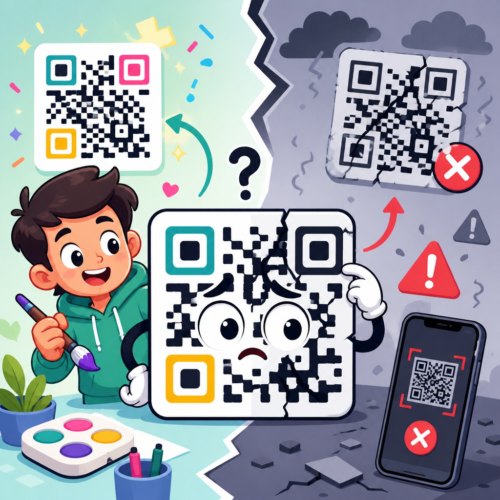
QR codes fail after customization because every design change competes with the code’s ability to be read by a camera, decoded by software, and matched to the data pattern built into the symbol. In practical terms, a QR code is not just an image. It is a machine-readable matrix of dark and light modules arranged according to ISO/IEC 18004, with finder patterns, alignment patterns, timing patterns, quiet zones, mask patterns, and error correction all working together. When people ask why QR codes do not work, the answer is usually not one dramatic mistake but a breakdown in one or more of those requirements.
Customization matters because branded QR codes often perform better in packaging, retail displays, menus, direct mail, event signage, and product onboarding. I have seen well-designed custom codes lift scan rates because they look intentional instead of generic. I have also seen redesigns destroy scan reliability overnight: a logo enlarged slightly too far, a quiet zone cropped by a print template, a gradient that looked sharp on a monitor but collapsed under dim restaurant lighting. The lesson is simple. Attractive QR codes can work extremely well, but only when design choices respect the technical limits of the symbol.
This article is the hub for QR code troubleshooting and support around customization-related failures. It explains the common reasons custom QR codes break, what scanners need to read them, how print and screen conditions affect performance, and how to test before launch. If you need a direct answer, here it is: QR codes usually stop working after customization because contrast drops, required spacing is removed, key patterns are altered, data density becomes too high, or the final code is deployed at the wrong size or in the wrong environment. Understanding those failure points lets you fix most broken QR codes quickly and avoid expensive reprints later.
How QR codes are built and why customization introduces risk
A QR code stores data across a square grid of modules. Scanning software first finds the three large corner finder patterns, then uses timing and alignment patterns to map the grid, correct distortion, apply the mask, and decode the payload. Error correction, usually based on Reed-Solomon coding, helps recover missing or damaged modules, but it is not a free pass for aggressive styling. Many designers misread error correction percentages as available space for decoration. In reality, that redundancy protects against random damage and normal distortion, not systematic design choices that erase crucial structures.
Customization creates risk because it changes the visual cues scanners rely on. Rounded modules can be fine, but they reduce edge definition. Inverted color schemes can work in some apps but fail in others because many scanners still expect dark foreground modules on a light background. Logo overlays can succeed when they avoid key patterns and the code uses an appropriate error correction level, but they fail when they cover timing lines or consume too much central area. Even seemingly harmless changes, such as adding a shadow or placing the code on a textured label, can interfere with thresholding in low-end phone cameras.
The safest way to think about a QR code is as data first and artwork second. A custom design must preserve the symbol’s anatomy. That includes the quiet zone, the relative darkness of data modules, clear finder patterns, and enough module size for the intended scanning distance. Once you understand that hierarchy, troubleshooting becomes much more direct.
The most common reasons customized QR codes do not work
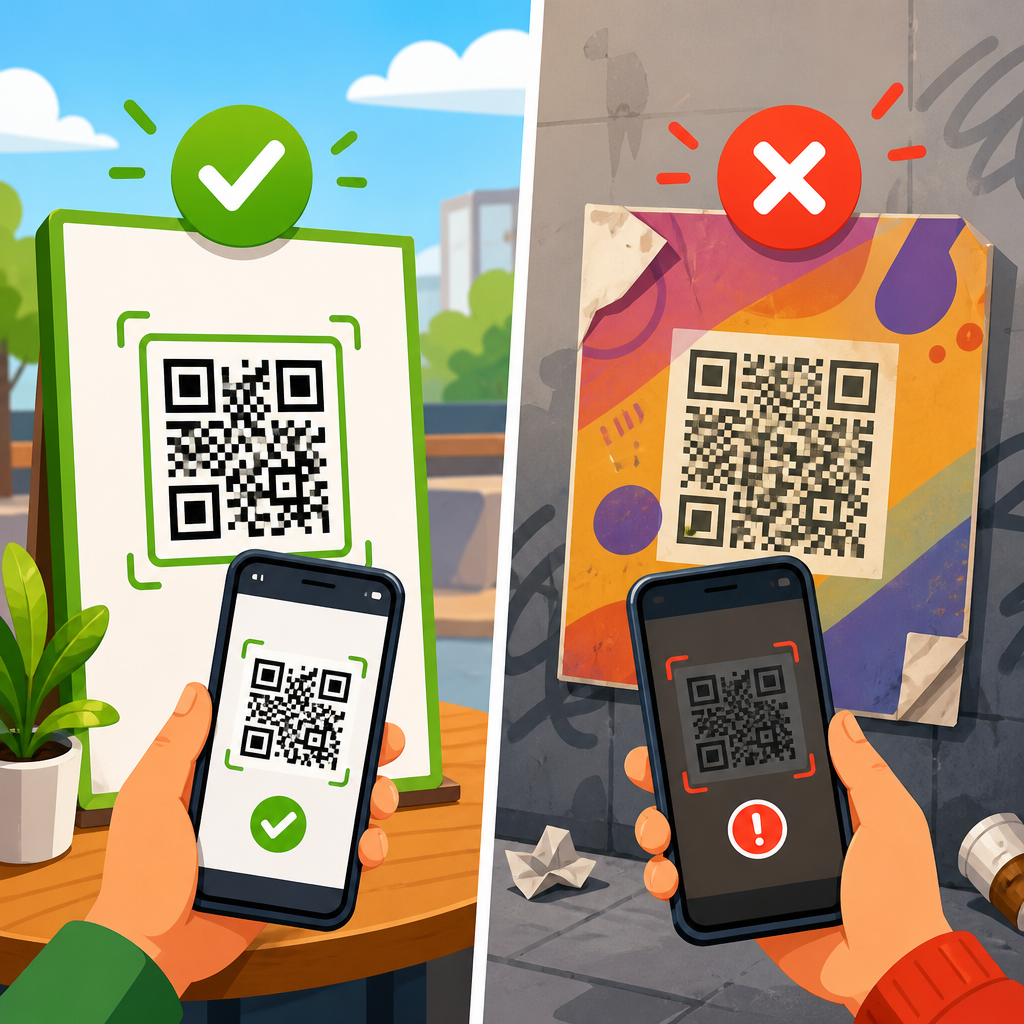
Most broken QR codes fail for repeatable reasons. The first is low contrast. Black on white remains the most reliable pairing because camera software can separate foreground and background quickly. Dark blue on white often works. Pale gold on cream often does not. The second is a damaged or missing quiet zone, the empty margin around the code. Without that clear border, scanners cannot confidently isolate the symbol from surrounding graphics. The third is over-customization of finder patterns and modules. Stylized corners may look modern, but if they no longer resemble the geometric markers scanners expect, recognition drops sharply.
Another major cause is excessive data density. A short URL encoded at a moderate version creates larger modules and more scanning tolerance. A long URL with tracking parameters, UTM strings, and campaign identifiers forces a denser code. Once a dense code is further customized, the margin for error disappears. This is why dynamic QR codes are usually more robust than static ones for marketing use. They encode a shorter redirect URL, which lowers complexity and leaves more room for safe branding.
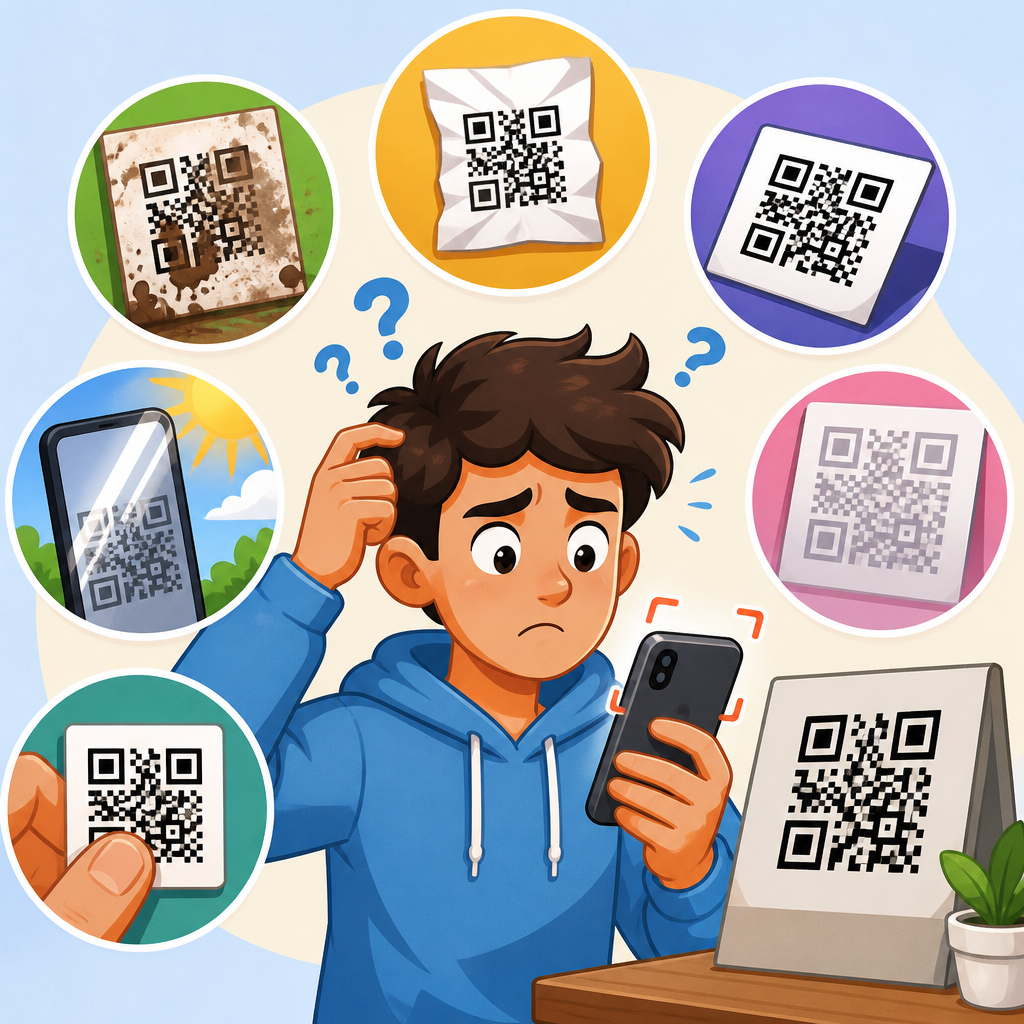
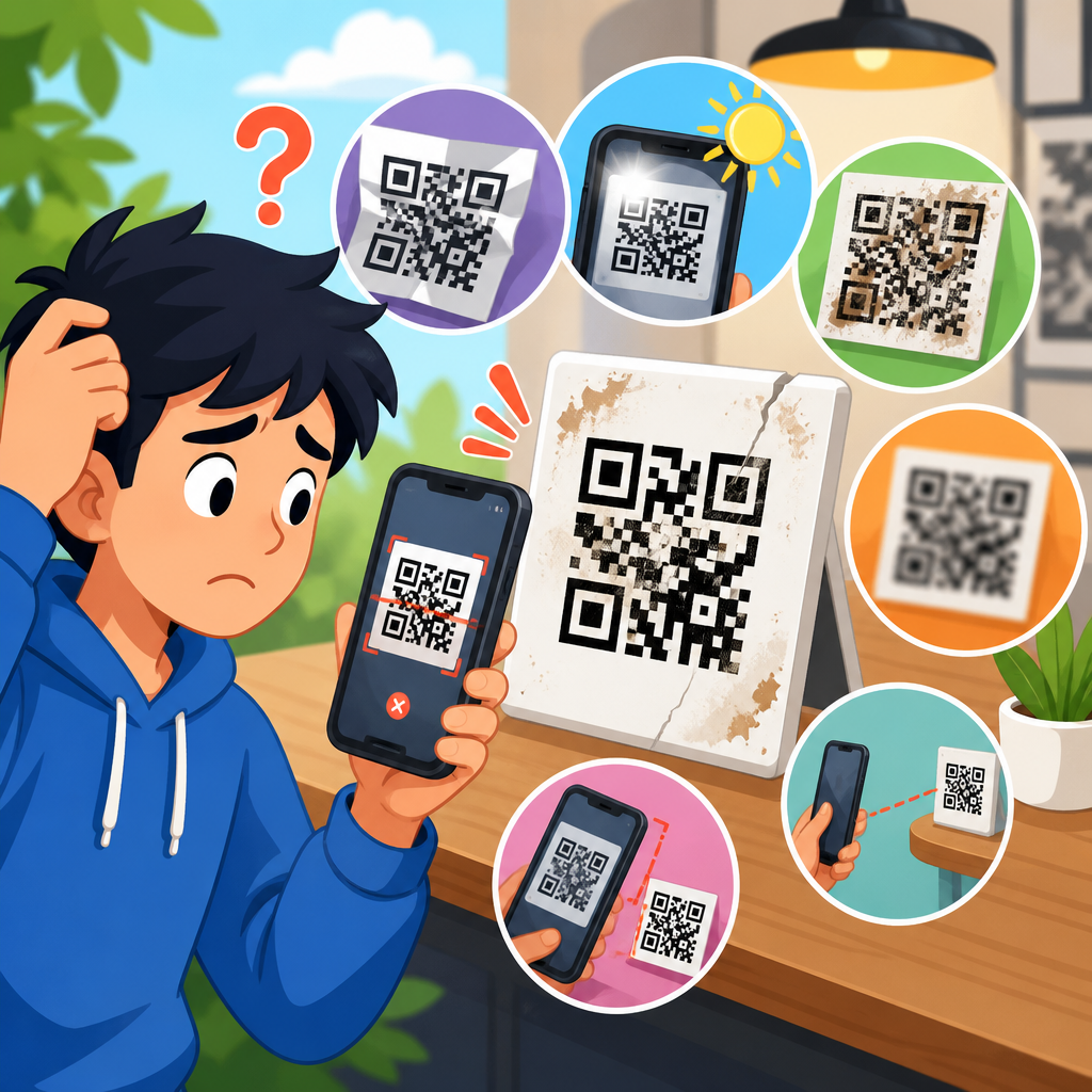
Environmental mismatch also breaks codes. A QR code that scans perfectly on a desktop monitor may fail on corrugated packaging, reflective foil, curved bottles, LED event screens, or storefront windows in direct sun. In support work, I have found that teams often test only one condition: one modern phone, one bright room, one ideal angle. Real users do not scan under ideal conditions, so designs that barely pass internal testing often fail in the field.
| Failure point | What changed | Why scanning fails | Practical fix |
|---|---|---|---|
| Low contrast | Light foreground, busy background, gradients | Camera cannot separate modules cleanly | Use dark modules on a light solid background |
| Quiet zone removed | Code cropped or placed too close to text | Scanner cannot isolate symbol boundary | Keep a clear margin of at least four modules |
| Logo too large | Center overlay covers data area | Error correction cannot recover systematic loss | Reduce logo size and raise error correction carefully |
| Dense payload | Long static URL or vCard data | Modules become too small for print or distance | Use a short dynamic URL |
| Print distortion | Ink spread, low resolution, curved surface | Module edges blur or warp | Increase physical size and proof on final material |
Why logos, colors, shapes, and gradients often cause scan failures
Logo insertion is one of the most misunderstood customization choices. A centered logo works only when the code has enough redundancy, the overlay stays away from critical structures, and the payload is short enough to leave generous module size. Many online generators make logo placement look effortless, but they do not know your print process, target scan distance, or lighting conditions. In production, I treat logo use as a test-driven decision, not a default branding step.
Color is another frequent issue. The rule is not simply “use contrast.” It is “use luminance contrast that survives real camera processing.” Some color pairs look distinct to the eye but collapse in grayscale, especially under warm indoor lighting. Red modules can also underperform because camera sensors and scanner algorithms handle them inconsistently against dark backgrounds. Metallic inks, varnishes, and embossing add another layer of risk by creating reflections or uneven edges. If the code is meant for packaging, restaurant tables, or outdoor signage, flat matte printing generally performs better than glossy decorative finishes.
Shapes and gradients fail when they interfere with consistency. Rounded dots, custom eyes, and branded frames can work if the underlying grid remains obvious. Problems start when modules become too thin, too decorative, or disconnected from the grid. Gradients are particularly risky because some parts of the code become lighter than others, reducing contrast unevenly across the symbol. That creates localized decoding failures that error correction may not repair. If a design requires a gradient, keep the darkest areas over all data modules and preserve a plain, high-contrast background.
Technical limits: error correction, version size, and quiet zone requirements
Error correction is often described in four levels: L, M, Q, and H. Higher levels add more redundancy, allowing a code to tolerate more damage or obstruction. However, higher redundancy also increases symbol complexity for the same amount of data. That means you cannot assume level H automatically makes a heavily branded QR code safer. In many cases, the better choice is reducing the payload through a short redirect URL so the code stays visually simpler while still using a robust correction level.
Version size matters because larger versions contain more modules per side. A dense version printed too small produces modules that bleed together, especially on absorbent paper, thermal labels, or low-resolution office printers. As a field rule, I avoid pushing custom codes into tiny placements unless the encoded data is extremely short. For posters, window decals, and trade-show signage, larger symbols are usually worth the space because people scan from varying distances and angles.
The quiet zone is non-negotiable. Standards call for a clear margin around the code, commonly at least four modules wide. Designers often trim that area to make the mark fit a label or align neatly with adjacent text. That decision regularly breaks scan performance, particularly when the surrounding layout includes borders, illustrations, or patterned backgrounds. If a code looks visually crowded, scanners often agree. Preserve white space around it before changing anything else.
Print and display issues that make a good QR code fail in the real world
Even a technically valid QR code can fail after production. Printing introduces dot gain, misregistration, banding, and substrate-related distortion. On corrugated cardboard, module edges can land over grooves and lose definition. On plastic pouches, flexography can spread ink enough to close gaps. On small product labels, thermal transfer printers may produce soft edges if settings are not calibrated. Each process changes the effective shape of the modules, which is why the same file can succeed on one material and fail on another.
Screen-based QR codes have their own problems. Low brightness, cracked displays, moiré patterns from photographing another screen, and animated backgrounds can all interfere with detection. LED walls are especially tricky because the pixel pitch can interact with the QR grid and create aliasing artifacts. If a code is shown on a stage screen or digital kiosk, test it from realistic audience distances with both iPhone and Android devices, using default camera apps and at least one third-party scanner. Do not assume a screenshot on a laptop proves readiness.
Placement matters as much as file quality. Codes wrapped around a bottle shoulder, placed near a fold, or printed across a seam are harder to scan because the grid becomes warped. Exterior installations face glare, weathering, and dirty surfaces. Restaurant table tents suffer from low light and sauce splatter. The correct troubleshooting question is not “Is the QR code valid?” but “Is this QR code still readable where and how people actually encounter it?”
How to troubleshoot a customized QR code step by step
Start with the destination, not the artwork. Confirm that the URL resolves quickly, uses HTTPS, and does not trigger regional blocks, login walls, or expired campaign redirects. Many “broken QR code” reports are actually landing-page failures. Next, inspect the source file. Regenerate the code from the original data with a trusted generator, then compare it with the published version to see whether layout edits, compression, or export settings altered the symbol.
Then test the code under controlled conditions. Use multiple devices, both major mobile platforms, and different scanner apps. Check from near and far distances, straight-on and slight angles, in bright and dim light. If scan performance is inconsistent, isolate variables. Replace the background with solid white. Remove the logo. Restore square modules. Increase size. Each change tells you which customization caused the weakness. In support practice, this elimination method identifies the root cause faster than debating visual preferences.
Finally, validate the production context. Print prototypes on the actual material, at final size, with the real finishing process. Test after lamination, varnish, or die-cutting, not before. For digital deployments, test on the exact screen hardware, brightness level, and presentation template that users will see. Document pass or fail rates and keep approved design specifications for future campaigns. QR reliability improves when teams treat it as a quality-assurance workflow rather than a last-minute design asset.
Best practices for creating branded QR codes that still scan reliably
The most reliable branded QR codes follow a few consistent rules. Keep the payload short, ideally through a dynamic short URL. Maintain strong contrast with dark modules on a light, plain background. Preserve a full quiet zone. Use logos sparingly and only after testing. Choose an adequate physical size for the intended scan distance. Avoid placing the code on reflective, curved, or heavily textured surfaces whenever possible. These are not conservative preferences; they are the conditions under which scanner software performs best.
Use professional tools that let you control export quality and error correction, such as generators from established QR platforms, vector output in SVG or EPS for print, and analytics-backed dynamic routing where campaign measurement matters. When teams ask me whether customization is worth it, my answer is yes, if they design for function first. The strongest results usually come from modest branding: a controlled color change, a small logo, a simple call to action, and disciplined testing. Overdesigned codes attract attention briefly, but readable codes convert attention into action.
If you are building a troubleshooting library for QR code support, use this page as the starting point for every scan issue related to customization. Most failures can be traced to contrast, spacing, data density, production distortion, or weak testing. Fix those five areas first, and you will solve the vast majority of “QR code does not work” cases without guesswork. Review your current codes, test them in real conditions, and update your design standards before the next print run.
Frequently Asked Questions
Why do QR codes stop working after they are customized?
QR codes usually break after customization because the design changes begin to interfere with the symbol’s core job: helping a camera detect it, helping software interpret its structure, and helping a decoder reconstruct the stored data. A QR code is not simply a decorative square. It is a tightly organized matrix of dark and light modules built according to ISO/IEC 18004, and each visible part has a functional role. The large finder patterns in the corners help scanners locate the code, the timing patterns help establish the grid, alignment patterns help correct distortion, the quiet zone separates the symbol from its surroundings, and the error correction system helps recover some damaged or obscured data. When customization affects any of those systems too aggressively, scanning reliability drops.
In practice, many customized QR codes fail because designers prioritize branding over readability. Common problems include low contrast between foreground and background, logos placed over too much of the center, rounded or reshaped modules that become ambiguous at small sizes, missing quiet zones, decorative borders that confuse edge detection, and visual effects such as gradients, shadows, textures, or transparency. Even when the code still looks recognizable to a person, a phone camera may not capture enough clean structure for the scanner to interpret it correctly.
Another important issue is that customization errors often stack. A code might survive one modification, such as a small logo, but fail when that logo is combined with reduced contrast, a tiny print size, and a busy background. Error correction can compensate for some damage, but it is not a license to redesign the symbol without limits. The more visual changes compete with the standardized pattern, the less margin for real-world conditions such as glare, motion blur, poor lighting, low-resolution printing, or lower-quality smartphone cameras.
How much customization can a QR code handle before it becomes unreadable?
The answer depends on the data density, print size, scanning distance, error correction level, and the specific type of customization being applied. There is no single percentage that guarantees safety in every case. QR codes are built with error correction levels that allow a portion of the symbol to be restored if some modules are damaged or hidden, but that capacity is shared across the entire code. It is not reserved exclusively for a logo or a visual effect. If other parts of the code are already compromised by printing flaws, poor contrast, or difficult scanning conditions, the remaining tolerance can disappear quickly.
As a general rule, the more data encoded in the QR code, the denser and more fragile the design becomes. A simple short URL creates fewer modules and leaves more visual breathing room, while a long URL or raw text payload creates a busier matrix with less flexibility. That is why two codes with the same logo treatment can perform very differently. One may scan instantly, while the other fails because the denser pattern offers less room for error. In addition, a code displayed on a glossy package, a curved bottle, a distant sign, or a low-quality screen may need far more structural clarity than one printed large and flat on matte paper.
The best way to think about customization is not in terms of what is theoretically possible, but what remains reliably scannable in realistic conditions. Conservative customization usually works best: maintain strong contrast, preserve the quiet zone, avoid altering finder and timing patterns, keep any logo modest in size, and test across multiple devices and distances. A QR code that only works in a perfect studio environment is not a successful QR code.
Does error correction mean it is safe to add logos, colors, and design effects?
Error correction helps, but it does not make a QR code customization-proof. In a QR symbol, error correction is designed to recover missing or damaged information up to a limit, depending on the selected level. This is extremely useful when part of the code is obscured by a logo, when printing is slightly imperfect, or when minor damage occurs during use. However, error correction is often misunderstood. It is a recovery mechanism, not unlimited spare capacity for design experimentation.
For example, placing a logo in the center may cover modules that the decoder can reconstruct, but only if enough of the surrounding symbol remains clear and if the logo does not intrude on critical functional patterns. If the code also uses weak contrast, a gradient background, softened module edges, or a too-small print size, those issues consume the readability margin that error correction might otherwise have saved. In other words, error correction can tolerate some disruption, but it cannot rescue a design where several scanning obstacles occur at once.
Colors and effects create similar tradeoffs. A QR code does not need to be black and white, but it does need a strong luminance difference between dark and light areas. Some color combinations that look stylish to the human eye perform poorly for cameras, especially under inconsistent lighting. Gradients can cause certain modules to fade into the background, metallic inks can produce glare, and transparency can let background textures interfere with the module grid. Error correction may help with minor inconsistencies, but if the symbol’s contrast and geometry are no longer clean, decoding becomes unreliable. The safest approach is to use customization as an enhancement around the code’s structure, not as a replacement for it.
What parts of a QR code are most important to preserve during customization?
The most critical elements to preserve are the finder patterns, quiet zone, overall module grid, contrast, and other structural features that allow the code to be detected and decoded correctly. The finder patterns are the three large square markers typically located at three corners of the symbol. These help the scanner identify that the image is a QR code and determine its orientation. If these are obstructed, restyled beyond recognition, or blended into surrounding artwork, scanning often fails immediately. Similarly, the timing patterns and alignment patterns help the software understand the spacing and geometry of the grid, especially if the code is viewed at an angle or printed on a curved surface.
The quiet zone is another major source of problems. This is the empty margin around the QR code that separates it from surrounding text, graphics, borders, or photographs. Designers sometimes crop it tightly or place the code on a busy layout where decorative elements touch the edge. That can make it much harder for scanners to isolate the symbol from the background. Even if the code itself is technically intact, poor separation can prevent detection before decoding even begins.
It is also essential to preserve clear module definition. Modules are the small dark and light squares that carry the encoded data. If they are rounded too heavily, merged together, textured, or distorted into unusual shapes, the scanner may not interpret the pattern correctly, especially at smaller sizes. Maintaining strong contrast and a clean, simple background is just as important. A well-customized QR code should still behave like a machine-readable symbol first and a branded asset second. The more faithfully it retains its structural cues, the more room you have for aesthetic variation without sacrificing performance.
How can you customize a QR code without breaking it?
The safest way to customize a QR code is to start with a technically sound symbol and make restrained visual changes that respect its scanning requirements. Begin by encoding as little data as possible, ideally using a short URL, because lower data density usually produces a simpler and more durable code. Choose an appropriate error correction level if you plan to add a logo or make minor visual modifications, but do not rely on error correction alone. Keep the fundamental geometry intact, preserve all required functional patterns, and maintain a proper quiet zone around the entire code.
From a design standpoint, use high contrast between the dark modules and the light background. Dark-on-light combinations tend to be most reliable. If you introduce color, make sure the difference in brightness remains strong enough for cameras, not just for human viewers. Use logos sparingly and place them carefully, usually in the center where they are less likely to interfere with critical detection patterns, while keeping their size modest. Avoid decorative choices that reduce clarity, such as overly complex gradients, busy background imagery, embossing effects, drop shadows, reflective materials, or extreme module reshaping.
Most importantly, test the customized QR code in the real environments where it will appear. Scan it with multiple phones, under different lighting conditions, at different distances, and from slight angles. Test it on both iOS and Android devices, and if it will be printed, test the final printed version rather than only the digital artwork. Check it on glossy and matte surfaces if relevant, and verify that it still works when the user is moving quickly or when the camera is not perfectly focused. Successful customization is not just about whether the code can scan once. It is about whether it can scan consistently for ordinary people in ordinary situations.