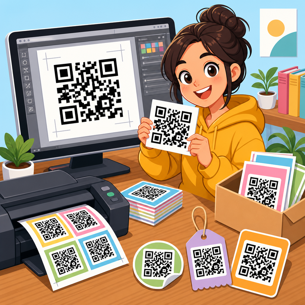
Unique QR code designs that stand out do more than look attractive; they improve scan confidence, strengthen brand recognition, and help bridge printed materials with measurable digital actions. A QR code, or Quick Response code, is a two-dimensional matrix barcode that stores data such as a URL, menu, payment address, app link, file, or contact record. In practice, design matters because people decide in seconds whether a code looks trustworthy, useful, and easy to scan. I have tested QR campaigns on packaging, event signage, retail displays, and direct mail, and the same lesson repeats: the best-performing codes balance visual distinction with technical readability. This article serves as a comprehensive hub for QR code design examples, showing what makes a design effective, which styles fit different business goals, and how to avoid choices that reduce scan rates.
When people search for QR code design examples, they usually want answers to practical questions. What colors are safe? Can you add a logo? How much can you customize the pattern? Which shapes work on packaging versus posters? What file format should a designer export? Those questions matter because a QR code is both a graphic asset and a machine-readable interface. If the design is too plain, it may be ignored. If it is too stylized, cameras may fail to decode it. Standards such as ISO/IEC 18004 define how QR symbols are structured, while modern generators like QR Code Monkey, Beaconstac, Uniqode, Flowcode, and Canva make visual customization accessible. The strongest design decisions respect that underlying structure while using contrast, spacing, framing, and context to guide users clearly toward the scan.
As a sub-pillar within QR Code Resources, Templates & Tools, this page brings together the major design patterns worth understanding before you create branded codes for marketing, operations, education, hospitality, or product packaging. Rather than listing trends without explanation, it focuses on why certain examples work in real use. A restaurant menu code faces grease, glare, and low light. A warehouse asset tag must survive small-print limitations and fast scanning. A museum placard can use stronger aesthetics because visitors stand nearby and expect to interact. By the end, you will know how to evaluate QR code design examples by scan reliability, brand fit, placement context, and conversion intent, then choose a style that stands out for the right reasons.
What Makes a QR Code Design Stand Out
A standout QR code design is recognizable at a glance, easy to trust, and simple to scan with an ordinary smartphone camera. The visual structure matters more than decoration. Every QR code includes position markers in three corners, timing patterns, data modules, and a quiet zone around the symbol. The quiet zone is non-negotiable; it gives a camera enough separation from nearby graphics. In real projects, the most common reason a “beautiful” code fails is that a designer lets background art, text, or borders crowd that margin. As a rule, maintain at least four modules of empty space around the code, preserve high contrast between foreground and background, and test the smallest printed size before approving artwork.
Standing out does not require novelty for its own sake. It usually comes from one of four levers: distinctive color, a clear frame with an instruction, integrated branding, or a context-specific shape treatment. For example, a cosmetics brand may use a soft beige background with a deep charcoal code and a small centered logo, then place the code inside a rounded label reading “Scan for shade match.” That combination outperforms an unlabeled black square because users understand the value immediately. Similarly, on event wayfinding signs, a bold frame with “Get schedule” increases scans because it removes ambiguity. Good QR design is not isolated graphic design; it is user interface design applied to print, packaging, and physical spaces.
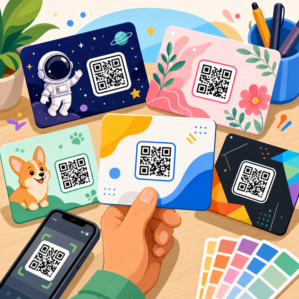
Branded QR Code Design Examples
Branded QR code design examples are the most requested style because they help a company connect offline materials to a familiar identity. The safest way to brand a code is through controlled customization: use the brand palette while keeping strong luminance contrast, place a small logo in the center, and shape the eyes or modules only within the generator’s tested limits. High error correction, commonly Level H, is useful when adding a logo because it allows part of the symbol to be obscured while remaining readable. Even then, restraint matters. A logo that covers too much area, especially over dense data regions, can make scanning inconsistent across older phones or low-light conditions.
I have seen branded codes work especially well on product packaging, business cards, and in-store displays. A coffee roaster, for instance, can print a forest-green code with a bean icon in the center on each bag, linking to brew guides and origin stories. The design feels premium because it matches the pack system, but the important part is that the code still scans from a curved matte surface. A real estate agent can place a navy-and-white code on a yard sign with a brokerage logo and the instruction “Scan for virtual tour,” reducing friction for drive-by leads. In both cases, the design stands out not because it is visually loud, but because it aligns with an existing brand system and supports a clear next action.
Color, Contrast, and Background Choices
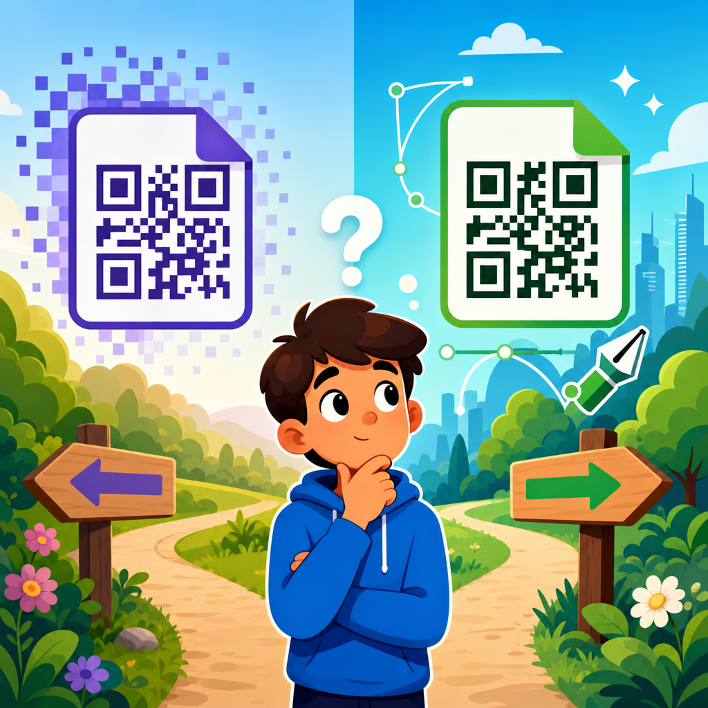
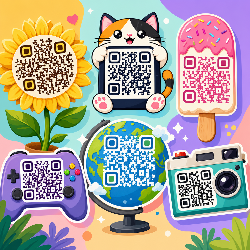
Color is one of the fastest ways to make a QR code unique, but it is also where many failures begin. A working rule is simple: dark foreground, light background, high contrast. Black on white remains the benchmark because it performs reliably across lighting conditions, reflective materials, and older camera sensors. That does not mean color is off-limits. Deep blue on pale cream, dark green on white, and burgundy on blush can scan well if the contrast ratio remains strong. Metallic inks, gradients, and transparent overlays are riskier because they may look clear to the eye but confuse the camera by reducing edge definition.
Background choice affects readability as much as foreground color. Busy photography behind a code lowers scanning performance unless the code sits on a solid patch. I recommend adding a white or very light backing plate whenever a code appears over product imagery, menus, posters, or social signage. Avoid inverting the common scheme unless you test thoroughly; light modules on a dark background can work with some scanners, but not as consistently. Print finish matters too. Gloss lamination creates glare under retail and restaurant lighting, while matte stock usually scans better. If a campaign depends on high volume scans, treat contrast and surface finish as performance variables, not finishing details.
Best QR Code Styles by Use Case
Different environments call for different QR code design examples. The right style is determined by viewing distance, available space, expected lighting, and what the user gets after scanning. The table below summarizes practical design choices I use when advising teams across common applications.
| Use case | Recommended design style | Why it works | Key caution |
|---|---|---|---|
| Product packaging | Branded color code with small logo and short CTA | Extends packaging identity and supports education, loyalty, or reorders | Test on curved surfaces and textured labels |
| Restaurant menus | High-contrast code in a bold frame | Fast recognition in low light and quick table turnover | Avoid glossy lamination and tiny print sizes |
| Event signage | Large code with minimal styling and directional text | Readable from distance and easy for moving crowds | Do not overcrowd with sponsor graphics |
| Business cards | Compact branded code on a clean back panel | Connects to vCard, portfolio, or booking page without clutter | Maintain quiet zone despite limited space |
| Retail displays | Campaign-themed code with landing-page offer | Matches promotional creative and improves conversion intent | Ensure code is not blocked by shelf glare |
| Museum or education | Elegant custom frame with descriptive label | Supports discovery and deeper content engagement | Keep accessibility text nearby for non-scanners |
The practical takeaway is that use case should drive style selection. A stylized circular module design might look sophisticated on a museum wall label where visitors are close and engaged. That same design may underperform on a street poster because distance and motion demand simpler geometry. Likewise, packaging codes often benefit from dynamic destinations that can update after printing, while permanent exhibit codes may link to stable reference pages. Design is never separate from context. The more precisely you define context, the easier it becomes to choose a QR style that stands out and still performs.
Creative Shapes, Frames, and Embedded Logos
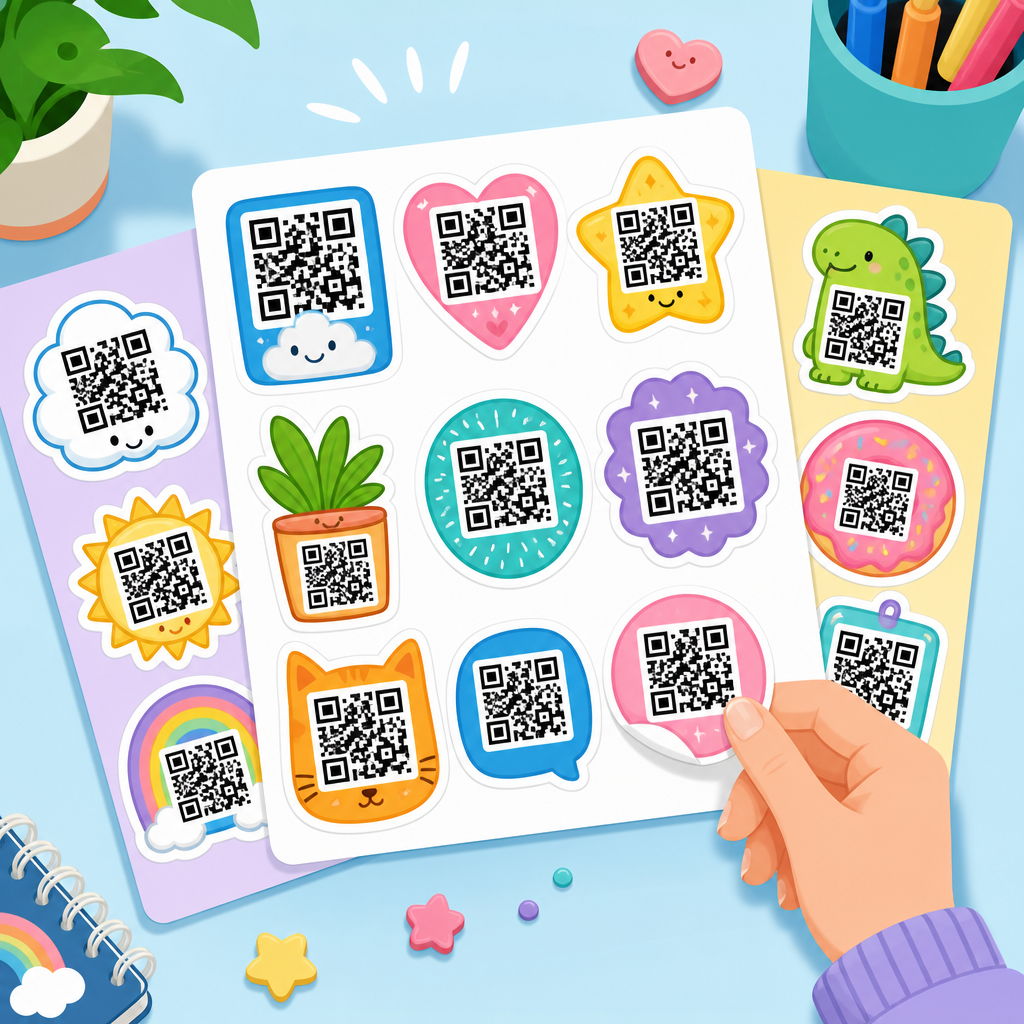
Many of the most distinctive QR code design examples rely on three customization layers: module shape, eye shape, and frame treatment. Module shapes can be square, rounded, dot-based, or softened geometric forms. Eye shapes, the three corner markers, are often the strongest branding opportunity because they can change appearance without compromising the whole symbol. Frames add a surrounding border, headline, or callout. Of these three, frames usually deliver the biggest gain in actual scan rate because they explain the action. “Scan to see the menu,” “Scan for care instructions,” and “Scan to verify authenticity” are more persuasive than a code presented without context.
Embedded logos can work extremely well when they are small, high contrast, and centrally placed. I usually advise clients to keep the logo within roughly 15 percent of the total symbol area unless the generator validates a larger treatment after device testing. The logo should also sit on a clean knockout shape rather than directly over dense modules. Good examples include a fitness studio placing a simple dumbbell icon inside a code that opens class schedules, or a skincare brand using a monogram that links to ingredient education. Poor examples include detailed crests, thin-line illustrations, or transparent marks that disappear against patterned modules. The goal is instant recognition, not visual complexity.
Print, Digital, and Environmental Design Considerations
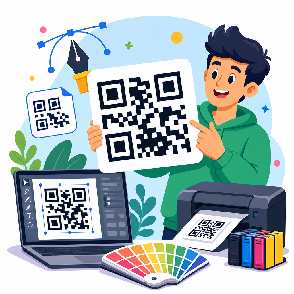
QR code designs behave differently across print and digital surfaces. For print, size is the first constraint. A common baseline is at least 2 x 2 centimeters for close-range use, but practical minimums depend on data density, camera quality, and distance. On posters viewed from several feet away, larger is better; a rough field guideline is scanning distance divided by ten to estimate code size. Vector formats such as SVG, EPS, and PDF are preferred for print because they scale cleanly. Raster exports like PNG are fine for web use but can blur when enlarged by an outside printer. Before release, test actual production proofs, not just on-screen mockups.
For digital screens, brightness, animation, and responsive placement become more important. A code in an email footer should not be so small that mobile users cannot realistically scan it with another device. On presentation slides, avoid placing the code near edges where projectors crop content. Environmental conditions matter too. Outdoor signs face direct sun, reflections, weathering, and oblique viewing angles. Industrial labels deal with abrasion and dirt. Healthcare settings may require larger, simpler codes because users range widely in device quality and technical comfort. In each case, standout design comes from anticipating the environment before styling the symbol.
Common Design Mistakes and How to Avoid Them
The most common QR code design mistakes are predictable and preventable. First is insufficient contrast, especially with pastel-on-pastel palettes or photo backgrounds. Second is removing or shrinking the quiet zone to make the code fit a layout. Third is over-customization: excessive gradients, decorative patterns, thin outlines, or logos that cover too much data. Fourth is printing the code too small for the intended distance. Fifth is linking to a poor landing page, which wastes even a successful scan. A striking QR code that opens a slow, unoptimized page is not effective design; it is a broken user journey.
Testing solves most of these issues. Scan with both iPhone and Android devices, in bright and dim light, from expected angles and distances. Test through the native camera app, not only a specialty scanner. Print samples on the final material, including any laminate or varnish. If you use a dynamic QR platform, review analytics for scan rate by placement and version. In campaigns I have managed, small fixes such as adding a white backing plate, increasing print size by a few millimeters, or rewriting the CTA often improved performance more than any aesthetic change. Reliable QR code design is disciplined design, not decorative excess.
How to Build a QR Code Design System That Scales
If your organization uses QR codes across many touchpoints, create a repeatable design system instead of designing each code from scratch. Start with approved variants: a primary black-on-white utility code, a branded marketing code, a compact code for business cards, and a large-format event code. Define acceptable logo size, color pairings, minimum print dimensions, quiet-zone requirements, and CTA patterns. Include export standards such as SVG for print and PNG at fixed pixel densities for digital. Document when to use static versus dynamic codes, who owns redirects, and how analytics are reviewed. This approach reduces brand inconsistency and avoids technical errors caused by one-off design decisions.
A scalable system also improves governance. Marketing may need campaign flexibility, while operations needs permanence and fast scanning. Product teams may want codes on inserts, labels, and onboarding guides that remain valid through packaging revisions. By setting templates and validation steps, teams move faster without sacrificing quality. If you are building out this subtopic across your site, link this hub to deeper resources on logo QR codes, menu QR templates, print sizing guides, dynamic versus static code strategy, and testing checklists. Use this page as the decision framework: choose the use case, match the environment, apply safe customization, then test until performance is proven.
Unique QR code designs stand out when they combine visual distinction with dependable scanning. The strongest examples use high contrast, preserve the quiet zone, fit the environment, and give users a clear reason to scan. Branded colors, frames, shaped eyes, and small embedded logos can all work when they respect the underlying structure of the symbol. Use case should guide every design choice, whether you are creating a packaging code, restaurant menu link, business card add-on, retail display, or event sign. Good design is measurable here: if people notice the code, trust it, and reach a useful destination quickly, the design has succeeded.
As the hub for QR code design examples within QR Code Resources, Templates & Tools, this page gives you the framework to evaluate styles before you commit time and budget. Start with readability, add branding with restraint, test in the real environment, and standardize what works. That process consistently produces QR codes that look better and perform better. Use these principles to review your current codes, redesign weak performers, and build a library of proven templates for future campaigns. Then move to the next resource in this cluster and apply one improvement this week.
Frequently Asked Questions
What makes a QR code design stand out without hurting scan performance?
A standout QR code balances visual creativity with technical reliability. The best designs immediately signal what the code is for, match the brand style, and still preserve the structural elements scanners need to read the code quickly. That means keeping strong contrast between the foreground and background, preserving the quiet zone around the code, and avoiding excessive decoration that interferes with the data modules. A QR code can be customized with brand colors, rounded modules, subtle pattern changes, and even a centered logo, but those changes should support usability rather than overpower it.
In real-world marketing, people often decide in a moment whether a QR code looks safe and worth scanning. A clean, professional design increases scan confidence because it feels intentional and trustworthy. For example, a restaurant menu QR code can use brand colors and a small logo to feel polished, while still remaining obvious and easy to scan from different angles and distances. The most effective designs are not just visually unique; they also make the purpose clear with surrounding context such as “Scan to View Menu,” “Scan for 10% Off,” or “Scan to Watch the Demo.” That combination of visual distinction and clarity is what helps a QR code stand out and perform.
How can branded QR codes improve trust and brand recognition?
Branded QR codes improve trust by reducing uncertainty. Many people hesitate before scanning a generic black-and-white code because they do not know where it leads or whether it is legitimate. When a code incorporates recognizable brand elements such as a logo, color palette, and consistent design language, it feels more credible and easier to associate with an established business. That visual familiarity can make the difference between someone ignoring the code and taking action.
Brand recognition also benefits because the QR code becomes part of the overall customer experience rather than an isolated utility. On packaging, posters, direct mail, product inserts, table tents, and event signage, a well-designed code reinforces the same identity customers see on the website, social media, and physical materials. Over time, that consistency strengthens memory and improves response rates. A unique code design can also help bridge offline and online touchpoints in a measurable way, allowing businesses to track scans, campaigns, locations, and conversions while keeping the customer journey visually cohesive. In short, branded QR codes do more than look better; they help people feel safer scanning and make every interaction more recognizable.
What design elements should I test before using a custom QR code in print or packaging?
Before launching a custom QR code in print or packaging, test the variables that most affect real-world scanning. Start with contrast, size, and placement. Even a beautifully designed code can fail if it is too small, printed on a reflective surface, or placed where users cannot comfortably scan it. Test how the code performs under different lighting conditions, from multiple distances, and on several smartphone camera types. This is especially important for packaging, labels, menus, window decals, flyers, and outdoor signs, where environmental conditions vary widely.
You should also test logo size, color combinations, error correction level, and surrounding call-to-action text. If a logo is too large, the code may become unreliable. If the background is patterned or low contrast, scan speed may drop. Always verify that the quiet zone remains intact and that decorative elements do not replace key data areas. Dynamic QR codes are often a better choice for campaigns because they let you update the destination URL without reprinting the code and provide scan analytics for optimization. A practical test process includes printing prototypes at final size, scanning on both iPhone and Android devices, and confirming that the destination page is mobile-friendly, fast, and aligned with the offer promised next to the code.
Are colorful or artistic QR codes as effective as traditional black-and-white ones?
Colorful and artistic QR codes can be just as effective as traditional black-and-white codes when they are designed correctly. The key issue is not whether the code uses color, but whether it maintains enough contrast and structural clarity for scanners to detect it easily. Dark foreground elements on a light background usually perform best, while very light colors, metallic effects, gradients with poor separation, or overly busy backgrounds can reduce readability. Artistic styling works well when it enhances the code without disguising it.
In fact, distinctive designs can improve engagement because they attract attention and feel more intentional within a branded layout. A custom QR code on premium packaging, a product display, or an event poster often outperforms a generic-looking code simply because more people notice it and feel confident scanning it. However, effectiveness depends on disciplined execution. Decorative frames, embedded logos, rounded corners, and brand colors should be tested carefully, especially if the code will be scanned from a distance or in less-than-ideal conditions. The safest approach is to treat the design as an enhancement to functionality, not a replacement for it. When the code remains unmistakably scannable, artistic styling can absolutely support better engagement.
Where should unique QR code designs be used for the best marketing results?
Unique QR code designs work best anywhere physical attention can be converted into measurable digital action. That includes product packaging, retail displays, business cards, brochures, postcards, direct mail, menus, trade show booths, event badges, tabletop signage, storefront windows, invoices, manuals, and thank-you inserts. In each case, a custom-designed code should fit the setting, the audience, and the action you want users to take. For example, packaging might send buyers to setup instructions, product registration, or loyalty rewards, while a poster might lead to ticket sales or a campaign landing page.
The strongest results come from pairing the code with a specific, relevant offer and clear intent. A QR code should never feel decorative for its own sake. It should answer the user’s silent question: “Why should I scan this?” That is why placement, copy, and design all matter together. If the visual design stands out, the call to action is compelling, and the destination experience is fast and useful, the code becomes a practical conversion tool rather than a novelty. Businesses also gain measurable value by tracking scans across locations, print runs, or campaign variations, which helps identify what creative approach produces the best response. Used strategically, unique QR code designs become a bridge between offline visibility and digital performance.