QR code poster design examples show how a simple scannable square can become the central element of a high-performing print campaign, not just a technical add-on. In practice, the best QR code poster design combines visual hierarchy, mobile usability, tracking, and a clear value exchange so people know exactly why they should scan. I have designed and audited QR campaigns for retail windows, event signage, trade show booths, restaurant walls, and campus wayfinding, and the same pattern appears every time: posters succeed when the code serves a specific user intent and fails when it is treated as decoration.
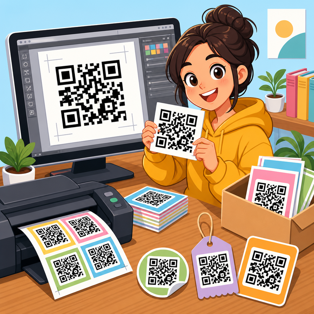
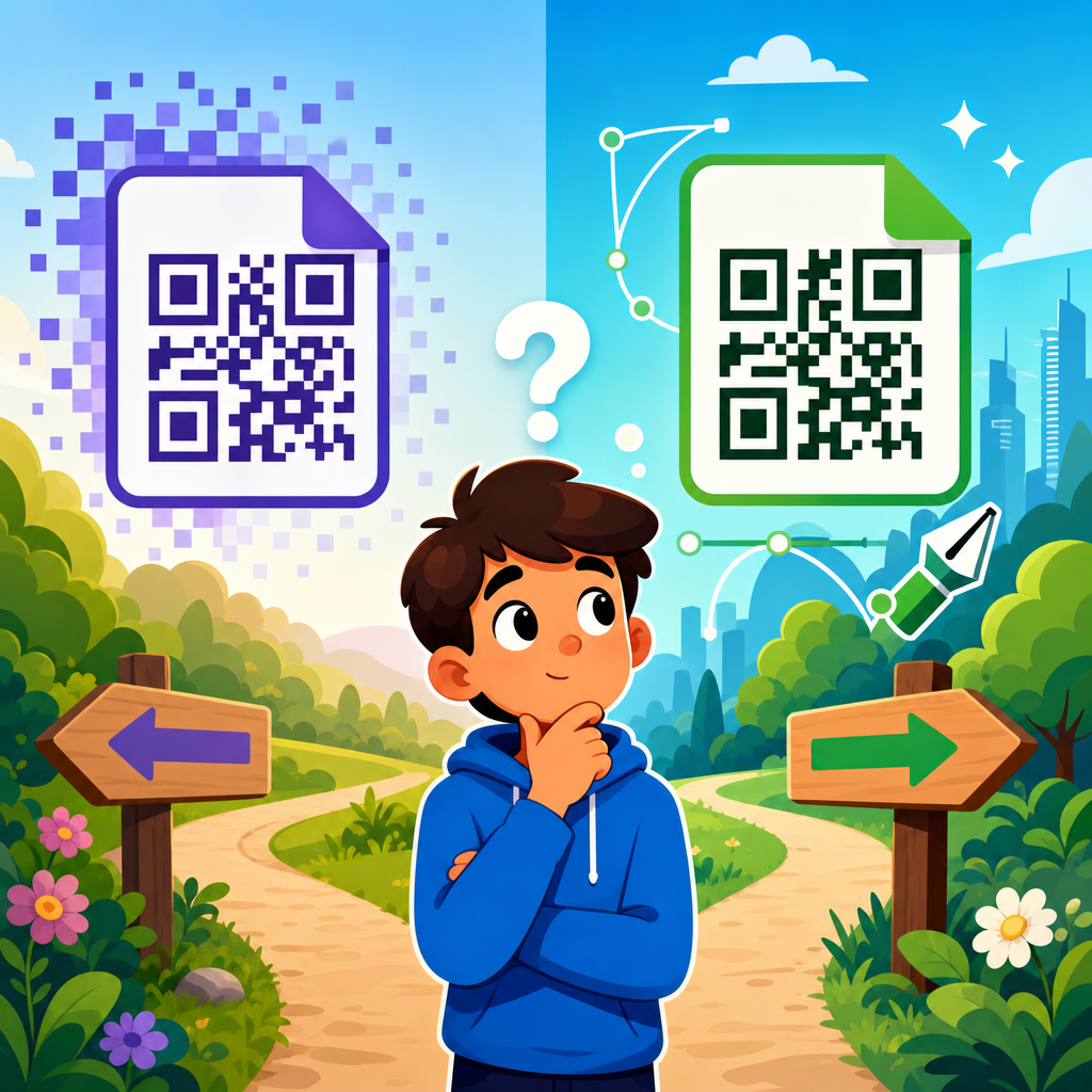
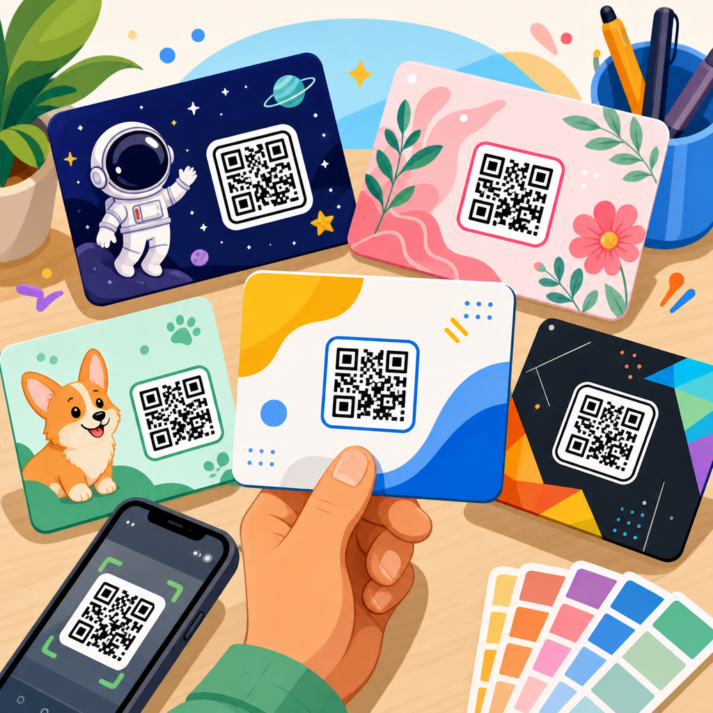
A QR code poster is any printed display that uses a Quick Response code to connect an offline viewer to digital content. That content might be a menu, coupon, app download, ticket page, product demo, lead form, map, Wi-Fi login, payment link, or PDF. Static codes point to fixed data and cannot be changed after printing. Dynamic codes route through a short URL and can usually be edited later, tracked, and segmented by location or campaign. For poster use, dynamic QR codes are generally the better choice because they support analytics, content updates, and A/B testing without forcing a reprint.
This topic matters because poster real estate is limited and attention is expensive. A good QR poster shortens the path from awareness to action. Instead of asking someone to remember a URL, search later, or type a coupon code, the poster lets them act in seconds. Smartphone adoption and native camera scanning have made behavior familiar, but familiarity does not guarantee performance. Scan rate depends on context, placement height, lighting, contrast, call to action, destination speed, and whether the landing experience matches the promise on the poster. Designing that chain well is what separates useful examples from weak ones.
As the hub page for QR Code Design Examples within a broader QR Code Resources, Templates & Tools library, this guide maps the main poster formats, explains what makes each one effective, and gives you standards you can apply before you send artwork to print. If you are building posters for stores, events, offices, hospitality, education, healthcare, or public spaces, the examples below will help you choose layouts that scan reliably, look professional, and produce measurable business results.
What makes a QR code poster design effective
The strongest QR code poster designs answer four questions instantly: what is this, why should I scan it, what happens next, and can I trust it. In my own campaign reviews, the most common failure is ambiguity. Posters say “Scan me” but never state the payoff. That wastes the user’s attention. A direct call to action performs better: “Scan to view today’s menu,” “Scan for 15% off,” “Scan to register,” or “Scan to see floor map.” Specificity reduces friction because the user can judge value before opening their camera.
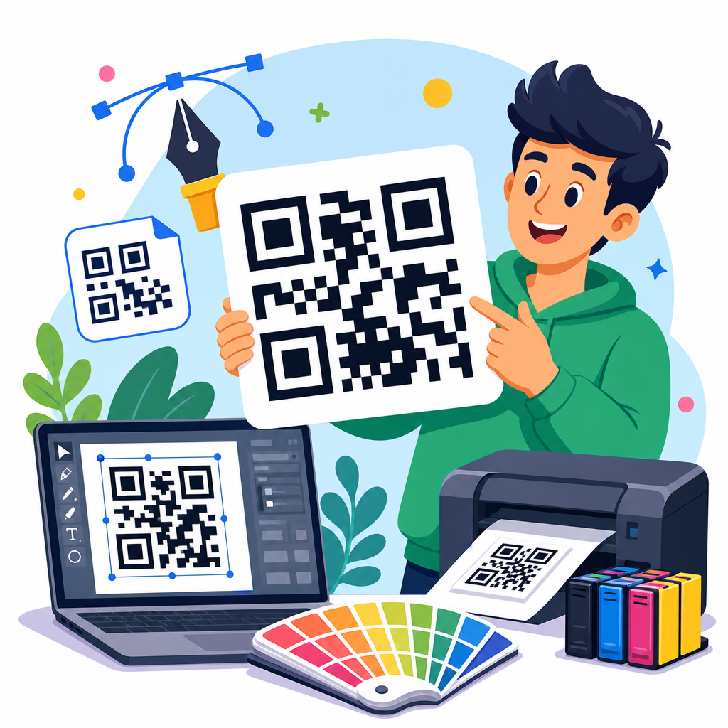
Visual hierarchy matters just as much as the code itself. The QR code should be large enough to scan from the expected distance, surrounded by adequate quiet space, and placed where glare, folds, or mounting hardware will not interfere. ISO/IEC 18004 governs QR code encoding, and practical design follows from that standard: preserve contrast, do not distort modules, and test error correction only within reason. Rounded corners, embedded logos, and color treatments can work, but they should never compromise readability. In production, I usually test with multiple phones on both iOS and Android under indoor and outdoor lighting before approval.
The destination experience is part of poster design, not an afterthought. If a poster promises a coupon and opens a slow home page, the design has failed. A mobile landing page should load fast, display one primary action, and maintain message match with the poster headline. UTM parameters, campaign naming conventions, and location-level links also matter. They let you compare performance across windows, aisles, campuses, or venues and improve the next print run with evidence rather than guesswork.
Retail and storefront QR code poster design examples
Retail posters work best when they connect immediate foot traffic to a low-friction action. A storefront example I have seen perform well uses a large headline such as “See today’s in-store offers,” a code positioned at chest height on the glass, and a backup short URL below. The digital destination opens a location-specific offer page rather than the generic store homepage. That simple choice improves conversion because shoppers are not forced to navigate. For window posters viewed from outside, larger codes and bolder contrast are essential because reflections and daylight reduce scan reliability.
Another strong retail example is a product launch poster placed near an endcap. The poster shows one hero image, three short benefits, and a code labeled “Watch a 30-second demo.” This format is effective for electronics, beauty, home goods, and fitness equipment because it answers a common in-aisle question: “How does this actually work?” Staff cannot always assist immediately, so the poster becomes a self-service sales tool. In measured campaigns, video destinations often increase dwell time, while direct “add to cart” pages work better when the product is already familiar.
Discount posters are common, but they need discipline. “Scan for 20% off today” can drive traffic, yet broad offers often attract scanners with low purchase intent. More targeted versions usually outperform them: “Scan for bundle pricing,” “Scan for loyalty signup bonus,” or “Scan to unlock student discount.” Those messages qualify the audience and support cleaner attribution. If the poster is placed near checkout, the code can link to a wallet pass, barcode coupon, or SMS opt-in. If it is placed outside the store, a map, store hours, and inventory highlights are often more useful than a generic discount splash page.
Event, conference, and trade show poster examples
Event posters use QR codes to compress logistics. A conference entry poster can link to agenda updates, speaker bios, venue maps, and calendar downloads in one scan. The best designs separate actions by intent instead of forcing one code to do everything. For example, a lobby poster may promote “Scan for live schedule,” while a sponsor booth poster says “Scan for product specs and meeting slots.” Different codes support cleaner analytics and better user expectations. At trade shows, I advise teams to avoid routing every scan to a homepage because booth traffic is high-intent and short on time.
Recruiting events provide another useful example. A campus poster with “Scan to apply in 3 minutes” works better than “Learn more” because the destination can open a mobile form with resume upload, role filters, and recruiting FAQs. For career fairs, adding a human face and company name next to the code increases trust. Candidates are more likely to scan when the benefit and brand are obvious. The same principle applies to museum events, charity galas, and local festivals: state the outcome, reduce the number of steps, and design for movement, noise, and crowded spaces.
Below is a practical comparison I use when planning poster formats for common environments.
| Poster type | Primary goal | Best CTA | Recommended destination | Key design note |
|---|---|---|---|---|
| Storefront promo | Drive walk-ins or offer claims | Scan for today’s offer | Location-specific deal page | Use large code for glass and glare |
| In-store product poster | Support product education | Scan to watch demo | Short video or product explainer | Place near decision point, not too low |
| Conference signage | Share schedule updates | Scan for live agenda | Mobile event hub | Separate schedule code from sponsor offers |
| Restaurant wall poster | Access menu or ordering | Scan to view menu | Fast mobile menu page | Keep code clear of food splashes and glare |
| Real estate poster | Generate property leads | Scan for photos and tour times | Listing page with inquiry form | Include agent name for trust |
Restaurant, hospitality, and venue poster examples
Restaurants normalized QR scanning for menus, but the best poster examples moved beyond emergency utility and turned the code into a service layer. A high-performing entrance poster says “Scan to view menu and join waitlist,” pairing two urgent actions in one mobile destination. Inside the venue, table or wall posters can handle allergen information, upsell desserts, collect reviews, or enroll guests in loyalty. The key is context. At the entrance, speed and queue management matter most. At the table, menu clarity and reorder convenience matter more.
Hotels and hospitality venues can use poster designs to reduce front desk load. Elevator and lobby posters that say “Scan for Wi-Fi, amenities, and late checkout” often outperform printed handouts because guests can act immediately on their phones. In resorts and stadiums, wayfinding posters with QR-linked maps help visitors navigate large spaces without downloading an app. For these cases, simple icon support is valuable. A map pin, menu icon, or ticket symbol next to the code adds quick meaning for international audiences and distracted users.
Venue posters also need strong operational thinking. If a stadium poster offers mobile ordering, the landing page should detect section or pickup point when possible. If a hotel poster links to a concierge page, it should include tap targets for housekeeping, dining, spa, and checkout. A QR code poster is not effective just because it scans; it is effective when it reduces effort in a moment that matters. That standard keeps design choices grounded in service quality rather than novelty.
Educational, nonprofit, and public information poster examples
Schools, libraries, hospitals, and nonprofits use QR posters differently from retail brands, but the design principles remain the same. In education, posters often support orientation, campus maps, assignment resources, tutoring, or club registration. One reliable example is a hallway poster that says “Scan for freshman orientation checklist,” linking to a mobile page with dates, maps, forms, and contact details. Because student traffic moves quickly, concise headlines and uncluttered layouts outperform dense bulletin-board style designs.
Healthcare and public service environments require extra care around trust and accessibility. A clinic poster that says “Scan for aftercare instructions” can be helpful, but it should never be the only source of critical medical guidance. Printed backup information, multilingual options, and plain language are essential. For public agencies, I have seen strong results from transit posters that link to service alerts and route maps, especially when each stop or station uses a location-aware dynamic code. That setup makes the poster more useful than a generic system homepage.
Nonprofit campaigns often use posters for donations, volunteer signups, and impact storytelling. The best examples combine one emotional proof point with a very clear next action. “Scan to fund 10 meals” is stronger than “Support our cause” because it turns abstract support into a concrete result. The landing page should continue that clarity with preset donation options, volunteer schedules, or campaign progress indicators. This is where specific imagery, named beneficiaries, and transparent use-of-funds language materially improve trust.
Design standards, testing, and common mistakes
Across all poster categories, certain standards consistently improve scan performance. Keep the code high contrast, ideally dark on light, and avoid busy backgrounds. Maintain quiet space around the symbol. Size the code for expected scanning distance; many teams use rough formulas, but real-world testing with actual devices is more reliable than theory alone. Include a short fallback URL for accessibility and edge cases. If the poster may be photographed from an angle, such as on a wall above a crowd, increase code size and simplify surrounding artwork.
Common mistakes are predictable. The code is too small. The call to action is vague. The poster has multiple competing messages. The destination is not mobile optimized. The code is placed on reflective glass or curved surfaces. Brand teams over-customize colors until contrast drops. Designers export low-resolution assets and the print shop scales them poorly. Marketing teams forget to tag links and later cannot attribute scans by location. None of these problems are hard to prevent, but all of them are common because QR posters often get produced late in a campaign without enough testing time.
If you want a repeatable workflow, start with the user goal, choose a dynamic QR platform, build the mobile destination first, then design the poster around one primary action. Test with different phones, lighting conditions, and distances. Track scan rate, click-through, completion rate, and assisted conversions, not just raw scans. Finally, document what worked so your next poster template becomes faster to produce and more likely to perform. Explore the rest of your QR Code Resources, Templates & Tools library, apply these QR code poster design examples, and build your next campaign around a scan experience people actually want to use.
Frequently Asked Questions
What makes a QR code poster design actually effective, not just visually interesting?
An effective QR code poster does more than place a scannable code on a nice-looking layout. The strongest examples treat the QR code as the focal conversion point of the poster, then build the design around that action. That means the visual hierarchy should guide attention in a clear sequence: first the headline, then the benefit, then the QR code, then a short instruction or call to action. If viewers do not immediately understand what they gain by scanning, response rates usually drop, even if the design itself looks polished.
In real-world environments such as retail storefronts, event entrances, restaurant interiors, and trade show booths, usability matters as much as aesthetics. The code must be large enough to scan from the intended viewing distance, placed where glare, folds, framing, or busy imagery will not interfere, and supported by enough contrast to remain readable under mixed lighting conditions. Good poster design also accounts for mobile behavior after the scan. If the code opens a page that is slow, confusing, or unrelated to the promise on the poster, the campaign underperforms no matter how strong the print design may be.
The best-performing QR code poster design examples also include a clear value exchange. People scan when they know what they will get: a discount, event registration, a menu, directions, product details, a giveaway entry, a video, or exclusive content. Specificity wins. “Scan for 20% off today” is far stronger than “Scan to learn more.” Add tracking through dynamic QR codes or campaign-tagged URLs, and the poster becomes a measurable marketing asset rather than a decorative print piece. That combination of clarity, usability, and measurable intent is what makes a QR poster effective.
How should I structure the layout of a QR code poster so people notice and scan it?
The most reliable layout approach is to design for fast comprehension. People often see posters in passing, while walking, waiting, or standing several feet away. A strong layout usually starts with a concise headline that communicates the main hook in one quick glance. Under that, a short supporting line explains the benefit or offer. The QR code should appear in a prominent, easy-to-find position, usually in the center or lower-middle area where it feels intentional and visually anchored. Nearby, a direct instruction such as “Scan to order,” “Scan for map,” or “Scan to claim your offer” removes ambiguity.
Whitespace is one of the most overlooked parts of successful QR poster composition. Crowding the code with too much text, decorative shapes, or competing images can reduce both scanability and attention. The code needs room to breathe, both technically and visually. The surrounding layout should frame the action rather than compete with it. In many successful examples, the poster includes one dominant image or color field, one primary message, and one clear action. That restraint is often what makes the code feel important.
It also helps to design based on viewing context. A poster in a retail window may need a larger code and bolder contrast because people might scan through glass from the sidewalk. A campus wayfinding poster may need a directional headline and map-focused messaging. A trade show poster may need a stronger incentive because attendees are overloaded with competing displays. The best layout is not just attractive in a mockup; it is tailored to where people will actually encounter it and how much time they will have to react.
What are the most common mistakes in QR code poster design examples?
The most common mistake is treating the QR code as an afterthought. Designers sometimes finalize the poster first and drop in the code wherever there is leftover space. That usually leads to weak hierarchy, poor placement, and low scan motivation. If the code is small, tucked into a corner, or disconnected from the main message, people either miss it or assume it is not important. High-performing posters make the code feel purposeful and central to the communication.
Another major mistake is offering no compelling reason to scan. Many posters say things like “Scan me” or “Learn more,” but that is not enough. People need a concrete payoff. In campaign audits, weak value exchange is one of the biggest causes of underperformance. If the viewer has to guess why scanning is worth the effort, most will move on. Good examples replace vague prompts with direct incentives, useful tools, or time-sensitive benefits that align with the viewer’s context.
Technical mistakes are also common. These include low contrast, over-stylized QR codes that compromise readability, printing the code too small, placing it on reflective surfaces, and linking to non-mobile-friendly destinations. Another frequent issue is failing to test under real conditions. A code may scan perfectly on a designer’s screen yet struggle in a dim hallway, behind glass, or under event lighting. Finally, many campaigns miss the opportunity to track results. Without dynamic codes, analytics, or segmented destinations, it becomes difficult to learn which poster version, placement, or offer actually worked best.
How can I make a QR code poster feel on-brand without hurting scan performance?
The key is to brand around the QR code, not at the expense of it. A QR poster can absolutely reflect a brand’s color palette, typography, voice, imagery, and campaign style, but the code itself still needs to scan quickly and reliably. The safest approach is to maintain strong contrast, preserve the quiet zone around the code, and avoid excessive visual manipulation. Minor brand integration, such as using approved accent colors, adding a logo carefully, or placing the code within a branded frame, can work well if the code remains technically sound.
Strong on-brand QR poster design usually comes from the surrounding system. The headline can reflect the brand voice. The supporting copy can reinforce personality and value. The background image, product photography, illustration style, and overall composition can all strengthen brand recognition while still keeping the code clear and prominent. In many of the best examples, branding creates trust and context, while the QR code remains clean and easy to use. That balance matters because visual uniqueness is helpful only if it does not interfere with function.
Testing is what separates smart customization from risky decoration. Before printing at scale, scan the poster across multiple phones, lighting conditions, and distances. Print prototypes at actual size rather than judging from digital comps. If you are embedding a logo in the center of the code or using a non-black code color, verify that performance remains consistent. A branded QR code poster should feel cohesive and polished, but conversion always comes first. If a branding decision makes the code harder to scan, it is usually the wrong tradeoff.
How do I measure whether a QR code poster campaign is successful?
Success starts with defining the goal before the poster is printed. A QR code poster can be designed to drive sales, ticket registrations, menu views, app downloads, lead capture, directions, video plays, or on-site engagement. Each objective calls for different metrics. At a minimum, you should track scans, unique visitors, landing page engagement, and completion actions such as purchases, sign-ups, or form submissions. A poster that gets many scans but few conversions may have strong creative but weak post-scan experience.
The most effective campaigns use dynamic QR codes or destination URLs with campaign parameters so each placement can be measured separately. That allows you to compare performance between a retail window, a conference booth, a restaurant wall, or a campus sign. You can also test different headlines, incentives, code positions, or landing pages to understand what drives better response. This is where QR code poster design becomes especially valuable: unlike many traditional print pieces, it can generate detailed behavioral data when set up correctly.
It is also important to evaluate offline factors alongside digital analytics. Poster height, lighting, foot traffic, line of sight, and environmental clutter all affect results. In some cases, a redesign is not needed; a placement change alone can improve scan rate dramatically. The best measurement approach combines hard metrics with observational insight. If people notice the poster but hesitate to scan, the value proposition may be unclear. If they scan but bounce quickly, the landing page may need work. If very few people notice the poster at all, the issue is likely hierarchy or placement. When you measure the full user journey from first glance to final action, you get the clearest picture of campaign performance.