QR code design best practices for beginners start with a simple truth: a code that looks attractive but fails to scan is a bad design. A QR code, short for Quick Response code, is a two-dimensional matrix barcode that stores data in black-and-white modules arranged inside a square grid. Smartphones and scanning apps read those modules to open a website, download a file, show contact details, connect to Wi-Fi, or trigger another digital action. For beginners, design and customization usually mean changing colors, adding a logo, selecting a frame, or reshaping the corner markers. Those choices matter because every visual change affects scanning reliability, print performance, and user trust.
I have worked on QR code campaigns for packaging, restaurant menus, event signage, and retail displays, and the same pattern shows up repeatedly: the best-performing codes are designed with function first and branding second. Businesses often treat QR codes like decorative assets, but they are really utility tools. If they are hard to scan, users abandon them within seconds. If they look suspicious, users hesitate to scan them at all. Good QR code design sits at the intersection of readability, branding, accessibility, and conversion optimization.
This hub page explains QR code design and customization comprehensively for beginners. It covers the essential design rules, the most common mistakes, how to choose colors and logos safely, the role of size and quiet zones, when to use static versus dynamic codes, and how testing should be handled before launch. If you are building your first campaign in the broader QR Code Creation & Tools category, this is the foundation. Master these practices, and every later topic, from generator selection to analytics and print deployment, becomes easier and more effective.
Understand How QR Codes Work Before You Customize Them
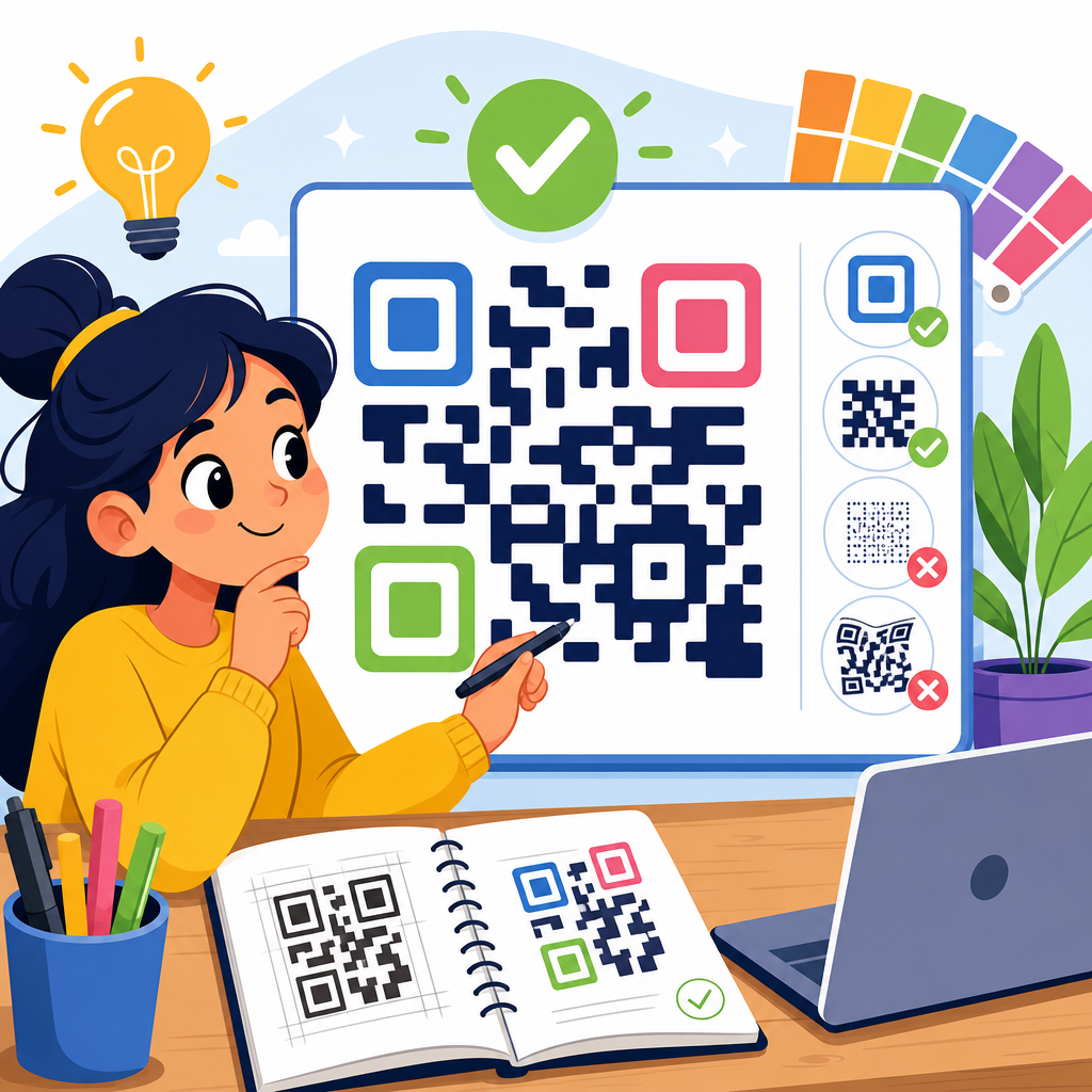
Before changing the appearance of a QR code, understand the structural elements that make scanning possible. A standard QR code includes three position detection patterns in the corners, alignment patterns that help scanners read distortion, timing patterns that define the grid, format information, and encoded data modules. Scanners do not interpret a QR code the way a person sees a logo or icon. They identify contrast, orientation, spacing, and error correction boundaries. That is why design decisions must protect these machine-readable features.
The biggest beginner mistake is assuming that modern phone cameras can scan anything. Cameras are better than they were five years ago, but they still struggle with low contrast, glossy reflections, tiny print sizes, warped surfaces, and overdesigned artwork. ISO/IEC 18004, the core QR code standard, exists for a reason: predictable structure enables reliable decoding. In practice, every customization should preserve clear finder patterns, sufficient module definition, and an untouched quiet zone around the code. If one of those breaks down, scan rates drop fast.
For this reason, start every project by deciding the code’s purpose and environment. A QR code on a product label viewed from 12 inches behaves differently from one on a billboard viewed from 20 feet. A code printed on matte cardboard behaves differently from one displayed on a phone screen or projected at an event. Good design begins with use case planning, not with color picking.
Start With the Right QR Code Type and Data Strategy
Design quality is tied directly to how much data you encode. The more data stored inside a QR code, the denser the grid becomes. Dense codes are harder to scan, especially when printed small or customized heavily. Beginners often paste long URLs filled with tracking parameters into a generator, then wonder why the result looks crowded. The practical fix is simple: use a short URL whenever possible, and use dynamic QR codes for campaigns that may change over time.
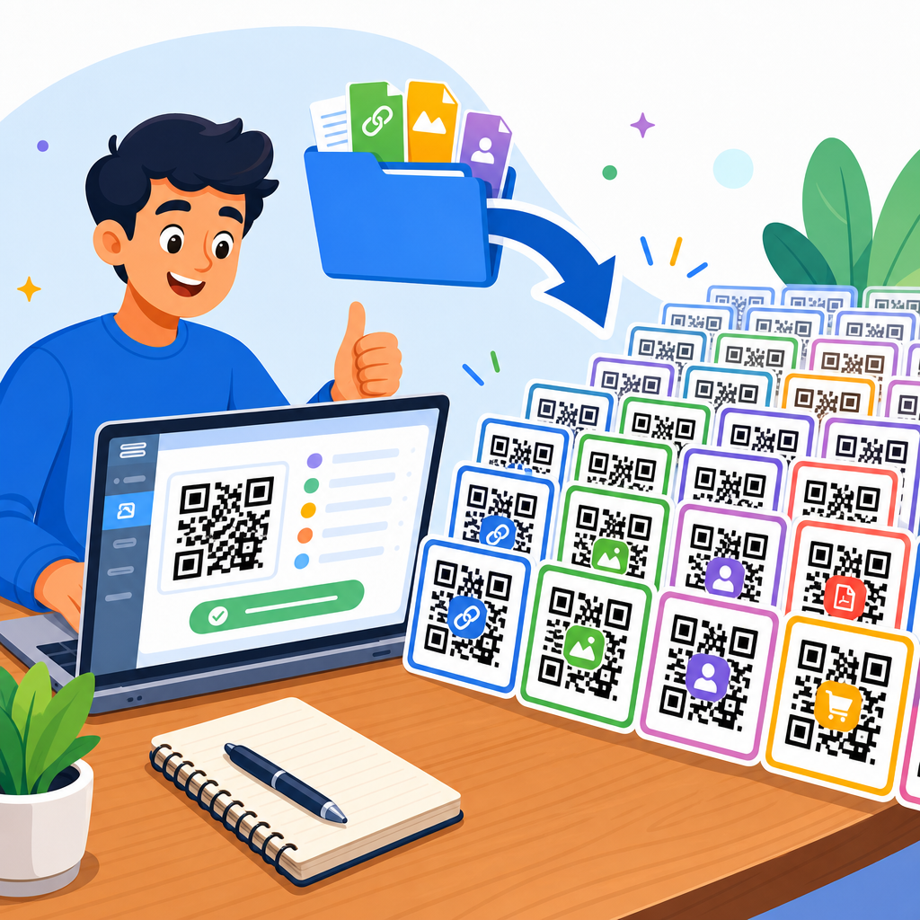
Static QR codes store the destination directly in the pattern. They are useful for permanent information such as plain text, fixed URLs, or contact details that will not change. Dynamic QR codes usually store a short redirect URL managed by a platform. That allows you to update the final destination without reprinting the code. In my experience, dynamic codes are the better choice for marketing, packaging, menus, PDFs, and posters because they support edits, analytics, and A/B testing while keeping the pattern simpler.
Data strategy also affects customization headroom. If you plan to add a center logo, rounded modules, or branded colors, begin with the leanest possible payload. Less dense codes tolerate visual customization better because scanners have more room to recover from missing or altered modules. That is one reason many professionals generate branded QR codes through services such as QR Code Generator Pro, Bitly, Beaconstac, Flowcode, or Uniqode rather than relying only on bare-bones free tools.
Use Color, Contrast, and Branding Without Hurting Scanability
The safest color rule is straightforward: dark foreground, light background, and high contrast between the two. Black on white remains the benchmark because it offers the highest readability across devices, lighting conditions, and print methods. Branded colors can work well, but only when contrast remains strong. Navy on white, dark green on cream, or deep maroon on pale beige often scan reliably. Yellow on white, light gray on pastel blue, or metallic silver on glossy packaging often fail.
In testing, inverted QR codes, such as white modules on a black background, are less consistently readable than standard dark-on-light combinations. Some modern scanners handle inversion, but many real-world conditions introduce glare and compression artifacts that reduce reliability. Gradients are another common beginner trap. A subtle two-tone gradient may scan on a large digital display, yet fail on print because module edges become visually soft. If you use a gradient, keep the transition minimal and test at final size on the final material.
Branding should support recognition, not overpower function. A frame with a short call to action like “Scan to view menu” or “Scan for setup guide” often improves engagement because it explains the benefit immediately. Color-matched corner eyes and tasteful module styling can reinforce visual identity. What matters is preserving contrast and structural clarity. When in doubt, simplify.
| Design Choice | Best Practice | Beginner Risk | Safer Example |
|---|---|---|---|
| Foreground color | Use dark tones | Light colors disappear in bright light | Dark blue on white |
| Background color | Keep it very light and solid | Busy backgrounds confuse scanners | White or pale cream |
| Gradient | Use sparingly, if at all | Soft edges reduce module definition | Single solid brand color |
| Inverted code | Avoid unless thoroughly tested | Lower scan reliability in the field | Dark code on light panel |
| Decorative background | Separate code from artwork | Patterns interfere with detection | White container behind code |
Logo Placement, Shape Customization, and Error Correction Rules
Adding a logo is the most requested customization, and it can work well when handled properly. QR codes include error correction levels, commonly labeled L, M, Q, and H, which allow a portion of the symbol to be restored if damaged or obscured. Higher error correction can support a centered logo or mild styling, but it is not a license to cover large parts of the code. In real projects, I treat high error correction as protection against small design intrusions and real-world wear, not as permission for aggressive artwork.
A practical guideline for beginners is to keep the logo small, centered, and surrounded by clear space. If the logo box blends into nearby modules, scanners may lose the data pattern. Most reliable branded codes place the logo inside a white knockout area so the central mark is visually distinct. As a rule of thumb, smaller is safer. Oversized logos are one of the top reasons a code scans in a design mockup but fails after printing.
Shape customization needs similar restraint. Rounded modules, softened eyes, and subtle corner styling can work if the underlying grid remains obvious. Extreme transformations, such as heart-shaped modules, fragmented dots, or highly ornamental corner markers, reduce machine readability. Beginners should also avoid manually editing a QR code in a graphics program. Always generate the final styled code from a reputable tool rather than altering the modules by hand in Illustrator, Canva, or Photoshop.
Size, Quiet Zone, Placement, and Print Material Matter More Than Most Beginners Expect
A technically correct QR code can still fail because it is too small, placed poorly, or printed on the wrong surface. The quiet zone, the blank margin around the QR code, is essential. It separates the symbol from nearby text, borders, and images so scanners can identify where the code begins and ends. Remove or crowd that margin, and detection becomes less reliable. Many beginners accidentally break the quiet zone by placing the code inside a busy poster layout or adding decorative borders too close to the edge.
For size, a widely used practical formula is scanning distance divided by ten. If a user stands 20 inches away, the code should be about 2 inches wide. That is not a strict engineering law, but it is a dependable planning rule. Small-format print pieces such as business cards usually need a clean, high-contrast code with minimal data. Large-format signage can support bigger symbols and more customization, but only if the viewing angle and lighting remain favorable.
Material choice changes performance. Matte finishes scan more reliably than glossy ones because glare interferes with camera focus and contrast detection. Curved surfaces, such as bottles and cups, can distort the grid, especially with dense codes. Fabric is risky because wrinkles break alignment. If you must print on challenging materials, increase code size, simplify the design, and test physical samples rather than relying on on-screen previews. For packaging, I often recommend printing a black-on-white fallback version during the first production run if the branded version is unproven.
Write Clear Calls to Action and Build User Trust Around the Scan
Good QR code design is not only about the symbol. The surrounding message determines whether people scan at all. A bare code with no explanation forces users to guess what will happen next. That uncertainty lowers response rates. A short, specific call to action works better: “Scan to download the manual,” “Scan to pay,” “Scan to see ingredients,” or “Scan for 10% off.” Clear benefit statements improve scan intent because users understand the value before opening their camera.
Trust signals matter just as much. QR codes became more widely accepted during contactless dining and payments, but users are also aware of phishing and malicious redirects. Design can reduce hesitation by pairing the code with a recognizable brand name, a visible destination domain, or supporting context such as customer service information. On printed materials, placing the code near brand assets and concise copy makes it feel legitimate. Random stickers with unlabeled codes tend to perform poorly because users suspect tampering.
The destination experience should match the promise. If the code says “Scan to view menu,” it should open a mobile-friendly menu instantly, not a cluttered homepage. If it says “Scan for setup guide,” the landing page should begin with setup instructions above the fold. Design and conversion are connected. A great-looking QR code that leads to a slow, confusing, or nonmobile page wastes every other design decision.
Test Across Devices, Lighting Conditions, and Real Use Scenarios Before Launch
Testing is the step beginners skip most often, and it is where professional QR code design proves itself. A QR code should be tested on both iPhone and Android devices, with native camera apps as well as common third-party scanners when relevant. Test in bright light, dim indoor light, and at the actual distance users will scan from. Print it at final size on the final substrate. If the code will appear on packaging, test it after the package is assembled. If it will appear on a digital screen, test it on the specific display technology and brightness settings.
I also recommend testing older devices, not just flagship phones. Midrange Android cameras reveal weaknesses that premium devices sometimes mask. Check scan speed, not only scan success. A code that opens after three seconds may technically work, but many users will give up before then. Run multiple scans from different angles and note any hesitation or focus hunting.
Use analytics when possible. Dynamic QR platforms can show scan counts, time of day, location patterns, and device types. That data helps you compare placements, calls to action, and design versions. If one poster gets traffic and another does not, the issue may be placement, messaging, or lighting rather than code styling alone. Testing before launch prevents failure; measurement after launch drives improvement.
For beginners, the core rule is simple: design QR codes to be scanned easily first, then customize them carefully. Start with the right code type and a short data payload. Keep contrast high, protect the quiet zone, size the code for the viewing distance, and treat logos and decorative shapes as limited enhancements rather than the main event. Pair the code with a clear call to action, place it on materials and surfaces that support reliable scanning, and always test under real conditions before publishing or printing at scale.
When these fundamentals are followed, QR code customization becomes a business asset instead of a risk. You can create codes that look branded, feel trustworthy, and perform consistently on packaging, signage, menus, mailers, presentations, and product documentation. That is why this topic sits at the center of QR Code Creation & Tools: every generator, analytics platform, print workflow, and campaign strategy depends on design choices that protect usability.
If you are building out your QR code skills, use this page as your starting point and apply these standards to every new project. Generate a simple version first, test it, then add branding in controlled steps until you reach the best balance of appearance and performance.
Frequently Asked Questions
1. What is the most important rule beginners should follow when designing a QR code?
The most important rule is simple: scanning reliability must always come before appearance. A QR code can be branded, colored, and styled to match a campaign or business identity, but if people cannot scan it quickly, the design has failed. QR codes work because scanners read a precise pattern of dark and light modules arranged in a square grid. When beginners make heavy design changes without understanding how those patterns function, they often reduce contrast, distort the shape, or cover too much of the code, which makes scanning inconsistent or impossible.
A good beginner approach is to start with a standard, high-contrast code and only make light visual adjustments after confirming it scans well on multiple devices. Keep the structure intact, preserve the quiet zone around the code, and avoid decorative changes that interfere with the finder patterns, timing patterns, or overall readability. In practical terms, that usually means using a dark foreground on a light background, avoiding excessive logo size, and printing the code large enough for the intended use. If you remember one best practice, remember this: every design decision should support usability first and branding second.
2. Can I customize a QR code with colors, logos, and shapes without affecting scanability?
Yes, but customization needs to be done carefully. Many beginners assume a QR code can be styled as freely as a social media graphic, but QR codes are functional tools with technical limits. You can often change colors, add a centered logo, soften corners, or use branded design elements, but each change introduces risk. The more heavily customized the code becomes, the more important testing becomes. A beautiful code that works only on one phone model or in ideal lighting conditions is not a successful design.
The safest customization practice is to maintain strong contrast between the foreground and background. Dark modules on a light background remain the most reliable option. Avoid low-contrast combinations such as light gray on white, pastel on pastel, metallic gradients, or colors that blend under poor lighting. If you add a logo, keep it modest in size and make sure the code uses enough error correction to compensate for the covered area. Even then, do not assume error correction gives unlimited freedom. It helps recover missing data, but it cannot fix every design problem.
Shape customization should also be conservative. Rounded modules and stylized corners may work, but the core grid still needs to remain readable to scanners. Overly artistic designs that break alignment, remove important square markers, or blend modules together can confuse scanning software. Beginners should think of customization as enhancement, not reinvention. Brand the code, but keep the essential geometry clear, balanced, and easy for a camera to interpret.
3. What size should a QR code be, and why does the quiet zone matter?
Size plays a major role in scan success. If a QR code is too small, the camera may not capture enough detail to interpret the data correctly, especially when printed or viewed from a distance. Beginners often use a code that looks fine on a computer screen but becomes difficult to scan on packaging, posters, menus, or business cards. As a practical guideline, the required size depends on scanning distance, code complexity, and printing quality, but in general, a larger code is safer than a smaller one. When in doubt, increase the size rather than shrinking it to fit a layout.
Just as important is the quiet zone, which is the empty margin around the QR code. This blank space helps scanners identify where the code begins and ends. Without a proper quiet zone, nearby text, borders, patterns, or background graphics can interfere with recognition. A common beginner mistake is placing the code too close to design elements or trimming the white space to make the layout look tighter. That may improve the visual composition, but it often harms function. The code needs breathing room to be detected accurately.
For best results, keep a clear margin around all four sides of the code and avoid surrounding it with clutter. If the code appears on a busy poster, patterned package, or image-heavy social graphic, place it inside a clean, high-contrast block so it stands apart from the background. The rule here is straightforward: give the QR code enough physical size to be scanned easily, and give it enough visual separation to be recognized instantly.
4. How do I test a QR code design before using it in print or marketing materials?
Testing should be treated as a required part of the design process, not an optional final check. Beginners often scan a code once on their own phone and assume it is ready to go. That is not enough. A QR code needs to work under real-world conditions, across different devices, camera qualities, screen brightness levels, and lighting environments. What scans easily on a new flagship phone may fail on an older device or in dim restaurant lighting.
A strong testing routine includes scanning the code on both iPhone and Android devices, using multiple camera apps if possible, and checking performance at different distances and angles. If the code will be printed, test an actual printed version rather than relying only on a digital preview. Print quality, ink spread, paper texture, glare, and material finish can all affect readability. If the code will appear outdoors, test it in sunlight and shadow. If it will appear on a screen, test it on both bright and dim displays, as well as small and large screens.
You should also verify the destination and user experience after the scan. The code may scan correctly but lead to a broken link, a slow-loading page, or content that is not mobile-friendly. From a practical marketing perspective, that is still a failure. Check that the landing page loads quickly, displays properly on phones, and matches the expectation set by the call to action. In short, test the code technically, visually, and experientially. The goal is not just to make it scan, but to make the entire interaction smooth and reliable.
5. What common QR code design mistakes should beginners avoid?
The most common mistake is prioritizing style over function. Beginners often try to make a QR code look highly original by changing too many variables at once: unusual colors, busy backgrounds, oversized logos, tiny print placement, and decorative frames that crowd the code. Any one of those choices may be manageable, but combined, they often create a code that scans poorly. Another frequent problem is using insufficient contrast. A code might look modern in muted tones or gradients, but scanners usually perform best when there is a clear distinction between dark and light areas.
Another major mistake is ignoring placement context. A well-generated QR code can still fail if it is placed where people cannot comfortably access or scan it. For example, codes positioned too high on a wall, too low on product packaging, across folded surfaces, or on reflective materials can create friction. Beginners should think about the user’s physical experience: Can someone see the code clearly? Can they hold a phone steady? Is there enough lighting? Is there internet access where the scan is expected to happen?
It is also a mistake to skip a clear call to action. Even a perfectly designed QR code may be ignored if users do not know what will happen when they scan it. Phrases like “Scan to view the menu,” “Scan to download the guide,” or “Scan to join Wi-Fi” improve trust and response rates because they explain the benefit. Finally, many beginners forget to maintain the destination over time. If the link breaks or the content becomes outdated, the QR code loses value. The best practice is to combine clean design, careful testing, strong placement, and a clear user purpose. That combination gives beginners the best chance of creating QR codes that are both attractive and effective.