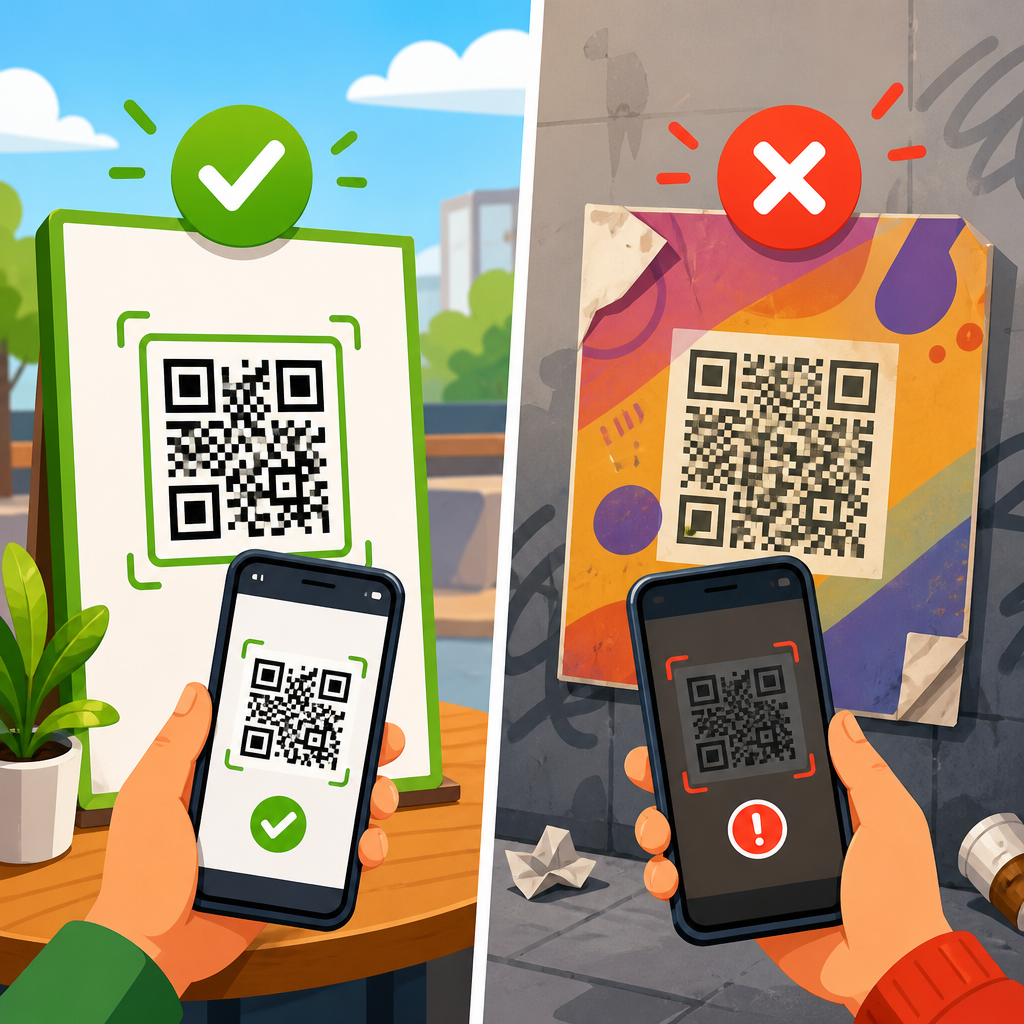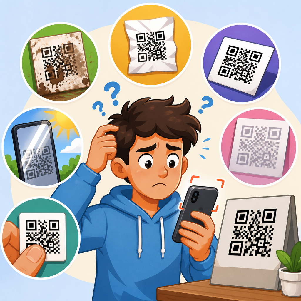
QR code contrast problems are one of the most common reasons a code scans inconsistently, fails under store lighting, or works on one phone but not another. In practical terms, contrast is the visual difference between the dark modules and the lighter background that lets a camera separate data from noise. When that difference is too small, the scanner cannot reliably detect the finder patterns, timing patterns, quiet zone, or the individual squares that encode the message. I have seen otherwise well-designed campaigns fail because a brand chose pale gray on white, glossy black on dark blue, or a transparent overlay on a busy photo. Fixing QR code contrast problems matters because readability affects conversion, support costs, and trust: if users cannot scan a code quickly, they abandon it. This hub explains how to diagnose low-contrast QR codes, how to repair them without breaking branding, and which tests prevent repeat failures across print, packaging, signage, labels, menus, and screens.
What QR code contrast means and why scanners fail
A QR code is read by software that first locates three large finder patterns in the corners, then estimates orientation, module size, perspective, and error correction. For that process to work, the code needs strong luminance contrast, not just color contrast that looks attractive to the human eye. A common mistake is assuming blue on red or green on orange is acceptable because the colors differ. Many smartphone cameras and scanner libraries effectively reduce the image to grayscale during detection, so what matters most is the brightness gap between foreground and background. Dark modules on a light background remain the most reliable arrangement. Light modules on a dark background can work in some apps, but failure rates rise because some decoders still expect the standard polarity.
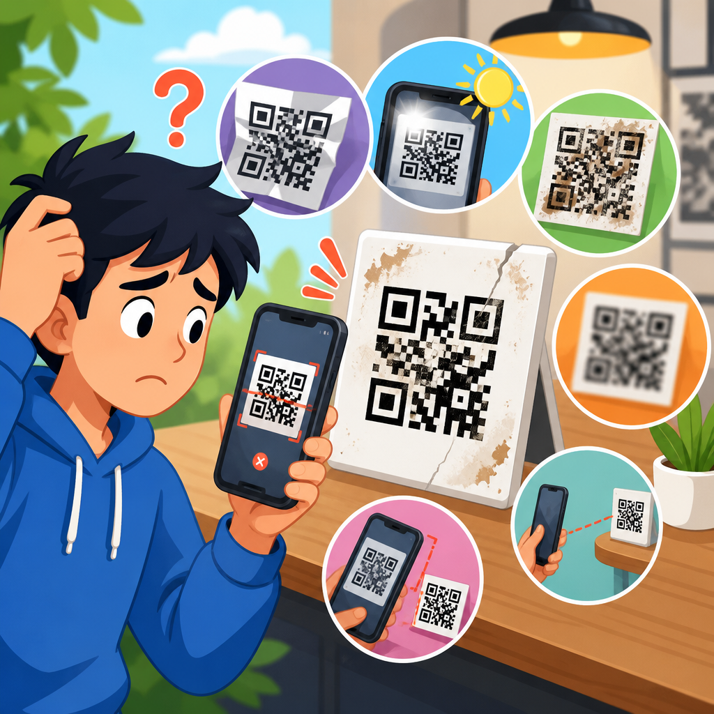
Low contrast often appears in specific situations: backlit restaurant displays, direct sun on retail windows, thermal labels printed with low ribbon density, metallic packaging, and business cards with matte black designs. The code may scan close up, then fail at normal distance because the camera loses edge definition. It may also fail when compressed for social media, where subtle tonal differences get flattened. In my testing, the fastest diagnosis is simple: convert the artwork to grayscale and zoom to 300 percent. If the modules do not clearly stand apart from the background, the scanner is guessing rather than reading. Contrast issues also combine with other faults, including insufficient quiet zone, over-stylized eyes, excessive logo coverage, and undersized modules, which is why this article serves as the hub for fixing broken QR codes broadly.
How to diagnose a broken QR code before redesigning it
Start with the most reliable question: does the code fail because of contrast, or because contrast is exposing another defect? I troubleshoot by checking five elements in order. First, test the live destination URL to rule out a landing-page error or expired redirect. Second, inspect the quiet zone; a QR code needs clear space around the symbol, ideally four modules wide. Third, review print sharpness and minimum size; tiny modules blur first. Fourth, inspect whether artwork has altered finder patterns or timing lines. Fifth, measure contrast under the actual viewing conditions, not just on a designer’s monitor. Codes often pass on a bright laptop screen and fail after offset printing, lamination, or placement on corrugated packaging.
Use more than one scanner when testing. iPhone Camera, Google Lens, Zebra DataWedge on enterprise devices, and common retail apps do not all behave the same way. If one decodes instantly and another struggles, you are already near the edge of acceptable contrast. Professional checks can go further. ISO/IEC 15415 defines print quality parameters for two-dimensional symbols, including symbol contrast, modulation, reflectance margin, axial non-uniformity, and fixed pattern damage. A verifier from Axicon, REA, or Cognex can grade these properties objectively. For many teams, that level of hardware is unnecessary, but understanding the standard helps. If a code is customer-facing and high volume, objective grading is worth the cost because “it scanned on my phone” is not quality assurance. Document each failure mode with photos at distance, angle, and lighting so you can separate contrast problems from size, glare, and damage.
The most effective fixes for QR code contrast problems
The safest fix is straightforward: use near-black modules on a white or very light matte background. In production, I recommend black at 100 percent on white, or a brand color with a luminance value close to black, then test a reversed version only if absolutely necessary. If the brand palette requires color, choose combinations with strong lightness separation, not merely different hues. Navy on white usually works; medium gray on pastel beige often does not. Avoid gradients inside the data area because they create uneven module visibility. If a gradient must appear, keep it outside the quiet zone and outside the symbol itself.
Background control matters as much as foreground color. Transparent QR codes placed over photos, wood grain, marble, fabric, or video are frequent failures. The fix is to place the code inside a solid patch or “knockout box” that restores a uniform background and protected quiet zone. On packaging, avoid reflective foils, spot UV, and high-gloss varnish across the symbol because glare lowers effective contrast even when the printed colors are technically different. On screens, increase contrast further than you would in print because brightness, fingerprints, and auto-exposure can wash out edges. If you inherit a stylized code with a central logo, reduce logo size before changing error correction blindly. Error correction can recover missing modules, but it cannot compensate for globally poor contrast that prevents initial detection.
| Problem | Typical cause | Best fix |
|---|---|---|
| Gray code on white fails in low light | Insufficient luminance difference | Change modules to black or much darker brand color |
| Code over photo scans only at one angle | Busy background and lost quiet zone | Add solid light background with four-module clear margin |
| Metallic package code fails under store lights | Glare reducing edge detection | Use matte patch, avoid foil and spot UV on symbol area |
| White code on dark poster scans inconsistently | Reversed polarity and low app compatibility | Return to dark-on-light version or test across multiple devices |
| Branded gradient code works on screen, not in print | Tonal compression and soft edges after printing | Replace gradient with solid fill and increase module size |
Design rules that prevent contrast issues from returning
Good QR code design starts before color choices. Generate the code at the shortest practical data length, preferably using a short URL or dynamic QR platform, because lower data density creates larger modules that tolerate real-world scanning conditions better. Choose an error correction level appropriate to the design: M is adequate for many uses, while Q or H helps when logos or minor abrasion are expected. Then preserve the core geometry. Do not reshape the finder patterns beyond recognition, remove alignment patterns on larger versions, or crowd the quiet zone with text, borders, or decorative frames. These changes reduce the scanner’s ability to lock onto the symbol, and low contrast makes the damage more severe.
Printing method also changes what “good contrast” looks like. Thermal transfer labels may require higher darkness settings or ribbon changes; inkjet on absorbent stock can feather edges; flexographic printing can spread ink and close small gaps; digital presses may reproduce dark brand colors inconsistently on uncoated materials. When I prepare files for print, I ask for the actual substrate and finishing details because a code that passes on coated proof stock may fail on kraft paper or clear film. For screen use, export the symbol as SVG when possible to keep edges crisp at any size. For raster formats, PNG is generally safer than JPEG because JPEG compression introduces artifacts around hard module boundaries. A reliable QR code is not just a graphic; it is a machine-readable symbol that needs production discipline.
How contrast interacts with size, distance, and lighting
Many teams misdiagnose contrast because the visible failure appears only at a certain distance. In reality, contrast, physical size, and camera resolution are linked. A low-contrast code may still scan when the phone is very close, where each module occupies enough pixels for the decoder to infer the pattern. Step back to a normal scanning distance and each module becomes smaller, blur increases, and the tonal gap is no longer sufficient. A common field rule is that the scanning distance is roughly ten times the code width, though device quality and content density change that. For a poster meant to scan from two meters away, a tiny code with marginal contrast is almost guaranteed to fail.
Lighting adds another layer. Direct reflections can erase dark modules; dim interiors increase image noise; mixed color temperature affects auto white balance; outdoor sunlight introduces harsh highlights and shadows. That is why contrast should be evaluated in context. I test restaurant table tents under warm interior bulbs, warehouse labels under LED high bays, and event signage outdoors at noon and dusk. If the code must work on screens, test with brightness reduced, night mode enabled, and cracked-screen protectors in mind. Also remember accessibility: older users or users with lower-end cameras benefit from stronger contrast and larger codes even when a flagship phone can cope with less. Designing to the minimum possible threshold is rarely worth the risk.
Fixing broken QR codes in print, packaging, and digital campaigns
For print collateral such as flyers, menus, and business cards, the repair path is usually simple: regenerate the code in vector format, place it on a white box, enlarge it modestly, and print a proof on the final stock. Check for ink gain, especially on uncoated paper. On product packaging, repairs are more constrained because legal copy, dielines, and branding compete for space. In those cases, create a dedicated scan zone away from seams, folds, and curves. Never place a code across a bottle shoulder, gusseted pouch crease, or carton edge where distortion changes module shape. If the package uses dark branding, keep the code in a light label panel rather than forcing a reversed design.
Digital campaigns introduce different failure points. Social platforms may compress uploaded images, website themes may resize or lazy-load assets, and video overlays may blur a code during motion. For landing pages and emails, export at sufficient pixel dimensions, preserve a generous quiet zone, and avoid animated effects crossing the symbol. On in-store screens or self-service kiosks, contrast must survive fingerprint smudges, brightness throttling, and off-axis viewing. If a code is already distributed and cannot be reprinted, consider adding a short fallback URL nearby. That does not solve the symbol problem, but it saves the user journey while you correct the next run. As the hub for fixing broken QR codes, the core principle is consistent: diagnose the actual cause, then repair contrast alongside surrounding factors instead of treating color as an isolated choice.
Testing workflow, tools, and quality checks
A dependable workflow prevents last-minute surprises. Generate the QR code using a reputable tool, such as QRCode Monkey, Bitly, Beaconstac, Flowcode, or a library like ZXing if you build internally. Export the master as SVG or high-resolution PNG. Place it into the final design and test from the artboard first, then from a printed proof or target device. Use at least three phones across iOS and Android, plus the native camera app and one alternative scanner. Test at expected distance, under expected lighting, and after any finishing process such as lamination or varnish. If scan time exceeds about one second consistently, do not assume it is acceptable just because it eventually decodes. Friction at the first interaction reduces response rates.
For organizations with scale, create a QR checklist. It should include destination verification, dynamic redirect confirmation, contrast review in grayscale, quiet-zone measurement, minimum physical size, print substrate note, glare check, and multi-device scan test. If the code carries critical functions such as payment, authentication, boarding, or medical information, add formal symbol verification against ISO/IEC 15415 and retain the grade in production records. Train designers and marketers to treat QR codes as operational assets, not decorative flourishes. The payoff is immediate: fewer broken scans, fewer support tickets, better campaign attribution, and a smoother path from offline attention to digital action. Review your existing QR codes this week, fix weak contrast first, and standardize the testing process before the next launch.
Frequently Asked Questions
What causes QR code contrast problems in the first place?
QR code contrast problems usually happen when there is not enough visual separation between the dark modules and the lighter background. A scanner does not read a QR code the way a person does. It looks for strong differences in light and dark so it can identify the finder patterns in the corners, the timing patterns, the quiet zone around the symbol, and the individual data modules. When those elements start blending together, the camera has a much harder time isolating the code from the surrounding surface.
In real-world use, poor contrast is often caused by design choices, printing issues, or environmental conditions. Common examples include dark gray on black, pastel colors on white, metallic inks, glossy finishes that create glare, gradients, textured backgrounds, transparent overlays, and photos placed behind the code. Even a code that looks stylish on a screen may fail when printed on packaging, labels, posters, or menus because ambient light changes how the colors appear. Store lighting, sunlight, reflections, shadows, and curved surfaces can all reduce the effective contrast seen by the camera.
Another important factor is device variability. One phone may scan a low-contrast code because it has a better camera sensor, more aggressive image processing, or a stronger QR reader app. Another phone may fail under the same conditions. That is why a code that “works on my phone” is not a reliable standard. The real goal is not just occasional readability, but consistent scanning across different devices, lighting conditions, and print runs.
How can I tell if my QR code does not have enough contrast?
The most obvious sign is inconsistent scanning. If the code works at one angle but not another, scans indoors but not under retail lighting, or reads on one phone and fails on another, contrast is a likely issue. You may also notice that users need to move farther away, get unusually close, tilt the phone, or try multiple times before the scan succeeds. Those are all practical symptoms of weak visual separation within the code.
Visually, low-contrast QR codes often use color combinations that look subtle, branded, or elegant but are difficult for cameras to interpret. Examples include navy on black, gold on cream, light gray on white, red on orange, or dark modules placed over busy artwork. If the background is not clean and light, or if the dark modules are not truly dark relative to that background, readability drops fast. The quiet zone is another area to inspect. Even if the main code appears readable, a compromised border around it can make scanners struggle to identify where the symbol begins and ends.
A practical way to test contrast is to scan under several conditions: bright daylight, low indoor light, overhead retail lighting, and with at least a few different phones. Print a physical sample if the final use is print, because on-screen appearance can be misleading. If performance changes noticeably from one environment to another, the contrast is probably too close to the minimum. In general, if you are asking whether the contrast is sufficient, it is usually wise to increase it before publishing or printing at scale.
What are the best colors and design choices for fixing QR code contrast problems?
The safest approach is simple: use very dark modules on a very light, solid background. Black on white remains the most reliable standard because it gives scanners the strongest possible separation. If you want to use brand colors, choose combinations that preserve that same logic. Deep navy, dark green, or dark brown can work well on white or very pale backgrounds, while light backgrounds should stay clean, flat, and free of patterns. The key is not the specific brand color but the brightness difference between the foreground and background.
Avoid gradients, transparency, metallic finishes, neon combinations, low-opacity overlays, and image-filled modules. These effects may look attractive in a mockup but often collapse under real lighting. Glossy materials can also introduce reflections that effectively reduce contrast even when the printed colors seem acceptable. Matte finishes and non-reflective surfaces usually perform better. If you place the QR code on packaging or signage, give it a plain area around the symbol so the code does not compete with surrounding text, borders, or photography.
Preserve the technical structure as well. Keep the quiet zone intact, avoid shrinking the code too much, and do not distort the shape of the modules or finder patterns beyond what your generator or testing process can safely support. If you are customizing a code with logos or brand styling, use a high error correction level carefully, but do not treat error correction as a substitute for contrast. Error correction can help with minor damage or obstruction, but if the scanner cannot clearly separate dark from light, the code may still fail before error correction even has a chance to help.
Can lighting, printing, and materials make a high-contrast QR code fail anyway?
Yes, absolutely. A QR code can be technically well designed and still underperform because of how it is produced or displayed. Lighting is one of the biggest variables. Harsh overhead lights, retail spotlights, direct sun, and reflective surfaces can wash out the background or create glare across the dark modules. That reduces the contrast the camera actually sees, even if the original file has excellent black-and-white values. This is why a code that scans perfectly on a computer screen may fail once printed and mounted in a store or on product packaging.
Printing introduces its own risks. Ink spread can soften module edges, cheap printers can reduce sharpness, and certain substrates can shift color unexpectedly. A light background may print darker than intended, or a dark foreground may come out weaker, especially on textured, colored, or absorbent materials. Transparent labels, foil packaging, and curved containers can also distort the code visually. In many cases, the issue is not only color contrast but also edge clarity, glare, and background interference working together.
The best fix is to test the actual production version, not just the digital artwork. Print a sample at the final size, on the final material, with the final finish, and place it in the real environment where users will scan it. Then test from normal scanning distances using multiple phones. If there is any doubt, increase contrast further, use a matte finish, simplify the background, and consider making the code slightly larger. Reliability in context matters much more than how polished the code looked in the design phase.
What is the fastest way to fix a QR code that scans inconsistently?
The fastest and most dependable fix is to rebuild the code using a dark foreground and a plain white or very light background, then retest it immediately. If the current code includes gradients, colored backgrounds, transparency, embedded textures, or artwork behind the modules, remove those elements first. Next, confirm that the quiet zone is clear on all sides and that the code is large enough for the intended scanning distance. In many cases, these simple changes solve the problem without requiring any deeper troubleshooting.
After that, check the output format and production method. Use a sharp source file, preferably vector when possible for print, and avoid resizing the code in ways that could blur the edges. If the code appears on a glossy sign, laminated menu, product wrapper, or reflective label, test a matte version. If it is printed very small, enlarge it. If a logo covers too much of the center or the module styling is heavily customized, simplify the design. The goal is to remove anything that makes the scanner work harder than necessary.
Finally, validate the fix with realistic testing. Scan the code using different devices, both newer and older phones, under different lighting conditions, and from the expected user distance. A successful repair is not just “it scanned once.” A successful repair means the code scans quickly, repeatedly, and without users having to hunt for the right angle. That level of consistency is the standard you want before publishing, printing, or deploying the QR code at scale.