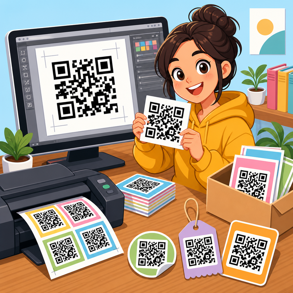
QR code design examples reveal a simple truth: most scanning problems are design problems, not technology problems. A QR code can be technically valid and still fail in the real world because contrast is weak, the quiet zone is crowded, the code is undersized, or branding overwhelms the data pattern. In this hub article, “Before and After QR Code Design Improvements,” I will show how effective QR code design changes performance, readability, and trust, using practical examples drawn from campaigns, packaging, signage, menus, and print assets. This matters because QR codes now sit at the intersection of offline and digital marketing. They connect packaging to product education, posters to event registration, business cards to contact capture, and retail displays to mobile checkout. A good design raises scan rate, reduces user hesitation, and supports brand consistency without breaking technical rules.
For clarity, a QR code is a two-dimensional barcode that stores data such as a URL, vCard, Wi-Fi credential, PDF, or payment payload. “Before” design refers to the common weak execution: tiny code, low contrast, no call to action, poor placement, or decorative changes that reduce scanning reliability. “After” design means the same destination and campaign goal, but with improved structure: correct sizing, strong contrast, adequate margin, tested error correction, and messaging that tells people what happens after the scan. In my work reviewing QR code assets for print shops, restaurant groups, and SaaS landing pages, the biggest gains rarely come from changing the link. They come from design improvements that remove friction. This article serves as the hub for QR code design examples across the broader QR Code Resources, Templates & Tools topic, so it covers the core principles, common failure patterns, and upgrade frameworks you can apply before you publish another code.
What Changes Between a Bad QR Code and a Good One
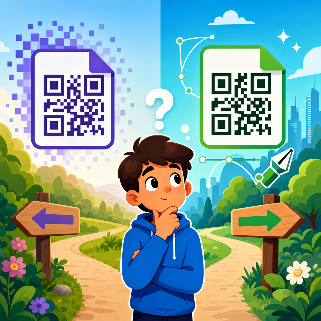
The difference between weak and strong QR code design is usually visible in five seconds. Bad examples tend to look like afterthoughts pasted into layouts at the end of production. Good examples are planned as conversion elements. They have space around them, a clear prompt, and enough size for the expected scan distance. The underlying standard matters here: ISO/IEC 18004 defines QR code structure, while real-world readability is influenced by camera quality, glare, print conditions, and user behavior. A QR code on glossy packaging under supermarket lighting behaves differently from one on matte card stock or a phone screen.
In practical reviews, I assess four layers. First is technical integrity: data length, error correction level, module clarity, and export quality. Second is visual execution: contrast, quiet zone, logo treatment, and shape customization. Third is placement context: height, angle, lighting, and surrounding elements. Fourth is user intent: whether the call to action explains the benefit, such as “Scan for assembly video” or “Scan to see ingredients.” The “after” version is not merely prettier. It is easier to notice, easier to trust, and easier to scan in the conditions where it will actually be used.
Before and After QR Code Design Improvements by Use Case
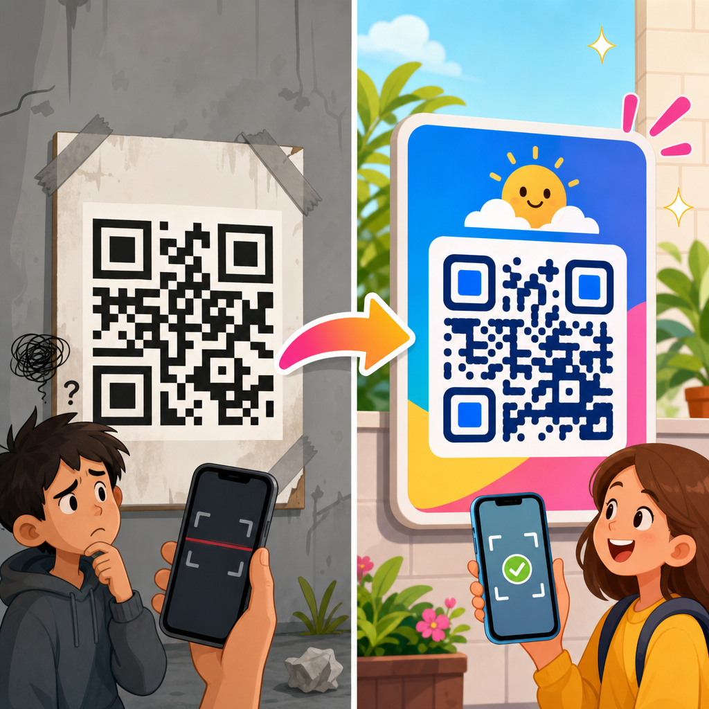
The fastest way to understand QR code design examples is to compare weak and improved versions by scenario. On restaurant menus, the “before” version is often a tiny code in the bottom corner with no label beyond “Scan me.” Diners ignore it because they do not know whether it opens a menu, a payment page, or a loyalty form. The “after” version is larger, placed near the table edge or menu header, and labeled “Scan to view today’s menu and allergens.” The design tells the user exactly why to act. Scan rate rises because uncertainty falls.
On product packaging, a common “before” example is a dark code printed over a textured photo background. It may pass on a high-end phone in studio lighting but fail on older devices in stores. The improved version uses a solid light background, maintains a clean quiet zone, and adds a short line such as “Scan for setup instructions and warranty.” That short line changes the economics of the code. Instead of acting as a generic digital ornament, it becomes a support gateway that can reduce returns and customer service volume. I have seen onboarding scans improve simply by moving the code from the side panel crease to a flat rear panel with better contrast.
Event posters show another pattern. The “before” design puts the code at the bottom in a dense block of sponsor logos, often below knee height on public boards. The “after” design positions the code at natural eye level, pairs it with event date and registration prompt, and scales it for several feet of scanning distance. Realistically, people scan posters quickly while walking. If they need to stop, crouch, and frame a tiny code, many will not bother. Good poster QR design treats scanning as a mobile-first conversion path, not an accessory.
| Use Case | Typical Before Problem | After Improvement | Expected Result |
|---|---|---|---|
| Restaurant Menu | Tiny code labeled “Scan me” | Clear CTA, larger size, menu-specific value | More scans and fewer questions |
| Product Packaging | Busy background and weak contrast | Solid background, margin, support-focused CTA | Better readability and post-purchase use |
| Event Poster | Low placement among clutter | Eye-level placement, distance-appropriate size | Faster registration scans |
| Business Card | Over-customized code with tiny modules | Simple branded code linking to contact card | Higher save rate and fewer failed scans |
Design Variables That Most Affect Scan Performance
Several design variables consistently determine whether a QR code works. Contrast is first. Dark foreground on a light background remains the most dependable pattern because smartphone cameras and decoding software detect edge transitions best under strong luminance difference. Reversed codes, such as white modules on black, can work, but they are less forgiving in low light and on low-end cameras. Gradient fills may look modern, yet they often introduce weak areas that reduce decode confidence. If branding requires color, preserve strong contrast and test across devices.
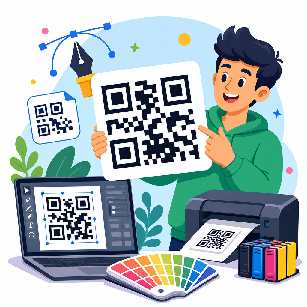
Quiet zone is second. Every QR code needs empty space around the symbol so scanners can identify its boundaries. Designers frequently violate this rule by placing text, borders, illustrations, or crop marks too close. Third is size relative to scan distance. A practical field rule is that larger viewing distance demands larger code size; small postcard codes might work in hand, while storefront window codes need to be significantly larger. Fourth is print quality. Raster exports can blur module edges, especially after scaling in layout tools. Vector formats such as SVG, EPS, or PDF preserve shape fidelity and should be standard for print production.
Error correction is another area that gets misused. QR codes support levels L, M, Q, and H, allowing some damage or obstruction while still decoding. Many branded codes add a center logo and switch to high error correction, which is appropriate up to a point. The problem appears when customization also rounds modules aggressively, changes finder patterns, or removes too much data area. Then the code becomes fragile even with H level. In practice, I recommend treating error correction as backup, not permission to decorate recklessly. Tools such as QR Code Generator, Beaconstac, QR TIGER, Adobe Illustrator, and mobile camera testing help validate design decisions before launch.
Branding Without Breaking the Code
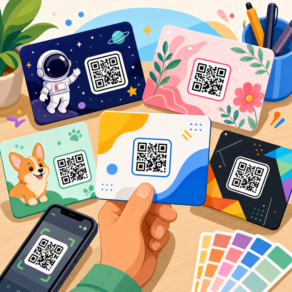
One of the most useful QR code design examples is the branded code that still scans instantly. Many teams assume they must choose between plain black-and-white utility and fully customized art. That is a false choice. Strong branding usually comes from restrained changes: using brand colors with sufficient contrast, adding a small centered logo, matching surrounding typography, and integrating the code into a consistent card or label design. The code itself should remain structurally conservative. The surrounding frame can carry much of the brand expression.
Consider a cosmetics package. The weak version uses pastel modules over a reflective foil box with a floral illustration behind the code because the marketing team wants visual cohesion. The improved version places the code inside a cream panel with a subtle border, keeps the modules deep plum for contrast, and adds “Scan for shade guide and tutorials.” The package still feels on-brand, but now the code reads clearly under retail lighting. Similar upgrades work on real estate signs, museum labels, direct mail, and trade show graphics. Branding succeeds when it supports recognition and trust, not when it compromises readability. If you want heavier customization, test on multiple phones, under multiple lighting conditions, and at the actual production size, not only on a desktop monitor.
Placement, Context, and User Intent
A QR code does not exist in isolation. Placement and context shape whether people notice it, trust it, and complete the scan. For example, on a tabletop tent in a café, a code placed beside “Join Wi-Fi” will receive different behavior than one placed beside “See seasonal specials.” On shipping boxes, a code near the opening flap may be damaged during unboxing, while one on an insert card survives and can guide the next action. These are design decisions with operational consequences.
User intent should drive copy, placement, and destination. If the goal is payment, speed matters and the code should be easy to access at the moment of checkout. If the goal is education, the code belongs near product instructions or FAQs. If the goal is lead capture, expectations must be explicit: “Scan for instant quote” performs better than “Learn more” because it clarifies value. In field audits, I often find that the code itself works, yet the campaign underperforms because users do not understand why they should scan. The “after” version solves that with precise language, supportive visual hierarchy, and a landing page that matches the promise printed next to the code.
Testing Methods and Common Mistakes to Avoid
The most reliable QR code design improvements come from testing before production. Test with both iPhone and Android cameras, because decoding behavior and autofocus performance vary. Test under bright light, dim light, and glare. Test at intended distance. Test after exporting from the final layout file, not only from the QR platform preview. If the asset will be printed, test a physical proof on the actual material. Matte paper, corrugated cardboard, acrylic signage, and laminated menus all affect readability differently.
Common mistakes repeat across industries. Designers shrink codes to preserve white space, then lose function. Marketers send scans to non-mobile pages with slow load times. Teams use dynamic codes without governance, so links later break after campaign ownership changes. Another mistake is ignoring analytics context. A low scan rate may indicate poor placement, but it may also indicate weak offer clarity or an audience that lacks enough motivation. Scan success should be measured with downstream metrics such as landing page engagement, form completion, coupon redemption, contact saves, or video watch rate. The best QR code design examples pair visual optimization with conversion tracking, usually through UTM parameters, campaign naming standards, and dashboards in GA4 or platform analytics. Design is only half the story; destination quality and measurement complete the loop.
Before publishing your next QR asset, audit it like a conversion tool. Check contrast, quiet zone, size, placement, CTA, destination, and proof testing. The strongest before-and-after improvements are usually simple: bigger code, cleaner background, clearer promise, better location, and a landing page that fulfills intent. That is why QR code design examples matter so much within QR Code Resources, Templates & Tools. They turn abstract guidelines into repeatable decisions you can apply to menus, packaging, print, signage, cards, and campaigns. Start with one high-traffic QR code, redesign it using the principles in this hub, test it in real conditions, and use the results to shape the rest of your library.
Frequently Asked Questions
1. Why do some QR codes fail to scan even when they are technically valid?
A QR code can be technically correct and still perform poorly in real-world conditions because successful scanning depends on more than data encoding alone. In practice, many failures come from design choices that make the symbol harder for phone cameras and scanning apps to interpret quickly. Weak contrast is one of the most common issues. If the code does not stand out clearly from its background, the camera may struggle to distinguish the modules, especially in low light, glare, or at an angle. Another major problem is an insufficient quiet zone, which is the clear margin around the code. When text, borders, patterns, or images crowd that area, scanners can have trouble identifying where the code begins and ends.
Size also matters more than many people expect. A code that looks fine on a desktop screen may become difficult to scan when printed too small on packaging, posters, menus, mailers, or labels. Distance plays a role as well, so a code intended for a storefront window or event banner must be much larger than one intended for a tabletop sign. Branding is another frequent source of scanning trouble. Adding logos, changing shapes excessively, using decorative colors, or placing the code over textured backgrounds can all reduce readability if not handled carefully. In short, the problem is often not that the QR code is broken, but that the design works against the scanner. That is why before-and-after improvements often lead to dramatic gains in scan success, speed, and user confidence.
2. What are the most important design improvements that usually make a QR code scan better?
The most effective improvements are usually the simplest ones: stronger contrast, more breathing room, better sizing, and cleaner branding integration. High contrast should always be a priority. In most cases, a dark code on a light background remains the most reliable option because it gives scanners the clearest possible separation between the pattern and the surface behind it. Designers sometimes try to use fashionable color combinations that look attractive in a mockup but reduce usability in the field. A “before” version may use mid-tone colors or gradients, while the “after” version replaces them with a clear, high-contrast palette that scans much faster.
Expanding the quiet zone is another high-impact improvement. The QR code needs empty space around all four sides so a scanner can isolate it easily. Removing clutter, decorative frames, or nearby text from this area can immediately improve performance. Resizing the code is equally important. If the code is too small for the viewing distance, increasing its dimensions often solves scan friction right away. In many before-and-after examples, simply enlarging the code and repositioning it in a more visible area significantly boosts interaction.
Branding should support the code, not overpower it. A well-designed “after” version often keeps the brand colors and logo but applies them with restraint, preserving the integrity of the data pattern. Additional helpful improvements include placing the code on a flat, non-reflective background, avoiding distortion, ensuring print clarity, and pairing the code with a clear call to action so people know what they will get by scanning. Together, these improvements make the code easier to detect, easier to trust, and easier to use.
3. How much does the quiet zone really matter in QR code design?
The quiet zone matters a great deal because it is one of the foundational elements that allows scanners to recognize the QR code as a distinct machine-readable object. The quiet zone is the empty margin surrounding the code, free from text, graphics, borders, and other visual interruptions. To a human viewer, a crowded design might still look acceptable, but scanning software relies on clean boundaries to identify the code quickly and accurately. When this clear space is compromised, the scanner may struggle to locate the code or may take longer to interpret it, especially in busy real-world settings.
In many poor-performing examples, the quiet zone gets squeezed by nearby headlines, decorative shapes, product imagery, or brand elements added too close to the edges. Sometimes the code is placed inside a colored badge or over a patterned background that effectively erases the clean margin. The result is a code that appears stylish but behaves unpredictably. After design improvements, restoring proper spacing often produces a noticeable difference in scan speed and consistency without changing the encoded data at all.
This is one reason QR code redesigns can be so effective: they solve practical usability barriers that are invisible if you only check whether the code “works” in ideal conditions. A properly preserved quiet zone helps the code scan faster across different devices, camera qualities, and lighting situations. It also reduces frustration for users who may give up after one failed attempt. For campaigns, packaging, retail displays, and printed materials, protecting the quiet zone is one of the easiest and most valuable changes a designer can make.
4. Can a branded or customized QR code still be reliable?
Yes, a branded or customized QR code can absolutely be reliable, but only if customization is approached with discipline. The key is understanding that a QR code is not just a graphic element; it is a functional pattern that must remain readable under many different conditions. Brand colors, embedded logos, rounded modules, custom frames, and other visual enhancements can work well when they are applied within scannability limits. Problems arise when aesthetics take priority over performance. For example, using low-contrast color combinations, inserting an oversized logo, or stylizing the module pattern too heavily can make the code harder to read even if it still scans in a controlled test.
The best branded QR code designs preserve the essential structure of the code while adding identity in ways that do not interfere with detection. A common improvement in before-and-after examples is reducing the size of the center logo, simplifying decorative elements, or switching to a more readable color palette. Another strong approach is to keep the QR code itself clean and use branding around it instead of inside every part of it. Supporting graphics, surrounding layout, and nearby copy can reinforce brand recognition without sacrificing scan performance.
Testing is what separates a successful customized code from a risky one. A branded QR code should be tested across different phones, screen qualities, lighting conditions, print sizes, and viewing angles. If the code is meant for physical environments, it should also be tested in the exact materials and finishes being used, such as glossy packaging, outdoor signage, or textured labels. When customization is balanced with technical best practices, a QR code can be both visually on-brand and highly dependable.
5. What should marketers, designers, and business owners look for in before-and-after QR code examples?
They should look beyond appearance and focus on what changed in terms of usability, clarity, and conversion potential. A strong before-and-after example does more than show that one code looks better than another. It reveals why the improved version performs better in real conditions. Start by examining contrast. Is the “after” version easier to distinguish at a glance? Then check spacing. Does the updated code have a protected quiet zone and less visual clutter around it? Size and placement are also critical. Is the revised code easier to notice and large enough for the intended scanning distance?
It is also useful to study how branding was handled. In effective examples, the improved version usually keeps visual identity while respecting the code’s functional needs. You may notice a smaller logo, simpler color treatment, a cleaner background, or fewer decorative interruptions. Another important area is user guidance. Many high-performing QR codes are paired with a strong call to action that explains what happens after the scan, such as “View the menu,” “See before-and-after results,” or “Claim your offer.” This increases trust and gives users a reason to engage.
Finally, the most valuable examples connect design changes to measurable outcomes. Better scanning speed, fewer failed attempts, higher engagement, improved campaign response, and stronger user confidence are all signs that the redesign worked. That is the real lesson behind before-and-after QR code design improvements: the goal is not just to make the code prettier, but to remove friction between the audience and the action you want them to take.