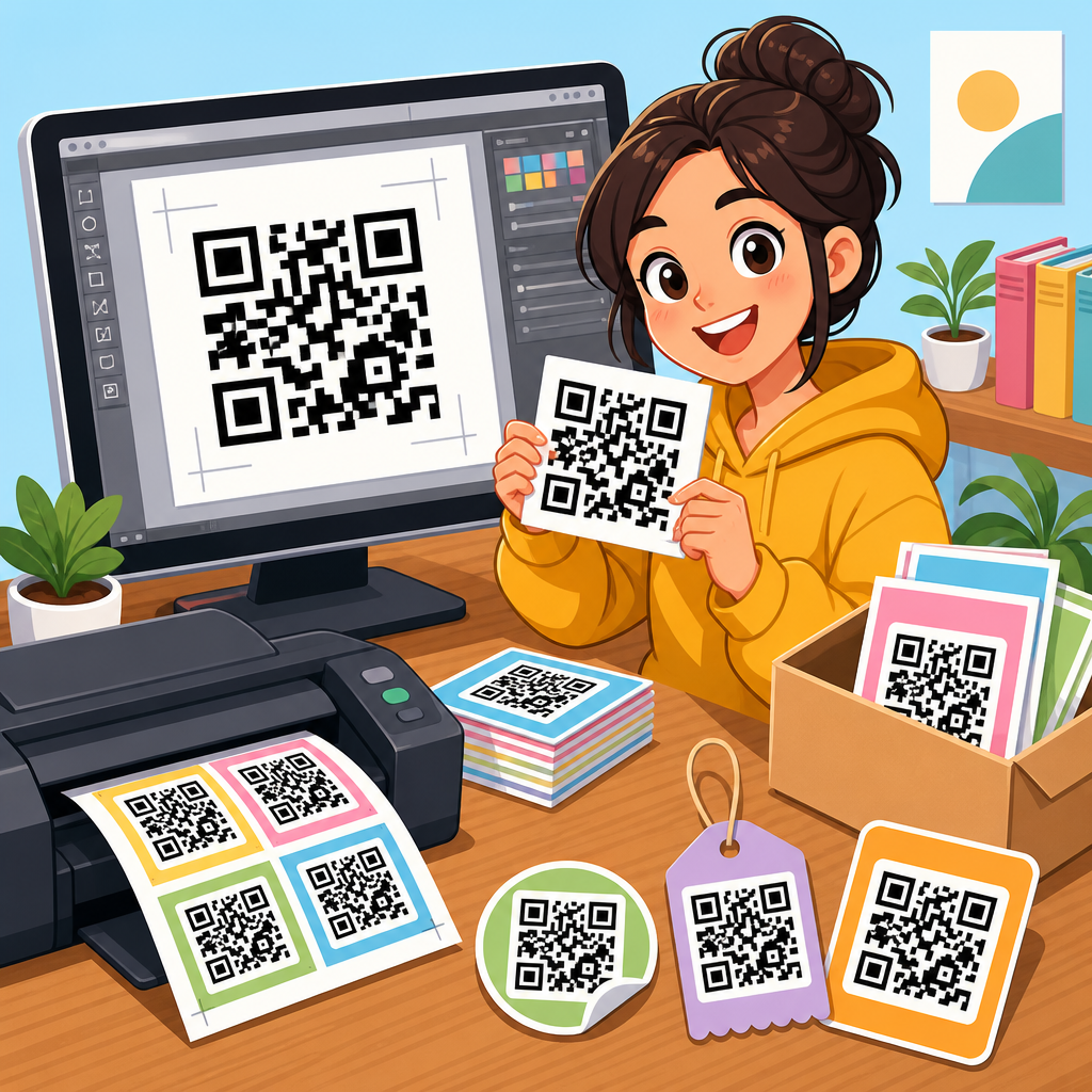
A strong QR code design checklist prevents the most common failure in physical-to-digital marketing: a code that scans poorly, looks off-brand, or sends people to the wrong experience. In practice, QR code design is not just about generating a square pattern and placing it on a flyer. It combines encoding choices, contrast, error correction, print production, mobile usability, analytics, and compliance. I have seen campaigns fail because a designer inverted colors without testing, shrank the code below a reliable scan size, or linked to a desktop page that loaded slowly on mobile. A checklist turns those avoidable mistakes into repeatable quality control.
For this hub, QR code checklists refers to structured review lists used before publishing, printing, or deploying a QR code in any channel. That includes packaging, posters, menus, direct mail, business cards, retail displays, event badges, email signatures, and digital screens. The goal is consistency: every code should be readable, purposeful, trackable, and aligned with the user journey. Key terms matter here. Quiet zone means the blank margin around the code. Error correction refers to the built-in redundancy levels, commonly L, M, Q, and H, that help recovery when part of the code is obscured. Dynamic QR codes use a short redirect URL so the destination can be updated later, while static QR codes store the destination directly and cannot be edited after creation.
This topic matters because QR adoption is now operational, not experimental. Restaurants, retailers, logistics teams, healthcare providers, and B2B marketers all rely on codes that must work under imperfect real-world conditions: glare, curved surfaces, low light, cracked phone screens, weak cellular connections, and rushed users standing several feet away. A complete QR code design checklist protects campaign performance and brand reputation at the same time. It also creates internal linking opportunities across a broader QR code resource center, from sizing guides and testing protocols to dynamic code tools and print templates. If your team needs one reliable framework for QR code checklists, this page is the hub.
What a QR code design checklist must cover
A comprehensive QR code design checklist should answer five practical questions before launch. First, is the code technically scannable? Second, is the visual treatment still compliant with scanner requirements? Third, does the landing experience match user intent? Fourth, is performance measurable? Fifth, does the production environment introduce risk? If a checklist misses any of those areas, it leaves room for avoidable failure.
Start with the encoded content. The destination should be final, secure, and mobile-ready. For most campaigns, that means using HTTPS, minimizing redirects, and avoiding destinations that trigger intrusive pop-ups or require awkward app installs. I generally recommend dynamic QR codes for campaigns expected to evolve, because they preserve the printed asset while allowing destination updates, A/B tests, and scan analytics. Static codes are appropriate when permanence matters more than flexibility, such as embedding a plain text string, Wi-Fi credential, or canonical URL that will not change.
Next comes symbol design. A QR code can be branded, but not at the expense of readability. Many generators let users add logos, rounded modules, custom colors, or decorative frames. Those features are useful only when supported by testing. The checklist should verify contrast, quiet zone, error correction level, output format, and final size in context. A code that scans on a designer’s phone at arm’s length may still fail on older Android cameras, under dim retail lighting, or when printed on textured stock.
Finally, the checklist must extend beyond the code itself. The call to action should tell users what they get by scanning, not merely say “Scan me.” The placement should match normal viewing behavior. The page should load fast and respect privacy expectations. Measurement should be configured before distribution, using UTM parameters, analytics dashboards, and if needed, event attribution by location or medium. In short, QR code checklists are not isolated design artifacts. They are deployment systems.
Scannability standards: size, contrast, quiet zone, and correction
The most important section in any QR code design checklist is scannability. A QR code exists to be scanned, so aesthetics are always secondary to read reliability. Four variables drive results most consistently: physical size, color contrast, quiet zone, and error correction.
Size should match scanning distance. A widely used rule of thumb is a 10:1 ratio, meaning for every ten units of viewing distance, use one unit of code size. A one-inch code is usually comfortable from about ten inches away, while a poster viewed from five feet may need a code around six inches tall. This is not a formal ISO shortcut, but it is practical in field use. Dense codes that encode longer URLs or vCards require larger print dimensions because their modules become smaller. If your generator increases data density, the checklist should trigger a size review.
Contrast must remain high. Dark modules on a light background are the safest option, and black on white remains the benchmark. Light gray on white, yellow on cream, or reflective metallic ink often reduces scan reliability. Inverted schemes, such as white modules on black, may work with some scanners but fail inconsistently, especially when screens add glare or prints lose edge clarity. A checklist should require contrast validation in real conditions, not just on a monitor.
The quiet zone is frequently ignored. Every QR code needs clear empty space around all four sides so the scanner can isolate the symbol from nearby text, borders, or images. Four modules is the standard minimum. When teams place a code inside a busy layout, they often eat into that space with decorative elements or a tight crop. The result looks polished and scans worse. I treat quiet zone violations as release blockers.
Error correction gives a branded code some resilience. Levels range from L at roughly 7 percent recovery through M, Q, and H at roughly 30 percent. If you add a center logo, print on packaging that may crease, or expect minor damage, Q or H is often worth the extra density. The tradeoff is that higher correction creates more modules, which may require a larger code for dependable scanning. This is why a checklist should evaluate variables together instead of one by one.
Branding without breaking scan performance
Good QR branding supports recognition and trust. Bad QR branding turns a working code into artwork that fails in the wild. The right checklist helps designers stay creative inside proven boundaries.
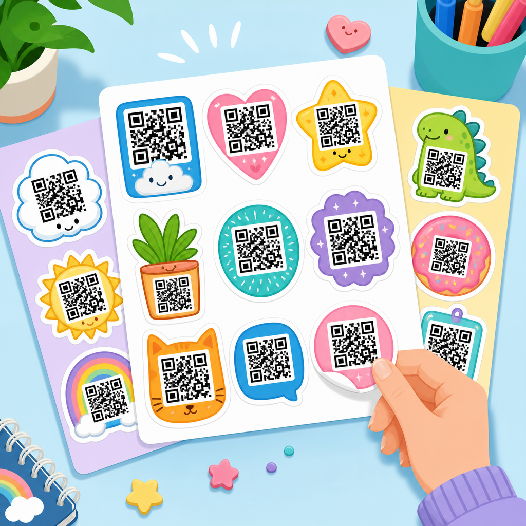
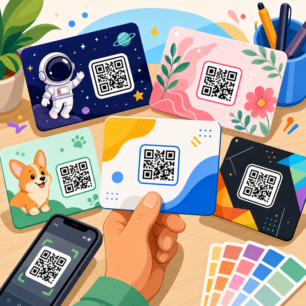
Logo overlays are the most common customization. They can improve confidence when users see a familiar brand mark, especially on packaging or direct mail where fraud concerns exist. However, the logo should stay centered, modest in size, and balanced against the selected error correction level. If the logo covers too many modules or sits off-center, some devices will not decode it. In production, I prefer testing the exact logo lockup at final scale rather than approving a percentage rule in the abstract.
Custom module shapes can work when they preserve the underlying grid logic. Rounded dots, softened corners, and subtle styling are usually acceptable. Extreme distortion is not. The three finder patterns in the corners must remain obvious, and alignment patterns should not be disguised. When a checklist asks whether the code “looks branded,” it should also ask whether the key patterns remain machine-readable at a glance.
Frames and callouts matter more than many teams realize. A visible border with clear instruction often improves scan rates because it clarifies interaction. “Scan to view the menu,” “Scan for setup instructions,” or “Scan to track your order” all outperform generic prompts because they set expectation and reward. The checklist should require a benefit-led call to action, not filler text. It should also verify that nearby copy does not imply a destination the code does not deliver.
| Checklist item | Best practice | Common failure |
|---|---|---|
| Color | Dark foreground on light background | Low contrast brand palette |
| Logo overlay | Small centered mark with higher correction | Oversized logo covering modules |
| Quiet zone | Minimum four-module clear margin | Text or borders crowding edges |
| CTA | State the benefit of scanning | Generic “Scan me” label |
| Output | Vector for print, high resolution for digital | Low-res raster export |
Placement, materials, and production quality control
Even a perfectly generated code can fail because of where and how it appears. Placement is a core part of every QR code design checklist because scan behavior changes with angle, lighting, movement, and surface material.
For print, avoid placing codes near folds, seams, bottle curves, corners, or tear lines. On corrugated packaging, the ridges can distort module edges. On glossy posters, overhead lights can create glare that blocks cameras. On laminated menus, fingerprints and scratches accumulate over time. In each case, the checklist should ask whether the material introduces reflection, warping, abrasion, or curvature. If yes, increase size, simplify styling, and test on the actual substrate.
Viewing angle matters too. A code mounted too low on a store shelf forces awkward body position. A code on a street poster may be partially blocked by foot traffic. A code inside a moving vehicle ad gets only a brief capture window, so size and simplicity become more important than visual flair. For digital signage, refresh rate and moiré effects can interfere with scanning, especially on older LED displays. In those scenarios, export quality and on-screen module sharpness should be reviewed before launch.
File format is a frequent production issue. For professional print, SVG, EPS, or PDF vector output is preferable because it scales cleanly. PNG can work for digital placements when exported at sufficient resolution, but screenshots from a generator interface often produce compression artifacts or blurred edges. The checklist should specify approved file formats by channel and require a final proof review after placement, not before.
Testing should be device-diverse and environment-specific. Scan with current iPhones, mid-range Android devices, and at least one older handset if your audience is broad. Test in bright light, low light, and typical user distance. Confirm that the destination opens correctly in both native camera apps and common QR scanning flows. Quality control is not complete until the deployed asset passes real-world scans, not just studio checks.
Landing pages, analytics, security, and governance
The user does not care that the code scanned if the destination disappoints. That is why the best QR code checklists connect design review with conversion review. The landing page should match the promise made beside the code, load quickly on mobile networks, and keep the next action obvious. If the code says “Scan for assembly instructions,” the page should open directly to those instructions, not a homepage search result. If it says “Scan for 10% off,” the discount should be visible immediately.
Speed matters because QR interactions are often spontaneous. Compress images, reduce script bloat, and test Core Web Vitals on mobile. A slow page loses intent fast. Accessibility matters too. Use readable type, sufficient contrast, and tap targets that work one-handed. If forms are involved, keep them short. Every extra field reduces completion.
Analytics should be intentional from the start. Dynamic QR platforms such as Bitly, QR Code Generator Pro, Beaconstac, Flowcode, and Uniqode can track scans by time, device, and location at varying levels of detail. Add UTM parameters so web analytics can attribute downstream behavior, not just the initial scan. For offline campaigns, create distinct codes by placement instead of reusing one code everywhere. That lets you compare store posters versus packaging inserts or trade show signage versus direct mail. A checklist should include naming conventions, campaign taxonomy, and ownership of reporting.
Security and governance are essential, especially in regulated or high-trust environments. Use HTTPS destinations, avoid unnecessary third-party redirects, and monitor codes for tampering in public spaces. In organizations with many stakeholders, establish approval rules for who can generate codes, edit destinations, and retire outdated campaigns. Broken redirects, expired promotions, and orphaned links are common because QR assets live longer than the teams that launch them. Governance keeps the experience reliable over time.
How to use this hub and build a repeatable checklist process
The simplest way to use a QR code design checklist is to structure it around project stages: brief, build, proof, test, launch, and maintain. In the brief stage, define the user action, destination, context, and success metric. During build, generate the code with the correct data type, correction level, and output format. At proof, validate size, quiet zone, branding, and call to action in the final layout. During testing, scan across devices and lighting conditions. At launch, confirm analytics, redirects, and destination readiness. During maintenance, review performance and update dynamic targets as needed.
As the hub for QR code checklists, this page should support deeper resources such as a print sizing guide, a QR code testing checklist, a packaging checklist, a restaurant menu checklist, a dynamic versus static decision guide, and a landing page optimization article. Teams rarely need one universal list in isolation. They need a master framework plus scenario-specific checklists that reflect channel risk.
The main benefit of a checklist is confidence. It reduces reprints, avoids broken experiences, protects brand presentation, and improves measurable results. If you manage QR codes across campaigns, standardize your review process now, document the criteria, and use this hub as the starting point for every new deployment.
Frequently Asked Questions
What should be included in a QR code design checklist before publishing or printing?
A reliable QR code design checklist should cover far more than whether the code simply exists on the page. Start with the destination itself: confirm the URL is correct, live, mobile-friendly, secure, and relevant to the context in which the code will be scanned. If the landing page is slow, broken, or poorly formatted for phones, the QR code has already failed even if it scans perfectly. Next, review the encoding type and make sure the code is generated from the final destination, ideally using a dynamic QR code when campaign flexibility, analytics, or future edits are important.
Then evaluate visual performance. The code should have strong contrast, a clean quiet zone around all sides, and enough size for the expected scanning distance. Avoid design treatments that interfere with readability, including low contrast, excessive logo coverage, distorted modules, heavy gradients, or decorative backgrounds that compete with the pattern. Error correction should be chosen intentionally: high enough to tolerate minor damage or branding elements, but not used as an excuse for overdesign.
Print and placement are equally important. Verify the final output dimensions, print resolution, substrate, lighting conditions, and location where the code will appear. A QR code on glossy packaging, curved bottles, vehicle wraps, storefront windows, or outdoor signage faces very different scanning conditions than one on a brochure. Finally, test across multiple devices, camera apps, operating systems, and real-world conditions. A strong checklist ends with validation: scan tests, URL verification, analytics setup, UTM tracking, and a final approval process to ensure the code is both technically sound and brand-appropriate.
How do color, contrast, and branding choices affect QR code scan reliability?
Color and branding decisions have a direct impact on whether a QR code works in the real world. The safest approach is still a dark code on a light background with a clear difference in luminance. Scanners do not read “brand style” the way humans do; they detect pattern separation. If the foreground and background are too similar in brightness, the code may look attractive but become difficult or impossible to scan under certain lighting conditions, camera qualities, or screen settings. This is why soft pastels, metallic inks, transparent overlays, and low-contrast brand palettes can create hidden performance problems.
Inverted QR codes, such as light modules on a dark background, sometimes work but are much riskier and should never be assumed safe without testing. The same goes for gradients, textured backgrounds, patterned packaging, or photography behind the code. Even when the QR code generator produces a valid symbol, those visual treatments can reduce edge definition and interfere with recognition. Branding elements such as logos can be effective if used carefully, but they should not obscure too much of the data area or alter the essential structure of the code. Finder patterns, alignment patterns, and the quiet zone must remain intact and visually clear.
The best practice is to integrate branding in ways that support, not compete with, scanability. Use brand colors with strong contrast, keep the background clean, preserve margins, and treat every styled version as a new asset that must be tested. A code that is slightly less “creative” but scans instantly will outperform a more decorative version every time. In QR marketing, usability is part of the design standard, not a compromise against it.
How large should a QR code be, and where should it be placed for the best results?
QR code size should always be determined by scanning distance, environment, and use case rather than guesswork. A common practical rule is that the code should be at least about one-tenth the distance from which it will be scanned. For example, if users will scan from 10 inches away, the code should be roughly 1 inch wide; if from 10 feet away, it needs to be much larger. However, that rule is only a starting point. Data density, print quality, surface material, and device camera performance all influence the minimum viable size. A dense code with a long URL may need to be larger than a simpler code encoding a shorter destination.
Placement matters just as much as dimensions. The code should be easy to notice, easy to approach, and easy to scan without awkward body positioning. If it is placed too high, too low, around a fold, near a curved edge, on reflective material, or in a dim area, people may abandon the attempt even if the code is technically readable. For physical marketing materials, leave enough surrounding space so the code does not feel crowded by other graphics, and pair it with a short call to action that tells users what they will get by scanning. “Scan for menu,” “Watch the demo,” or “Get 10% off” usually performs better than placing a QR code with no explanation.
It is also important to think about context. A code on product packaging may be scanned while the item is in someone’s hand, but a code on a poster in a transit station may need to work quickly from a standing distance. A code on a restaurant table may deal with glare from overhead lights, while a code on an outdoor sign may face weathering and direct sun. Good placement planning means anticipating those conditions and testing the code where it will actually be used, not just on a designer’s screen.
Why are testing and analytics essential parts of a QR code design checklist?
Testing is essential because many QR code problems do not show up until the code is used in real conditions. A design may scan on one phone in the studio and still fail on older devices, under poor lighting, through a social media camera, or after being printed on textured stock. That is why a proper checklist includes test scans on iPhone and Android devices, with different native camera apps and scanning tools, from realistic distances and angles. If the code appears on packaging, signage, or direct mail, test a printed proof rather than relying only on the digital artwork.
Analytics matter because a QR code is not just a graphic; it is a conversion point. Without tracking, you may know people scanned but not whether they reached the right page, stayed engaged, or completed the intended action. At minimum, campaigns should use trackable URLs, UTM parameters, or a dynamic QR platform that records scans by date, device, location, and campaign asset. This data helps marketers compare placements, measure response rates, identify drop-off points, and optimize future creative and distribution decisions.
Testing and analytics also protect against costly mistakes. They help catch broken links, redirect loops, geo-blocked content, app-only destinations, or mobile pages that load too slowly. They can reveal if one print version outperforms another or if a call to action drives stronger engagement. In short, testing confirms functionality before launch, and analytics confirm performance after launch. Both are necessary if the QR code is meant to produce measurable business results rather than simply decorate a layout.
What are the most common QR code design mistakes that cause campaigns to fail?
The most common mistake is assuming that generating the code is the same as designing a successful QR experience. In reality, failures usually come from a chain of small oversights: the code is too small, the contrast is weak, the quiet zone is cramped, the destination page is not mobile-friendly, or the URL was entered incorrectly and no one rechecked it. Another major issue is overstyling. Brands often try to customize the code with gradients, embedded logos, rounded shapes, transparent effects, or reversed colors without validating whether those changes remain scannable in print and under real lighting conditions.
Production errors are another frequent cause of failure. A code may work in the original file but become blurred, compressed, stretched, or recolored during export, printing, or vendor handoff. Placement can also sabotage performance: codes on curved surfaces, reflective materials, folds, seams, window glass, or locations with poor lighting often underperform. In some cases the QR code itself scans, but the experience still fails because users land on a desktop page, a dead link, a file that takes too long to load, or content that does not match the promise of the call to action.
One of the most avoidable mistakes is skipping a final checklist and real-world scan test. Teams may review aesthetics closely but never verify functionality after the asset is resized, printed, or installed. The best way to prevent campaign failure is to treat QR codes as a cross-functional deliverable involving design, marketing, production, and user experience. When the checklist includes technical validation, brand review, mobile usability, and measurement planning, the odds of failure drop sharply and the code becomes a dependable bridge from physical media to digital action.