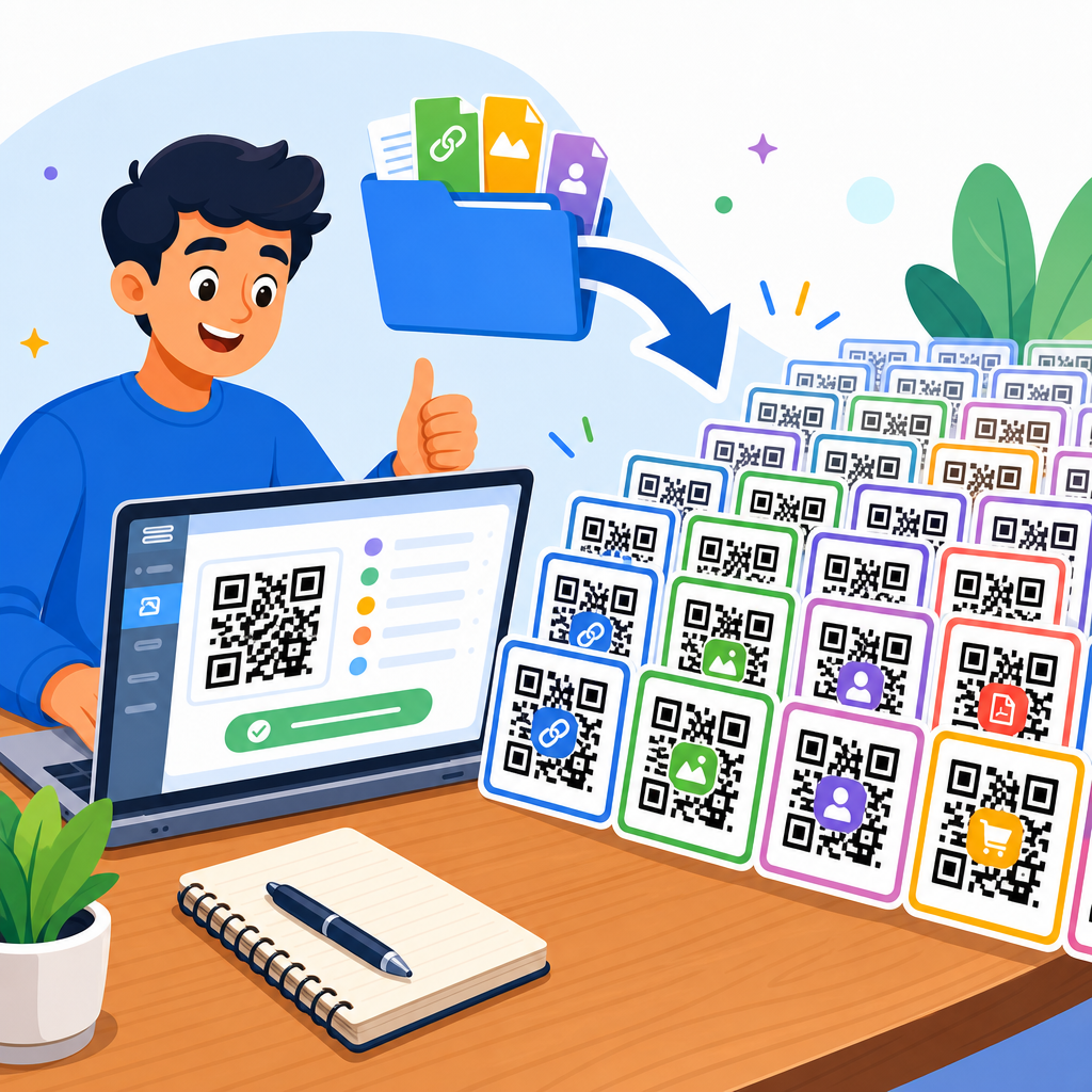
QR code design can make the difference between a seamless scan and a failed interaction, and after testing codes on packaging, menus, posters, business cards, and retail displays, I have seen the same preventable mistakes ruin otherwise smart campaigns. A QR code is a two-dimensional matrix barcode that stores data such as a URL, contact card, Wi-Fi credential, payment address, app deep link, or plain text. Modern smartphones decode it with native camera software, which means the barrier to use is low, but low friction does not guarantee good results. The design choices around contrast, size, error correction, quiet zone, branding, destination, and print production directly affect whether people can scan quickly under real conditions. That is why this topic matters for any business working within QR Code Creation & Tools. If a code is beautiful but unreadable, it fails. If it scans but sends users to a broken mobile page, it still fails. Effective QR code design is not decoration layered onto a symbol; it is a balance between aesthetics, technical reliability, device compatibility, and user trust. This hub article explains the most common QR code design mistakes to avoid and the practical standards that help custom codes perform consistently.
Poor contrast, weak sizing, and missing quiet zones
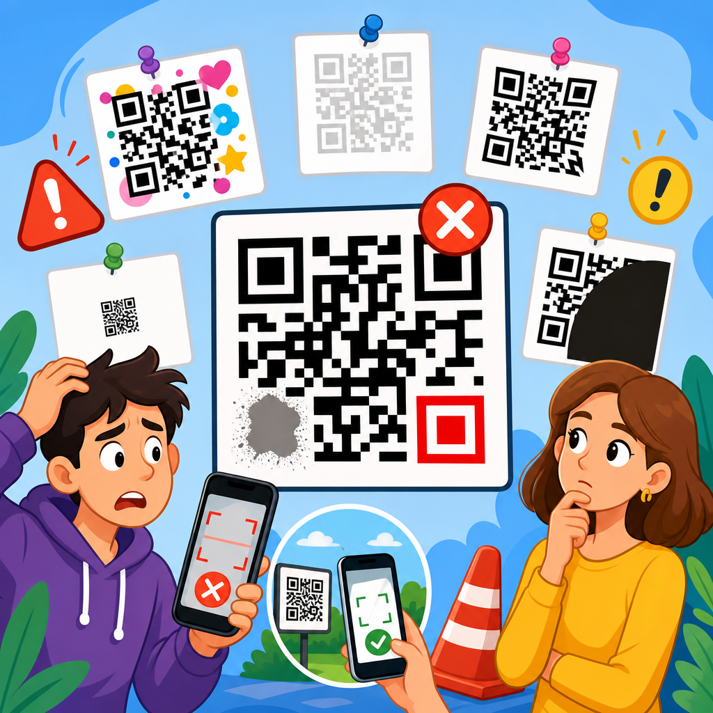
The most common QR code design mistake is reducing scan reliability in pursuit of style. The code must be easy for a camera to separate from its background, and that starts with contrast. Dark modules on a light background remain the safest choice because smartphone cameras and decoding libraries detect them fastest. In production tests, black on white still outperforms pastel combinations, metallic ink, and low-contrast brand palettes, especially under glare or low light. Inverted designs, such as white modules on black, may scan on some devices but often fail on older phones, budget Android models, or reflective printed surfaces. Gradient fills create another issue because some modules become too light to read. If you want a branded look, keep the functional pattern dark and reserve color for the frame, call-to-action, or surrounding design.
Size is equally important. A practical baseline for print is a scanning distance ratio of roughly 10:1, meaning a code viewed from 10 inches away should be at least 1 inch wide. That rule helps on flyers, packaging, shelf talkers, and table tents. For posters or storefront windows, increase size substantially because users scan from farther away and at awkward angles. I have seen restaurant menus fail simply because the code was shrunk to fit a corner near legal text. The code looked tidy but forced diners to hover, zoom, and retry. On digital displays, pixel density matters too. Exporting a small raster image and stretching it on screen softens module edges, making the code harder to decode. Vector formats such as SVG or EPS preserve crisp geometry for print and responsive digital use.
The quiet zone is the blank margin around the QR code, and removing it is one of the fastest ways to break scannability. ISO/IEC 18004, the standard commonly referenced for QR code structure, specifies a clear margin around the symbol. As a working rule, keep at least four modules of empty space on all sides. Designers often crop too tightly, place the code against busy photography, or let graphic elements bleed into the edge. That visual crowding confuses the scanner’s ability to isolate the symbol from its surroundings. If the code must sit on a branded background, place it inside a solid container or white panel. Decorative borders can work, but the quiet zone itself must stay clear. Before approving artwork, test the code from multiple phones, under different lighting conditions, and at the actual viewing distance. Lab-perfect scans do not guarantee field performance.
Over-customization that damages the code structure
Customization can strengthen brand recognition, but excessive styling often interferes with the QR code’s core geometry. The most sensitive elements are the finder patterns, alignment patterns, timing patterns, and data modules. Rounded modules, custom dot shapes, embedded logos, and altered corner eyes can all work if the underlying structure remains intact and error correction is set appropriately. Problems begin when designers push customization past the tolerance level of common scanning apps. For example, replacing square modules with thin strokes may look elegant on a mockup, yet stroke-based designs lose clarity when printed on textured labels or compressed into social graphics. Likewise, turning the finder patterns into complex icons can stop detection entirely because those three corner markers help the decoder orient the symbol.
Logo placement deserves special caution. Many generators allow a logo in the center, but not every code has enough redundancy to tolerate the obstruction. Error correction levels L, M, Q, and H provide increasing recovery capacity, with H offering the most resilience, but higher correction also increases code density. That means adding a large logo to a long URL can create a dense symbol with very small modules, trading one risk for another. The better approach is to shorten the destination, use a dynamic URL when appropriate, increase physical size, and keep the logo modest. In client work, I usually start with medium or high error correction only after confirming the final data load and print size, not before.
Shape experimentation creates similar issues. Circular QR codes and highly stylized silhouettes are visually striking, but they can remove too much usable area or disrupt the standard square boundary scanners expect. A safer branding method is to customize the frame around the code, use a concise call-to-action, and align colors with the campaign while preserving conventional modules and finder patterns. Trusted tools such as QR Code Generator Pro, Beaconstac, Flowcode, and Bitly’s QR features offer customization controls that stay closer to working tolerances, but no tool can guarantee performance if the design is pushed beyond practical limits. Every custom code should be tested across iPhone and Android devices, native camera apps, and at least one third-party scanner because decoding behavior varies. The best branded QR code does not merely match the visual identity; it scans instantly in ordinary conditions.
Ignoring destination experience, context, and user trust
A QR code is only as effective as the experience it unlocks. One major design mistake is treating the symbol as the finish line instead of the beginning of the journey. If the code opens a non-mobile page, a slow-loading site, a generic homepage, or a destination with no clear next step, scan volume may look acceptable while conversions remain poor. The landing page should match the user’s context. A code on product packaging should open product support, setup guidance, warranty registration, or replenishment options, not a cluttered corporate homepage. A code on event signage should load a map, agenda, or check-in page optimized for mobile bandwidth. When I audit QR campaigns, weak destination alignment is often a larger problem than the code artwork itself.
Trust also influences scan behavior. Users hesitate when a QR code appears without explanation, branding, or a visible destination cue. During the early surge of contactless menus, many venues posted plain black codes with no text, forcing customers to guess whether they led to a menu, payment page, or unrelated promotion. A brief instruction such as “Scan to view the menu” or “Scan for setup video” reduces friction because it answers the immediate question: why should I scan this? Branded frames help as well, provided they do not crowd the quiet zone. If space allows, add the destination domain beneath the code. Seeing a known domain improves confidence and can reduce abandonment.
Accessibility and environmental context matter too. Codes placed behind glass, on curved bottles, near reflective foil, or in dimly lit corners scan poorly even when technically well designed. A glossy laminate can introduce glare that hides modules from the camera. Curved surfaces distort the square geometry, especially on small cylindrical packaging. In those cases, move the code to a flatter panel, increase size, and avoid placing critical information across a seam or fold. For inclusive design, support the QR code with a short fallback URL or NFC alternative when possible, and ensure the landing page meets mobile accessibility expectations such as readable type, sufficient color contrast, and simple tap targets. The code should save effort, not add uncertainty.
Skipping production checks, analytics, and long-term maintenance
Many QR code failures happen after the design file leaves the screen. Print production can alter color, sharpness, and legibility in ways that are not obvious in digital proofs. Dot gain on absorbent stock can thicken modules, while poor resolution can blur edges. Small registration shifts in multi-color printing may create fuzzy boundaries that slow detection. That is why final output testing matters on the exact substrate, finish, and size being used. I always recommend scanning a press proof or finished sample rather than approving from a PDF alone. Environmental durability matters as well. Outdoor posters fade, labels scratch, and shipping cartons crease. If the code supports an essential function such as warranty activation or medication instructions, print redundancy and placement deserve extra care.
Another avoidable mistake is choosing a static code when the campaign needs flexibility. Static QR codes permanently encode the final destination, so any URL change requires reprinting every asset. Dynamic QR codes route through a short URL or management platform, allowing you to update the destination, track scans, segment by campaign, and sometimes use geolocation or device rules. Dynamic options are invaluable for retail promotions, restaurant menus, real estate signage, and packaging that stays in market for months. The tradeoff is platform dependence: if the service lapses, rebrands, or restricts features, the code may break. Use a reputable provider, document ownership, and monitor links regularly.
| Mistake | Why it hurts scanning or conversion | Better approach |
|---|---|---|
| Low contrast colors | Cameras struggle to separate modules from background | Use dark modules on a light, matte background |
| Code too small | Users must move closer and retry repeatedly | Size for viewing distance, using the 10:1 rule as a baseline |
| Cropped quiet zone | Scanner cannot isolate the symbol cleanly | Keep at least four modules of empty margin |
| Oversized center logo | Obscures too much data and increases failure rate | Use modest logo placement with suitable error correction |
| Generic landing page | Scans do not turn into useful actions | Send users to a mobile page matched to the context |
| No testing after print | Production defects go unnoticed until launch | Scan final samples on multiple devices and in real lighting |
Analytics complete the picture. Track not only total scans but also completion events such as purchases, sign-ups, downloads, reservations, or support article views. UTM parameters in destination URLs can help attribute traffic in Google Analytics 4, while platform dashboards can reveal time, location, and device trends. Those insights inform future design choices. For example, if a window decal gets scans only during daylight, glare may be limiting evening use. If scans are high but bounce rate is severe, the landing page likely needs improvement. Maintenance should be routine: review every live code, verify redirects, renew domains, and ensure privacy disclosures fit the use case, especially when collecting personal data. Good QR code design is not a one-time creative task; it is an operational system that combines visual design, scanning reliability, destination quality, measurement, and governance over time.
How to create customized QR codes that still scan reliably
The safest way to approach QR Code Design & Customization is to treat function as non-negotiable and style as a controlled enhancement. Start by defining the scan goal: open a menu, claim an offer, join Wi-Fi, download an app, authenticate a product, or trigger a payment. Then choose the shortest viable destination and, if updates may be needed, a dynamic code managed by a stable platform. Keep the symbol square, maintain a clear quiet zone, and preserve recognizable finder patterns. Use high contrast, export in vector format for print, and avoid placing the code on glare-prone or curved surfaces when a flat matte area is available. If you add a logo, compensate with adequate size and tested error correction rather than guessing.
From there, build a repeatable testing process. Scan with recent iPhones and Android phones, both close up and from expected user distance. Test in bright light, low light, and off-angle conditions. Print a physical sample at final size on final stock. Confirm that the landing page loads quickly over cellular data and presents one obvious next action. Add a short instruction near the code so users understand the value of scanning, and include a fallback URL when the context supports it. These practices turn QR customization into a reliable conversion tool rather than a branding gamble. If you are building out a broader QR Code Creation & Tools strategy, use this page as the hub standard: design for instant recognition, real-world scanning, and mobile-first outcomes, then review each live code regularly. Strong QR codes are not just attractive. They are usable, trustworthy, measurable, and worth scanning. Audit your current codes against these mistakes, fix the weak points, and make every scan easier for the customer today.
Frequently Asked Questions
What are the most common QR code design mistakes that cause scan failures?
The most common QR code design mistakes are usually visual decisions that interfere with how a phone camera detects the code’s structure. One of the biggest problems is low contrast. A QR code should generally be dark on a light background, because scanners look for a clear difference between the data modules and the surrounding space. When brands reverse the colors, use pastel tones, add gradients, or place the code over a busy image, scan reliability often drops fast. Another frequent issue is removing or shrinking the quiet zone, which is the empty margin around the code. That blank border is not decorative; it helps the scanner distinguish the QR code from nearby text, graphics, or packaging elements.
Size is another major factor. A code that looks sharp on a monitor may become too small once printed on packaging, menus, posters, shelf talkers, or business cards. If the modules are tiny, camera autofocus and motion blur can make the code unreadable. Over-customization is also a repeat offender. Rounded modules, embedded logos, unusual patterns, and heavily stylized eyes can work, but only if they are tested thoroughly. Push the design too far and the code may still look attractive while becoming inconsistent across devices, lighting conditions, and scan distances.
Poor placement creates failures too. Codes positioned on curved bottles, reflective surfaces, folds, corners, or locations blocked by glare are far more likely to frustrate users. Finally, many campaigns fail because nobody tested the final code in the real world. A QR code that scans perfectly from a digital mockup may perform badly once printed, laminated, reduced in size, or viewed under store lighting. In practice, the most reliable approach is simple: maintain strong contrast, preserve the quiet zone, use an appropriate size, avoid excessive decoration, and test the exact final version on multiple devices before launch.
How much can you customize a QR code before it becomes hard to scan?
You can customize a QR code quite a bit, but the safe limit is determined by function, not aesthetics. Many brands want a code that feels on-brand, and that is reasonable. You can often change colors, soften corners, add a logo, and adjust the frame or call-to-action without harming performance, provided the core data pattern remains easy for scanners to interpret. The problem starts when customization changes too many structural elements at once. If you alter the finder patterns, reduce contrast, distort the modules, overlay a large logo, and remove whitespace, the combined effect can make the code unreliable even if each change seems minor on its own.
Error correction gives some room for customization because QR codes can tolerate a certain amount of damage or obstruction. That is why a small centered logo is often possible. But error correction is not a license to redesign the code beyond recognition. It is there to provide resilience against printing imperfections, surface wear, and minor visual interference, not to compensate for aggressive styling choices. In real-world testing, heavily customized codes tend to fail first on older phones, in dim lighting, at awkward angles, or when viewed quickly by people in motion.
A good rule is to customize around the code more than inside it. Brand the surrounding layout, add a clear instruction such as “Scan to view menu” or “Scan for product details,” and use a well-designed frame rather than reinventing the data pattern itself. If you do customize the code, keep the contrast high, preserve the finder patterns, protect the quiet zone, keep logos modest in size, and run print and distance tests across different devices. The best custom QR codes still look unmistakably like QR codes at first glance.
Why do color choice and contrast matter so much in QR code design?
Color and contrast matter because scanners are not judging whether a QR code looks stylish; they are trying to separate machine-readable elements from the background quickly and accurately. A camera interprets the code through light, shadow, edges, and contrast. When there is a strong difference between dark foreground modules and a light background, detection is fast and reliable. When the contrast is weak, the camera struggles to distinguish the module grid, especially in poor lighting, glare, or motion. This is why black on white remains the most dependable standard, even though many other combinations can work if they preserve sufficient contrast.
Problems usually appear when designers prioritize brand palettes over scan performance. Light gray on white, yellow on cream, navy on black, metallic inks, transparent overlays, and photographic backgrounds all increase the chance of failure. Gradient fills can also create trouble if one part of the code becomes too light relative to the background. Glossy printing introduces another complication: reflections can wash out portions of the code, effectively reducing contrast even if the original design looked acceptable on screen. This is especially common on menus, window decals, food packaging, and retail displays with overhead lighting.
Another overlooked issue is color inversion. While some smartphones can scan light codes on dark backgrounds, inverted designs are less universally reliable than dark-on-light formats. The safest choice is still a dark code on a clean, light, non-reflective background. If brand consistency is important, use darker brand colors for the modules and keep the background very light. Before approving production, test the code under realistic conditions: indoor lighting, daylight, glare, different phone cameras, and varying distances. If a color choice introduces even slight hesitation during scanning, it is usually not worth the branding tradeoff.
What is the ideal size and placement for a QR code on packaging, posters, menus, and business cards?
The ideal size and placement depend on scanning distance, surface conditions, and how quickly the user is expected to act. A useful rule is that the farther away the code will be scanned from, the larger it needs to be. For close-range items like business cards, product labels, and tabletop menus, the code can be relatively small, but it still must remain comfortably scannable with a handheld phone camera. For posters, window graphics, and in-store displays viewed from several feet away, the code needs significantly more physical space. If users must step closer than expected just to get a scan, the code is probably undersized for the context.
Placement matters just as much as size. A technically valid QR code can still underperform if it is printed on a curved bottle, squeezed near a fold, wrapped around an edge, placed too low to the ground, or positioned where glare obscures it. On packaging, choose a flat area whenever possible and avoid seams, corners, or textured surfaces. On posters and signs, place the code where a person can scan it without blocking traffic or contorting the phone at an odd angle. On menus, make sure the code is easy to notice and not competing with dense typography or decorative elements. On business cards, avoid placing it so close to trim edges that the quiet zone is compromised.
It also helps to consider the user journey. If the scan is meant to happen instantly, the code should be easy to spot, easy to reach, and paired with a clear reason to scan. Placement should support behavior, not just layout symmetry. In practical terms, use a size appropriate for the distance, preserve whitespace around the code, keep it off problematic surfaces, and test the final printed piece in the exact context where people will use it. Reliable QR design is always contextual; the best size on a poster is not the best size on a carton, tent card, or business card.
How should you test a QR code before publishing or printing it?
Testing should happen in stages, because many QR code problems only appear after the design leaves the screen and enters the real environment. First, confirm the destination works correctly. Make sure the URL, contact card, payment link, Wi-Fi credential, app deep link, or text payload is accurate and behaves as expected on both iPhone and Android. If the QR code points to a webpage, verify that the landing page is mobile-friendly, loads quickly, uses HTTPS, and reflects the promise made near the code. A perfectly scannable code still fails if it sends users to a broken, slow, or confusing destination.
Next, test the visual code itself on multiple devices using native camera apps, not just one scanner tool. Try newer and older phones, different screen brightness levels, and a range of lighting conditions. If the code will be printed, test a printed version at actual size rather than relying on a digital preview. Check it under store lighting, near windows, at night, and from the intended scanning distance. If it will appear on glossy packaging, laminated menus, or window signage, test for glare and reflections. If it will be placed on a curved or textured surface, test the code on that actual material or a close mockup.
Finally, test usability, not just technical readability. Ask whether people can notice the code quickly, understand what it does, and scan it without frustration. Include a clear call-to-action so users know why they should engage. If any scan requires repeated attempts, odd angles, or stepping much closer than intended, treat that as a design problem worth fixing before release. The strongest QR campaigns succeed because they are tested as real-world interactions, not just as graphics. In other words, validate the destination, verify the print, test across devices and conditions, and make sure the entire experience feels effortless.