Testing your QR code design before printing is the difference between a smooth scan and a wasted production run, and after reviewing countless branded codes for packaging, menus, posters, labels, and direct mail, I can say most failures come from design decisions made too late. A QR code is a two-dimensional matrix barcode that stores data such as a URL, contact record, Wi-Fi credential, payment request, or app link in a grid of dark and light modules. QR code design includes everything that affects both appearance and readability: size, contrast, error correction level, logo placement, color palette, quiet zone, destination URL, and the material where the code will be printed. Printing locks those choices into a physical asset, so prepress testing matters because scanning conditions in the real world are unpredictable. People scan in glare, low light, motion, bad cellular coverage, awkward angles, and on damaged surfaces. A design that scans on a designer’s monitor can fail on matte cardboard, glossy acrylic, curved bottles, or outdoor signage. This article explains how to test your QR code design before printing, what standards matter, which design choices are safe, and how to build a repeatable approval process that reduces risk across every campaign.
Start with scanability fundamentals before you style anything
The first rule of QR code design is that function outranks decoration. Before you choose colors or add a logo, confirm that the underlying code is generated correctly and points to the final destination. Use a reputable QR code generator that supports dynamic URLs, export formats such as SVG and PNG, and adjustable error correction. Verify that the encoded data is clean, especially if you are using UTM parameters, vCard fields, or deep links. Shorter payloads generally produce less dense codes, and less dense codes are easier to scan at smaller print sizes. For most marketing uses, a dynamic short URL is the best starting point because it keeps the module pattern simpler and gives you post-print control over redirects and analytics.
Next, protect the structural elements scanners rely on. The three finder patterns in the corners, alignment patterns, timing patterns, and the quiet zone are not decorative; they are detection features. The quiet zone is the blank margin around the code, and in practice it should be at least four modules wide on every side. I have seen otherwise solid designs fail because a border, background texture, or headline crept too close to the edge. Maintain strong contrast between foreground and background, ideally dark modules on a light background. Black on white is still the most reliable combination. Inverted schemes, gradients, metallic inks, or low-contrast brand colors can work, but only after testing across multiple devices. If you must style heavily, increase physical size and preserve the finder patterns clearly.
Choose design variables that survive real print conditions
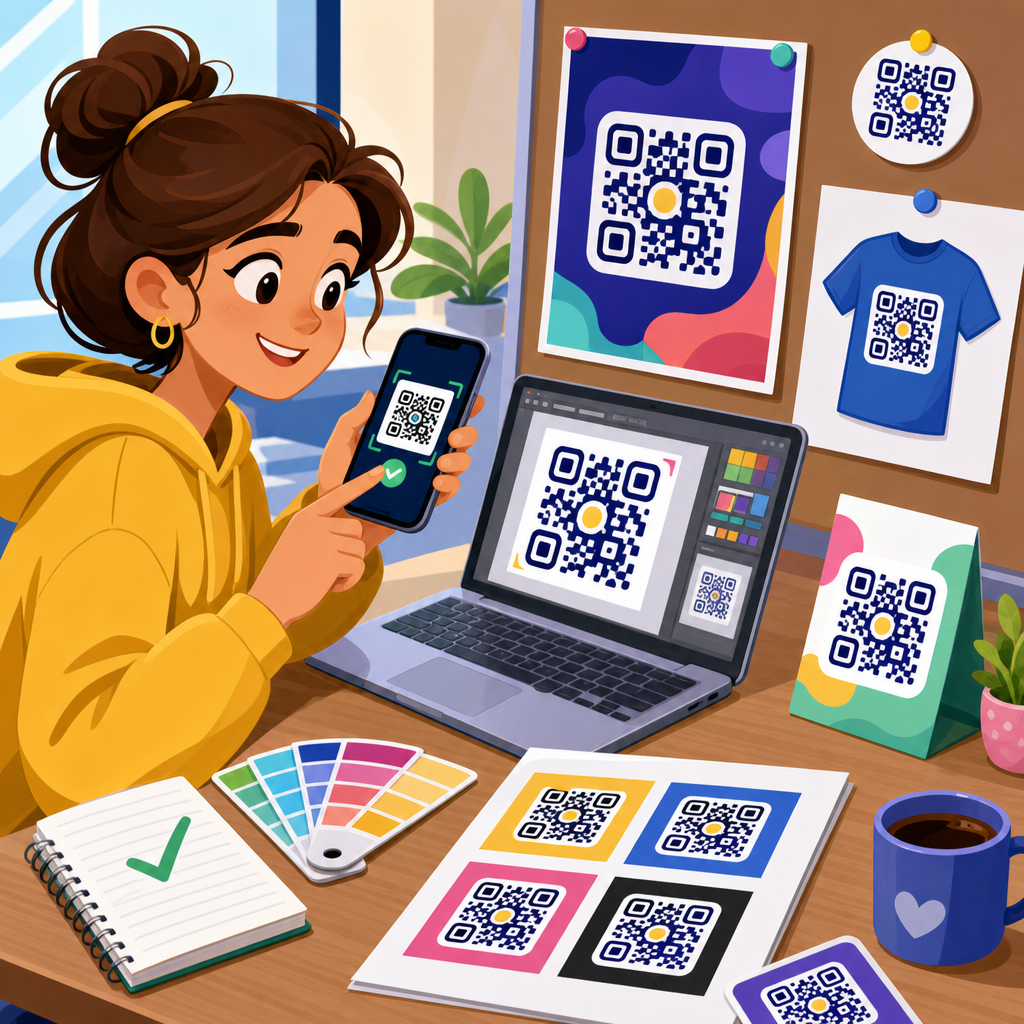
Customization is valuable when it reinforces branding without sacrificing readability. The safest variable to customize is the frame or call-to-action around the code, not the modules themselves. A label such as “Scan to view menu” or “Scan for setup guide” improves response and does not interfere with decoding if it stays outside the quiet zone. Logo placement can also work if it is modest and paired with a higher error correction level. Error correction allows scanners to recover data when part of the symbol is obscured or damaged. Level M is often enough for light branding, while Level Q or H is better when a centered logo covers modules. The tradeoff is density: more error correction means more modules, which can make a small printed code harder to scan. That balance should be tested, not guessed.
Color and material decisions need equal scrutiny. A code printed in navy on cream stock usually performs well; a code printed in pale gold on white or dark gray on black usually does not. Reflective laminates, foil stamping, embossing, varnish, translucent labels, and textured substrates all reduce consistency. Curved packaging introduces distortion, especially on narrow bottles and tubes, where the code should be placed on the flattest panel available. Outdoor applications add UV fading, dirt, and weather exposure. In those cases, increase size, use weather-resistant inks, and avoid delicate styling. Screen rendering can hide these problems, which is why digital approval is only the first checkpoint. The design has to be tested on the same material, finish, scale, and placement planned for the final run.
Build a pre-print QR code testing checklist
A reliable testing process is systematic. Start with the final asset, not a draft screenshot. Export at production quality, place it in the actual layout, and print a prototype at true size. Then test under the conditions users will face. Use multiple phones, more than one scanning app, and both native camera scanners and popular third-party apps. iPhone and Android camera behavior differs, and some devices handle low contrast and glare better than others. Test at normal user distance, not just from close range. A poster code may need to scan from several feet away; a product label may be scanned from inches. Check loading speed after the scan, because a technically readable code still fails if the landing page is slow or blocked by a poor mobile connection.
| Test area | What to verify | Common failure | Practical fix |
|---|---|---|---|
| Destination | Correct final URL, redirects, tracking parameters | Broken link or wrong campaign page | Use dynamic code and confirm redirect chain |
| Print size | Scans at intended viewing distance | Modules too small for phone camera | Increase code dimensions and simplify payload |
| Contrast | Dark modules clearly separated from background | Brand colors blend or wash out | Use darker foreground and lighter background |
| Quiet zone | Blank margin on all four sides | Text or graphics too close to code | Restore at least four modules of clear space |
| Logo styling | Logo does not block essential patterns | Oversized center mark breaks decoding | Reduce logo size and raise error correction |
| Material finish | Readable on actual substrate and coating | Glare from gloss laminate | Switch to matte finish or adjust placement |
| Environment | Works in bright, dim, and angled conditions | Outdoor glare or shadows prevent scan | Increase size and improve contrast |
This checklist becomes even more useful when shared with designers, marketers, and print vendors. In my projects, the fastest way to prevent rework is assigning pass or fail criteria before anyone signs off. For example, a retail shelf tag might require a first-time scan on at least four recent phones under store lighting, while a trade show banner might require successful scans from six feet away. When those criteria are explicit, subjective debates about “looking good” stop overruling technical performance. The code either passes the usage test or it does not. That discipline saves money because reprinting a batch of labels or point-of-sale pieces costs far more than running a structured test during design review.
Test on devices, apps, distances, and network conditions
Many teams test with one phone in ideal office light and assume the code is ready. That is not enough. Device diversity matters because camera quality, autofocus speed, image processing, and native scanning behavior vary by model and operating system. Test on recent iPhones, mid-range Android devices, and at least one older phone with a weaker camera. If your audience includes warehouse staff, delivery drivers, restaurant customers, or older consumers, assume a wider range of devices and scanning habits. Native camera apps are the baseline, but it is worth checking Google Lens and a dedicated scanner app because some users still rely on them. What you are measuring is not just whether a scan can happen, but whether it happens quickly without hunting for focus.
Distance testing should match the use case exactly. A business card code may only need to scan at eight to twelve inches, while a storefront window code might need to work from a sidewalk. A practical rule is that denser codes need larger printed dimensions for the same scanning distance. If you are embedding a long URL, multiple parameters, or a complex vCard, expect to increase size or switch to a shortened dynamic link. Network testing matters too. Scan the code on Wi-Fi, 5G, and weak cellular service. If the landing page is heavy with scripts, autoplay video, or large images, users may blame the code when the real issue is page performance. Test the full user journey from camera open to destination loaded, including cookie banners, app-store redirects, form fields, and localized pages.
Validate print production, placement, and substrate effects
Pre-print testing must include the production method because print technology changes how modules reproduce. Digital printing, offset lithography, thermal transfer, flexography, and screen printing each introduce different risks. Dot gain can thicken dark modules, fine reverses can fill in, and low-resolution output can blur edges that scanners depend on. Ask your print provider for a contract proof or, at minimum, a high-fidelity sample on the intended stock. If the code will be produced in vector format, keep it vector through the workflow whenever possible. Rasterizing too early can soften edges and create aliasing artifacts. For packaging, request a dieline proof and confirm the code does not fall on folds, seams, perforations, tamper labels, or curved areas where distortion is likely.
Placement deserves strategic thought. A QR code on a restaurant menu should sit where hands will not cover it and lighting is decent. A code on product packaging should avoid corners that crease in transit. On direct mail, the code should not compete with dense copy or sit in a low-attention area. On outdoor posters, avoid lower positions where mud, scuffs, or parked vehicles may block it. Material choice affects every one of these situations. Uncoated paper is usually forgiving. Gloss finishes create glare. Clear labels on tinted bottles reduce contrast. Textured cardboard can break small modules. Metal surfaces can reflect harshly. The solution is not always to abandon branding; often it is to increase code size, use a white underprint, move the code to a flatter area, or switch to a matte coating for the scan zone.
Use analytics, version control, and approval gates to prevent costly mistakes
The best QR code testing process does not end with a successful prototype scan. It includes measurement and governance. Dynamic QR codes let you change the destination after printing, which is invaluable when a landing page moves, a campaign ends, or regional routing needs adjustment. They also provide scan analytics such as timestamp, location by IP approximation, device type, and total scans, depending on the platform. Tools from Bitly, QR Code Generator Pro, Beaconstac, Flowcode, and enterprise campaign platforms can support this, but the principle matters more than the vendor: never print a high-volume marketing code that cannot be monitored and, when appropriate, redirected. Analytics help you distinguish design problems from offer problems. If scans are high but conversions are low, the code works and the landing experience needs improvement.
Version control is equally important. I have seen teams approve one code in a presentation, then accidentally place an outdated file into artwork before press. Prevent that by naming assets clearly, storing final files in a single approved folder, and documenting the encoded destination, error correction level, size, color values, and proof date. Create approval gates between design, marketing, web, and print production. The web team should verify the destination and mobile performance. The designer should verify quiet zone, contrast, and placement. The printer should verify reproduction quality. The campaign owner should sign off on the final proof. After printing, run a production sample audit from multiple boxes or sheets because the first proof is not a guarantee that every unit in the run reproduced perfectly.
Testing your QR code design before printing is not a minor quality check; it is the step that protects campaign performance, brand credibility, and production budget. A successful printed QR code combines a clean payload, adequate size, strong contrast, preserved quiet zone, sensible logo use, and placement on a surface that real phones can read under real conditions. The process is straightforward when you treat it as part of design, not as an afterthought: generate the right code, style conservatively, print a true-size proof, test across devices and lighting, validate the substrate and finish, and lock in approval controls before the full run. That approach turns QR code design and customization from a risky visual exercise into a dependable communication tool.
As the hub for QR Code Design & Customization, this topic connects naturally to deeper work on QR code size guidelines, logo integration, color best practices, print materials, dynamic versus static codes, and mobile landing page optimization. If you manage packaging, signage, menus, mailers, or product labels, build a repeatable test checklist now and use it on every new code. One disciplined round of pre-print testing will prevent most scan failures you would otherwise discover only after the job is in customers’ hands.
Frequently Asked Questions
1. What should I test first before printing a QR code design?
The first thing to test is basic scan reliability under real-world conditions, not just whether the code works once on your own phone. A QR code can technically contain the right destination and still fail in print because of poor contrast, inadequate quiet zone, overly aggressive branding, or a size that is too small for the intended scanning distance. Start by confirming that the encoded content is correct and final, whether that is a URL, PDF link, menu, app download page, payment request, or contact card. Then test the design itself: the code should have strong contrast between foreground and background, a clean margin around it, and enough module clarity that the pattern remains distinct when viewed at the final print size.
Next, test a printed proof at actual size rather than judging from a screen. Many QR codes look crisp digitally but lose readability once printed on textured stock, corrugated packaging, glossy labels, or low-resolution signage. Scan it using multiple devices, different camera qualities, and different lighting conditions. If the code is going on packaging, test on the actual material and curved surface if possible. If it will appear on a poster or window graphic, test from the expected scanning distance. The goal is to validate the entire user experience, from noticing the code to scanning it quickly and reaching the correct destination without hesitation or repeat attempts.
2. How do size, scanning distance, and placement affect QR code performance?
Size, distance, and placement are some of the most important factors in whether a printed QR code scans easily. A common mistake is choosing a code size based on available design space instead of how people will actually interact with it. A small QR code may scan fine from six inches away on a product label, but the same dimensions can fail on a poster meant to be scanned from several feet away. As a practical rule, the farther away the user is expected to scan, the larger the code needs to be. This is especially important for retail signage, restaurant displays, event graphics, direct mail pieces, and transit ads, where people may not be standing directly in front of the code in ideal lighting.
Placement matters just as much. Avoid putting the code too close to folds, seams, edges, bottle curves, perforations, or reflective finishes. A QR code placed on a crinkled pouch, wrapped around a cylindrical container, or printed over a textured background can become harder for cameras to interpret even if the file itself is perfect. Leave enough clear space around the code and position it where a user can comfortably point a phone at it without glare or obstruction. Before approving a print run, test placement on a physical mockup in the exact location planned for production. That step catches issues that are nearly impossible to judge accurately on a flat digital layout.
3. Can branded QR codes with logos, custom colors, or stylized shapes still be tested reliably?
Yes, branded QR codes can absolutely be tested reliably, but they need much more validation than a standard black-and-white code. The more you customize a QR code with a logo overlay, rounded modules, gradients, colored backgrounds, or altered eye patterns, the more you reduce the margin for error. What often works on a bright monitor or in a design mockup may become unreliable when printed with ink gain, color shifts, coating, or substrate texture. That is why every branded variation should be treated like a functional asset, not just a visual element. Test the exact final artwork, not a simplified placeholder.
Pay special attention to contrast and error correction. Dark-on-light remains the safest choice, and subtle color combinations that feel premium in design terms can create scanning problems in practice. Avoid low-contrast pairings such as pastel on white, metallic inks, or dark colors printed over patterned backgrounds. Logos should not cover too much of the code, and decorative shapes should not interfere with the recognition patterns in the corners. If you are using a dynamic QR code, confirm the redirect works consistently and loads quickly as well. The best approach is to print several branded versions and compare scan speed across multiple phones and environments. If one version requires users to reposition their phone or try more than once, it is too risky for production, no matter how attractive it looks.
4. What kinds of real-world testing should I do before approving a QR code for mass printing?
Real-world testing should simulate the exact conditions in which the QR code will be used. That means printing it at final size, on final or similar material, and testing with multiple devices in varied environments. Use both newer and older smartphones, iOS and Android, and if possible try different camera apps or native scanning tools. Test in bright light, dim indoor light, angled light, and situations with glare. If the code appears on packaging, test on filled products, assembled cartons, or finished labels rather than flat proofs alone. If it is on direct mail, check how it performs after the piece is folded, handled, and viewed under household lighting.
You should also test user behavior, not just technical readability. Time how long it takes for someone unfamiliar with the piece to notice the QR code, understand what it does, and complete the scan. Make sure any call to action near the code is clear and relevant. A code that scans but gives no reason to engage will underperform just as surely as a code that fails technically. It is also smart to test the landing experience after the scan: page load speed, mobile formatting, tracking parameters, redirects, and destination accuracy. In practice, a QR code should scan quickly on the first try in most normal conditions. If success depends on perfect lighting, a steady hand, or a flagship phone, the design is not ready for a large print run.
5. What are the most common QR code print mistakes, and how can I prevent them?
The most common mistakes are surprisingly consistent: making the code too small, reducing contrast, removing or shrinking the quiet zone, placing the code on busy artwork, over-customizing it with branding, and failing to test on the final substrate. Another frequent issue is exporting the code improperly, such as using a low-resolution raster file that becomes blurred in production. Designers also sometimes stretch or distort the code to fit a layout, which can compromise readability. Even when the QR code itself is technically valid, surrounding design choices can ruin performance, especially if the code is printed over patterns, gradients, transparent films, foil, or varnish.
Prevention comes down to a disciplined proofing process. Generate the code from a reliable source, keep it in a high-quality vector format when possible, and preserve the required quiet zone around all sides. Use strong contrast, avoid unnecessary visual effects, and size the code for the actual scanning distance. Print physical proofs early, not after the design is already locked. Test on the final material, in the final placement, with multiple devices and lighting conditions. If you are using variable data, multiple SKUs, or several campaign links, test every version instead of assuming one successful sample represents the entire batch. The cost of extra testing is tiny compared with the cost of reprinting unusable packaging, menus, posters, labels, or mailers. In my experience, the safest QR code designs are not the ones that look the most creative on screen, but the ones that still scan instantly after production realities have had their say.