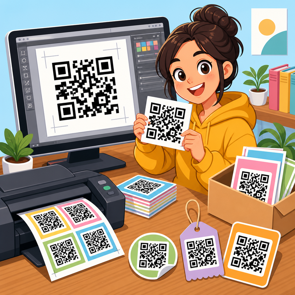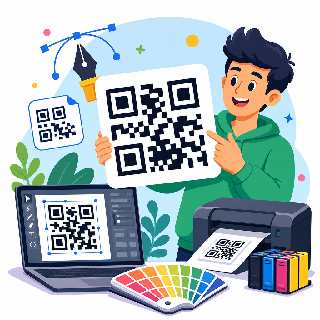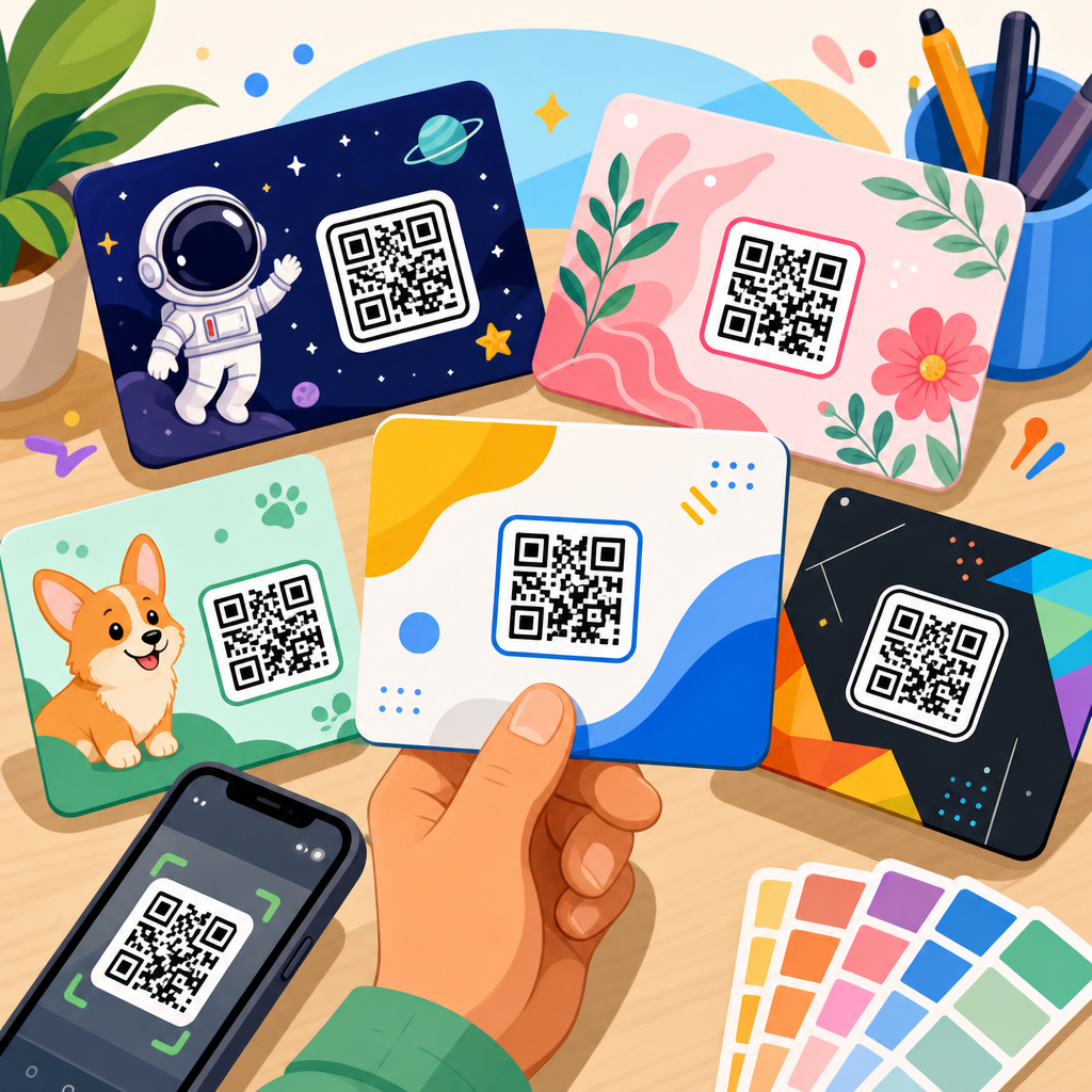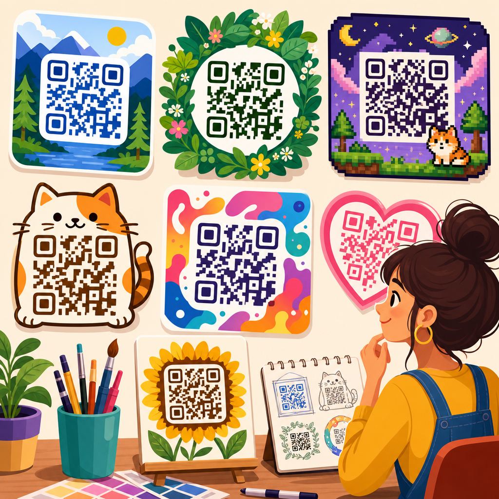
QR code design inspiration starts with a simple truth: a scannable code does not have to look generic. In my work with retail brands, event teams, restaurants, and SaaS companies, I have seen the same pattern repeatedly. Plain black-and-white squares often get ignored, while thoughtfully designed QR codes earn attention, communicate brand identity, and increase scans without sacrificing usability. A strong QR code design inspiration gallery helps marketers, designers, and business owners understand what is possible, what performs well, and where visual creativity must stop so function can remain intact.
A QR code, or Quick Response code, is a two-dimensional matrix barcode that stores information such as a URL, file link, contact card, coupon, payment request, or app download destination. Modern smartphones can read them instantly through the native camera app, which is why QR codes now appear on packaging, menus, posters, product displays, direct mail, presentations, badges, storefront windows, and checkout counters. Design examples matter because the code itself is rarely the whole experience. The surrounding call to action, color palette, frame, logo, destination page, and print context all influence whether a person notices the code and decides to scan.
This hub page covers QR code design examples comprehensively so you can evaluate styles by use case instead of chasing visual novelty. It explains which design variables affect performance, highlights common patterns across industries, and points you toward practical approaches for campaigns, packaging, hospitality, events, education, and digital products. If you are building a broader library of QR code resources, templates, and tools, this article serves as the central guide for design inspiration: the place to compare options, learn best practices, and identify the right direction before creating your own code.
What makes a QR code design effective
The best QR code design examples balance three goals: visibility, brand fit, and reliable scanning. Visibility means the code is easy to notice at the moment a user can act on it. Brand fit means the design looks native to the package, poster, email, or sign rather than pasted on at the last minute. Reliable scanning means the structure remains readable across devices, angles, lighting conditions, and print qualities. In practice, that usually requires preserving sufficient contrast, maintaining a quiet zone around the code, using an appropriate error correction level, and avoiding distortions that interfere with finder patterns and alignment modules.
When I review underperforming codes, the problem is rarely the technology. It is usually execution. Teams shrink the code too far on packaging, place it over busy photography, use low-contrast colors, or add a center logo that is too large for the selected error correction level. A well-designed example solves these issues in advance. It also matches the promise of the scan destination. If a sign says “Scan to see today’s menu,” the landing page should open directly to the menu, not to a slow home page that forces extra taps. Design quality includes the post-scan experience.
Static and dynamic QR codes also shape design possibilities. A static code permanently contains the final destination data. A dynamic code points to a short redirect URL that can be updated later and tracked for analytics. For campaigns, print materials, and multi-location businesses, dynamic codes are usually the better design choice because they protect the visual asset from becoming obsolete. If the destination changes, the printed code does not need to be replaced. That flexibility is one reason so many polished QR code design examples come from brands using platforms such as Bitly, Beaconstac, QR Code Generator Pro, Flowcode, Uniqode, or Scanova.
QR code design examples by style and brand treatment
Most QR code design inspiration falls into a handful of repeatable styles. Minimal branded codes use subtle color shifts, rounded modules, and a small logo mark in the center while keeping the overall structure conventional. These work well for business cards, invoices, email signatures, and B2B collateral where trust and clarity matter more than novelty. Bold campaign codes use high-contrast brand colors, custom frames, and directional copy such as “Scan for 20% off” or “Watch the demo.” They are common in retail windows, point-of-sale displays, and direct mail because they need to interrupt attention quickly.
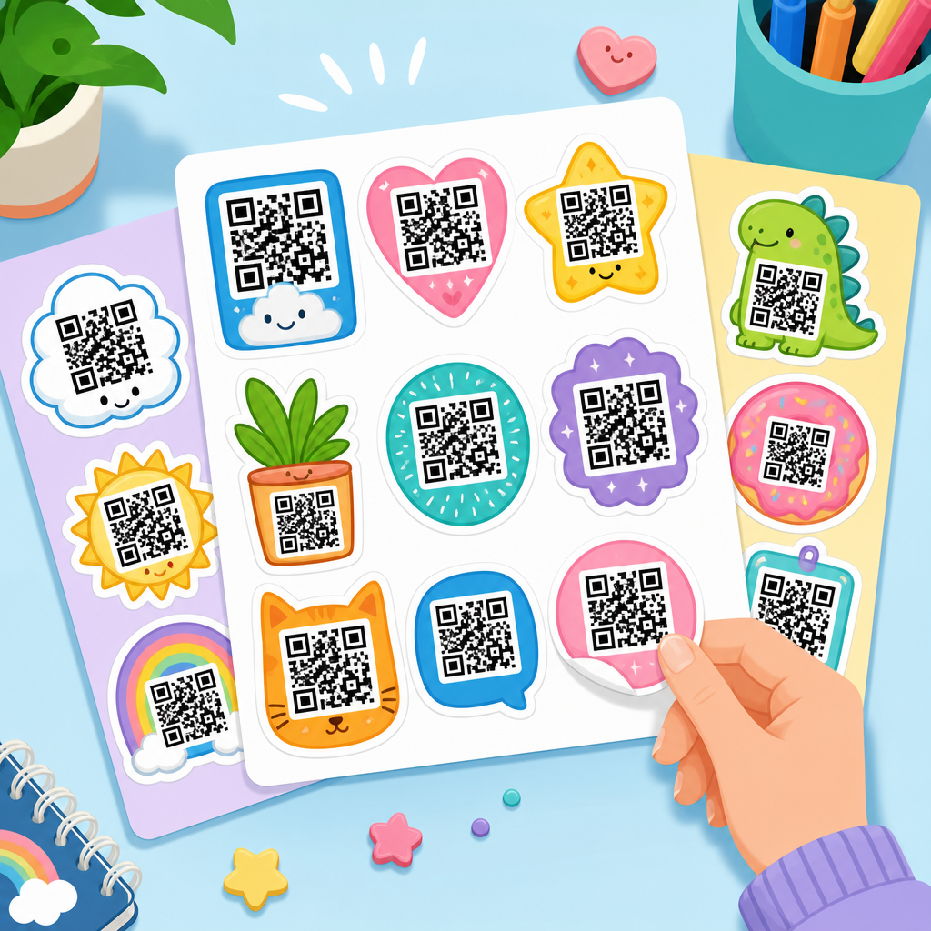
Illustrated or shape-modified QR codes are popular in lifestyle, food, entertainment, and tourism categories. Here, designers may turn square modules into dots, circles, brush shapes, or icons, and they may style the outer eyes to resemble camera lenses, map pins, or product motifs. The strongest examples still preserve core geometry. Good QR code design examples feel customized without forcing the user to guess whether the code is scannable. If a code looks like art first and utility second, scan rates often drop because users hesitate.
Another useful category is contextual integration. Instead of floating a code inside a blank box, the design incorporates it into packaging panels, table tents, labels, shelf talkers, or event signage so it appears intentional. A coffee bag might place the code beside roast notes with the prompt “Meet the farm.” A museum placard might position it below object details with “Hear the curator.” The code succeeds because the context supplies a clear reason to scan. In every gallery I build for clients, contextual examples outperform purely decorative ones because they tie design directly to user motivation.
| Design style | Best use cases | Main advantage | Primary risk |
|---|---|---|---|
| Minimal branded | Business cards, invoices, brochures | High trust and strong scan reliability | Can look generic if CTA is weak |
| Bold campaign | Retail signs, mailers, posters | Grabs attention quickly | Overstyling can reduce contrast |
| Illustrated/custom shape | Food, travel, entertainment | Strong brand personality | May harm readability if heavily modified |
| Context-integrated | Packaging, exhibits, menus | Connects scan action to immediate intent | Can blend in too much if not framed clearly |
Industry-specific inspiration: retail, restaurants, events, and packaging
Retail provides some of the clearest QR code design examples because the commercial objective is measurable. On store windows, codes often promote store maps, loyalty signups, seasonal lookbooks, or limited-time offers. The best examples use large format printing, concise benefit-driven copy, and placement at natural stopping points such as entrances and checkout queues. In apparel, I have seen QR codes integrated into hangtags that lead to fit guides, styling videos, or sustainability disclosures. Brands that connect the code to a decision already happening in the aisle usually achieve better scan rates than brands that send shoppers to a generic homepage.
Restaurants and hospitality businesses use QR design differently. Menu QR codes taught consumers to scan quickly, but the strongest current examples go beyond basic menus. Tabletop displays can link to wine pairings, chef stories, allergy details, waitlist signup, feedback forms, or mobile payment. Here, readability under low light matters, so dark modules on a light background remain the safest choice. Laminated table tents, coaster prints, and outdoor ordering signs need durable contrast and a short fallback URL. Good restaurant QR code design examples also respect pace: one clear action per placement, not five competing prompts on the same table.
Events depend heavily on wayfinding and time-sensitive engagement, which makes design discipline essential. A registration badge might use a plain code for access control, while nearby signage uses branded QR codes for schedules, speaker bios, floor maps, sponsor activations, and lead capture forms. The most effective event examples include microcopy that answers the immediate question in the attendee’s mind: “Scan for session slides,” “Vote live,” or “Join the giveaway.” Packaging is equally strategic. Consumer packaged goods brands place QR codes on labels to unlock recipes, authenticity checks, refill instructions, warranty registration, ingredient sourcing, or augmented experiences. On small labels, size testing is mandatory because curved surfaces and matte finishes can affect camera recognition.
Practical design rules that protect scan performance
Good inspiration is useful only if it translates into production standards. The first rule is contrast. Dark foreground on a light background remains the most dependable option, and contrast should stay strong even after printing, lamination, or exposure to glare. Reversed codes, such as white modules on black, can work, but they deserve testing across iPhone and Android devices before launch. Second is quiet zone management. ISO/IEC 18004 specifies the structure for QR codes, and one of the most commonly violated requirements in custom artwork is the clear margin around the code. Crowding that space with patterns or copy can break scanning even when the code looks fine on screen.
Third is size. A practical baseline many printers use is at least 2 x 2 centimeters for close-range scanning, though larger sizes are safer for distance viewing, low-light environments, and older phone cameras. A billboard, trade show wall, or storefront decal needs proportionally larger dimensions based on expected scanning distance. Fourth is error correction. QR codes support L, M, Q, and H levels, allowing increasing amounts of damage or obstruction recovery. If you plan to add a center logo or stylized modules, Q or H is usually appropriate, but higher error correction also increases density, which can complicate tiny prints. Design choices always involve tradeoffs.
Fifth is destination optimization. A beautiful code cannot compensate for a poor landing experience. Mobile-first page speed, concise copy, accessible forms, and parameterized tracking links are part of design success. I recommend testing every code in the exact context where it will live: under store lighting, on textured paper, behind glass, on corrugate, or on glossy labels. Teams should also test with and without protective cases, at different camera distances, and across native camera apps plus common scanners. This is where many eye-catching QR code design examples separate themselves from amateur work: they are validated in the real environment, not just admired in a mockup.
How to build your own QR code inspiration workflow
If you are using this page as a hub for QR code design examples, the smartest next step is to organize inspiration by objective, surface, and audience behavior. Start with the objective: do you want menu access, lead capture, product education, payment, app installs, reviews, or post-purchase support? Then define the surface: packaging, poster, counter card, business card, email, label, badge, or slide deck. Finally, identify audience behavior: standing in line, browsing a shelf, seated at a table, attending a conference, or opening direct mail at home. These three filters narrow design choices faster than aesthetics alone.
Create a reference library of examples and evaluate each one against a fixed checklist. Include CTA clarity, contrast ratio, logo size, quiet zone integrity, print method, material, expected scan distance, analytics setup, and landing-page alignment. When I run workshops, I ask teams to collect ten QR code design examples they admire and then classify them by what problem they solve, not just how they look. That exercise usually reveals that the strongest designs are surprisingly restrained. They use color and framing with intention, but they do not fight the code’s core function.
This hub should connect naturally to deeper resources on QR code templates, QR code generators, print sizing guides, packaging examples, restaurant menu QR strategies, event QR workflows, and QR code testing tools. That structure helps readers move from inspiration to execution. The main benefit of a curated gallery is confidence: instead of guessing what a successful code looks like, you can compare proven patterns, choose a design direction that fits your brand, and launch with fewer scanning problems. Use the examples here as a benchmark, test before printing at scale, and build your next QR code around a clear user action.
Frequently Asked Questions
What makes a QR code design inspiring without hurting scan performance?
The best QR code design sits at the intersection of creativity and function. Inspiring designs do more than look attractive in a gallery; they still scan quickly, consistently, and across a wide range of devices. In practice, that means preserving the core structure that scanners rely on, including strong contrast, clear quiet space around the code, and recognizable finder patterns in the corners. A beautifully branded QR code that fails under average lighting or on older smartphone cameras is not good design. It is decoration at the expense of usability.
What usually makes a code feel inspired is the thoughtful application of brand elements rather than random styling. This can include using a brand color palette, integrating a logo in the center, softening the shape of modules, placing the code inside a strong layout, or pairing it with packaging, signage, menus, event materials, or digital ads in a way that feels intentional. The design should support the brand story while still communicating immediately that the code is meant to be scanned. The most effective examples in a QR code design inspiration gallery show that visual personality and technical reliability are not competing goals when executed correctly.
A useful rule is to treat scannability as non-negotiable and styling as a layer built around it. Test the code at different sizes, viewing angles, screen brightness levels, and print conditions. If the code still works in realistic settings, then the design is doing its job. Inspiration should not just come from what looks unique, but from what solves the real marketing challenge: attracting attention, reinforcing identity, and converting curiosity into action.
How can businesses use a QR code design inspiration gallery to improve their own marketing materials?
A QR code design inspiration gallery is most valuable when it is used as a strategic reference, not just a collection of pretty examples. Businesses can study galleries to identify patterns in what works across industries, formats, and customer touchpoints. For example, a restaurant may notice that menu QR codes perform best when paired with a clear call to action and positioned where guests naturally look. A retail brand may learn that product packaging codes are more effective when they feel like part of the package design rather than an afterthought. Event teams may discover that high-contrast, large-format codes are essential for signage that must be scanned from a distance.
The gallery can also help teams refine their creative direction. Instead of saying, “We want the QR code to look more modern,” a marketing or design team can point to examples that use rounded modules, embedded logos, frame treatments, or color gradients in ways that still feel clean and readable. That makes collaboration easier between stakeholders, designers, and whoever is generating the code. It turns vague feedback into specific design decisions rooted in proven examples.
Beyond aesthetics, a good gallery helps businesses think about context. A QR code for a SaaS onboarding flow should not be designed the same way as a QR code on a coffee cup, trade show banner, direct mail piece, or museum wall display. Different use cases require different sizes, placement choices, contrast levels, and supporting text. By reviewing inspiration through the lens of purpose, businesses can create codes that are not only visually stronger but also more aligned with customer behavior and campaign goals.
What design elements can be customized on a QR code while keeping it reliable?
There are several design elements that can usually be customized safely when handled with care. Color is one of the most common. Brands often move beyond black and white to use dark blues, greens, reds, or other brand-aligned tones. The key is maintaining enough contrast between the foreground and background so scanners can still distinguish the pattern. Light-on-light combinations, overly subtle gradients, or busy photographic backgrounds often create problems. In most cases, darker code elements on a lighter background remain the safest choice.
Shape is another area where customization can add personality. Designers may round the square modules, stylize the corner eyes, or add frames and badges around the code. These changes can make a QR code feel more polished and brand-consistent, especially in consumer-facing materials. Logos can also be added in the center, provided the code has sufficient error correction and the logo does not obscure too much of the data pattern. This is one of the most effective ways to make a code recognizable while signaling trust and ownership.
Other customizable elements include background treatments, embedded calls to action, decorative borders, and the surrounding layout. In fact, some of the strongest design improvements happen around the QR code rather than inside it. A short instruction such as “Scan to view the menu” or “Scan for the demo” often has a bigger impact on scan rate than aggressive visual manipulation of the code itself. Reliable customization is about restraint. It is rarely necessary to push every design option at once. The strongest results usually come from one or two brand-forward enhancements supported by rigorous testing.
Why do branded QR codes often get more scans than plain black-and-white ones?
Branded QR codes often outperform generic ones because they earn attention and trust more effectively. Most people have become accustomed to seeing plain QR codes, and many of those codes blend into the background. A thoughtfully designed code stands out in the visual hierarchy of a page, sign, package, or screen. It signals that the brand put care into the experience, which makes users more likely to notice it and understand that it is intended as a meaningful interaction rather than filler.
Branding also reduces hesitation. When a code includes recognizable colors, a company logo, or clear visual integration with the surrounding asset, users feel more confident about what they are scanning. That matters because one of the biggest barriers to QR engagement is uncertainty. People may wonder where the code goes, whether it is legitimate, or whether it is worth the effort. A branded design paired with concise supporting text helps answer those questions quickly. It tells users who the code belongs to and what value they can expect after scanning.
Just as important, branded codes work better as part of a broader customer experience. In retail, they can extend packaging into video, reviews, or loyalty offers. In events, they can connect print signage to schedules, maps, or check-in flows. In restaurants, they can reinforce menu identity and streamline ordering. In SaaS, they can make product education or app downloads feel more polished and intentional. The added scans are rarely just about visual novelty alone. They come from better alignment between brand, context, and user motivation.
What should readers look for in a high-quality QR code design inspiration gallery?
A high-quality QR code design inspiration gallery should do more than showcase stylish examples. It should present a range of practical, real-world applications that help readers understand why certain designs work. The best galleries include examples across industries such as retail, hospitality, events, food service, technology, education, and packaging. This variety helps readers compare use cases and identify ideas that map to their own goals rather than copying trends blindly.
Readers should also look for evidence of functional thinking. Great galleries highlight design choices such as contrast, spacing, call-to-action framing, logo placement, size considerations, and context-specific execution. For example, a code intended for a poster viewed from several feet away should be displayed differently from one printed on a product label. A useful gallery makes these distinctions clear, whether through captions, categorization, or visual comparison. It teaches readers how to evaluate QR design, not just admire it.
Finally, the most valuable inspiration galleries balance creativity with credibility. They show branded, distinctive QR codes that still appear clearly scannable and professionally implemented. They help marketers, designers, and business owners see how design can improve engagement without creating friction. If a gallery leaves readers with practical ideas they can apply immediately, sharper instincts about what to test, and a stronger understanding of how QR codes support customer experience, then it is doing its job well.