Choosing the best error correction settings for print QR codes is one of the most important decisions in QR code design because it directly affects scan reliability, symbol size, print flexibility, and the amount of damage a code can tolerate. Error correction in QR codes refers to the built-in ability of the symbol to remain readable even when part of it is obscured, scratched, blurred, distorted, or poorly printed. For teams working on packaging, labels, posters, product inserts, direct mail, retail signage, event credentials, or industrial marking, understanding error correction levels is not optional; it is a core production setting that influences whether a campaign scans smoothly in the real world.
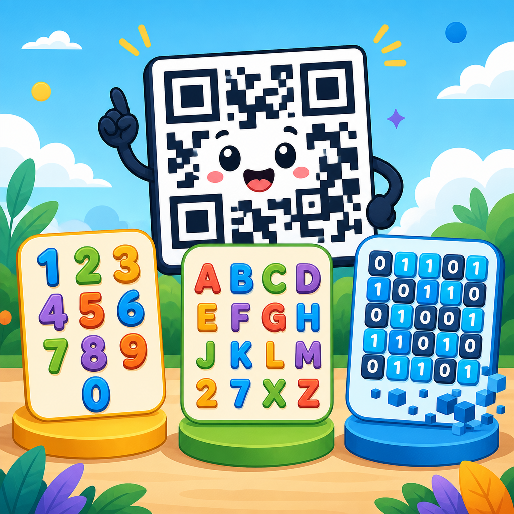
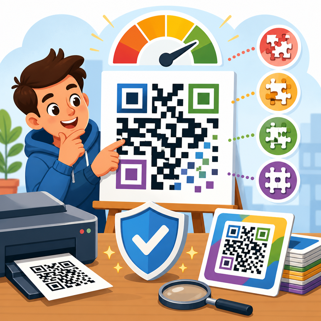
QR codes use Reed-Solomon error correction, a mathematical method that adds redundant data so the original content can be reconstructed when some modules are unreadable. Standard QR codes offer four levels: L, M, Q, and H. Level L can recover about 7 percent of damaged codewords, M about 15 percent, Q about 25 percent, and H about 30 percent. Those figures are widely cited, but they are often misunderstood. They do not mean a logo can safely cover exactly that percentage of the symbol area, and they do not guarantee success under every printing condition. Recovery depends on where the damage occurs, how dense the data is, the version of the QR code, contrast, quiet zone, scanning device quality, and whether the affected modules disrupt finder patterns, timing patterns, or alignment patterns.
I have seen teams treat error correction as a decorative feature, raising it to H because they want a large center logo, then discovering the resulting code became too dense for a small carton label. I have also seen the opposite mistake: using L on glossy packaging to keep the code visually simple, only to watch scans fail after shrink-wrap reflections and normal abrasion in distribution. The best error correction settings for print QR codes are therefore situational. The right choice balances environmental risk, print process capability, available physical size, scan distance, and the amount of branding or styling planned. This article serves as a practical hub for that decision, explaining what each level does, when to use it, how print conditions change the choice, and how to validate performance before production.
How QR code error correction levels work in print
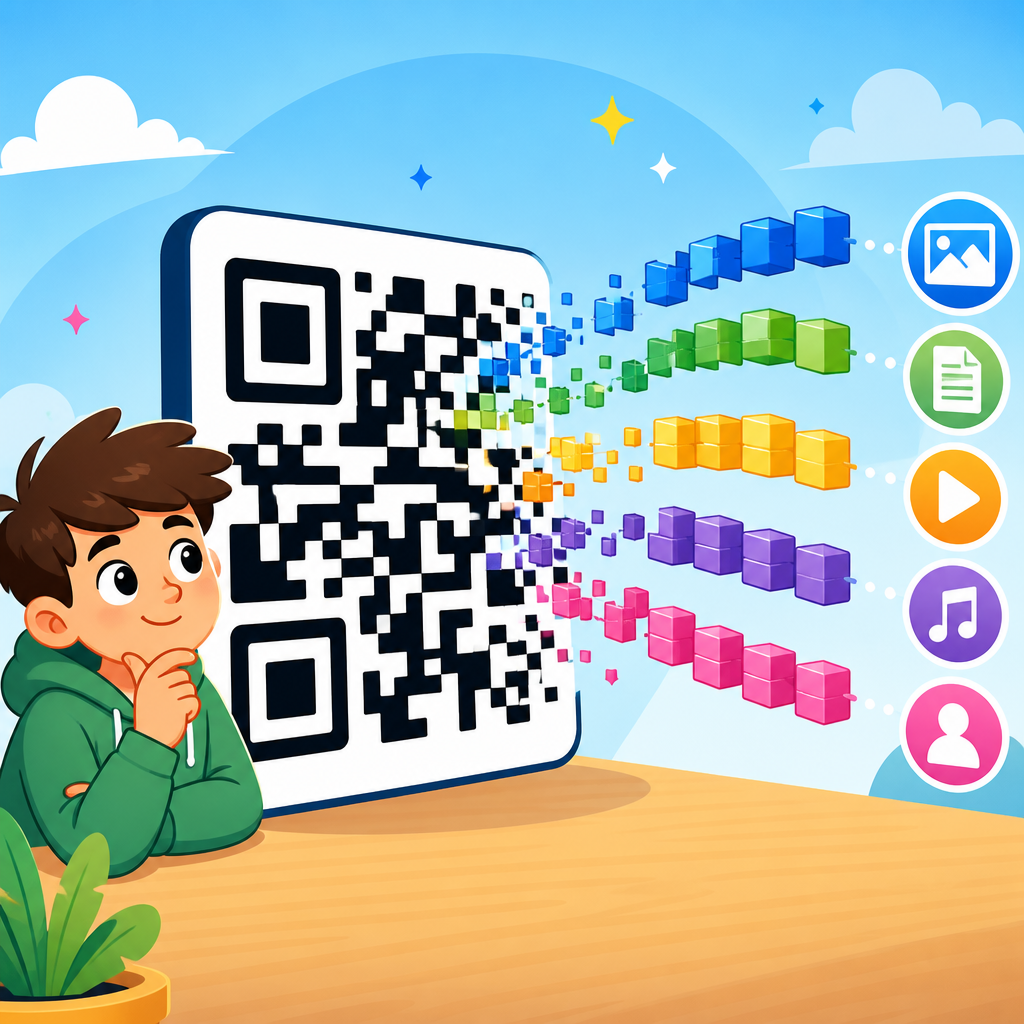
A printed QR code is a grid of square modules arranged according to ISO/IEC 18004, the international standard that defines QR code structure. Some parts of the symbol are functional patterns used for orientation and decoding, while the remainder holds data and error correction codewords. Reed-Solomon encoding spreads redundant information across the symbol so scanners can reconstruct missing or corrupted portions. In practical print terms, this means a code can still scan when ink gain rounds corners, flexographic plates fill in small gaps, labels crease, varnish introduces glare, or part of the code is covered by a fingerprint or a promotional sticker.
The four levels are not quality grades where higher is always better. Higher correction adds redundancy, which reduces net data capacity at a given size. If the encoded content stays the same, raising correction usually forces the generator to move to a larger QR version, creating more modules. More modules in the same physical area means smaller module size. Smaller modules are harder to print cleanly and harder for cameras to resolve at typical user distances. That tradeoff is why error correction must be chosen with print specifications in mind rather than selected in isolation.
For example, a simple short URL printed at 25 mm square may scan well at M on a corrugated shipper, while the same square using H could become dense enough that dot gain and rough substrate texture cause module closure. Conversely, a museum placard exposed to abrasion and occasional overlamination scratches may genuinely benefit from Q or H because the sign area allows larger dimensions and visitors scan under variable lighting. In production, the best setting is the one that survives expected damage without creating a symbol too small or too dense for the chosen print method.
What each error correction level is best for
Level L is best for clean environments, high-quality printing, short scan distances, and cases where keeping the symbol compact is the top priority. It is common on manuals, indoor brochures, transactional forms, and other applications where the code is unlikely to suffer wear. Because L preserves the most capacity, it can help when you must encode more characters without increasing symbol size. However, it gives the least tolerance for scratches, smudges, and decorative interference, so it is rarely my first choice for consumer packaging or outdoor materials.
Level M is the general-purpose default for many print QR codes. It offers a practical balance of resilience and size, making it suitable for product packaging, flyers, shelf talkers, menus, direct mail, and event materials. Many professional generators default to M for good reason: it provides meaningful protection against ordinary print imperfections without inflating the module count as aggressively as Q or H. When a client asks for the safest starting point, M is usually where I begin testing.
Level Q is best when the printed code faces moderate physical risk or when branding elements may remove some data area. It is a strong choice for cosmetic packaging, beverage labels with condensation exposure, warehouse labels subject to rubbing, and retail signage cleaned frequently. Q also gives useful margin when print quality is inconsistent across suppliers or presses. It is not automatically necessary, but it often becomes the right setting when field conditions are harsher than the design team first assumed.
Level H is best for high-risk environments, premium branded designs with a centered logo, and assets likely to experience damage over time. Examples include outdoor posters, reusable equipment tags, industrial labels, returnable transport packaging, and display units handled repeatedly. H is also common when a brand insists on visual customization. The limitation is clear: if the physical print area is small, H can push the code into a version with module sizes below what the press, substrate, or smartphone camera can handle consistently. That is why H should be justified by actual use conditions, not selected simply because it sounds safest.
| Level | Approximate recovery | Best use case | Main tradeoff |
|---|---|---|---|
| L | 7% | Clean indoor print, compact symbols, higher data loads | Lowest damage tolerance |
| M | 15% | General packaging, print marketing, everyday scanning | Moderate redundancy only |
| Q | 25% | Wear-prone labels, light styling, variable print conditions | Larger or denser symbol |
| H | 30% | Harsh handling, logos, outdoor or long-life print | Highest density and size pressure |
How print conditions change the right setting
The best error correction settings for print QR codes depend heavily on substrate, press technology, finishing, and viewing context. On coated paper with offset lithography, fine modules reproduce cleanly, so M or Q often performs well at moderate sizes. On uncoated stock, absorbency can spread ink and soften edges, reducing separation between adjacent modules. In that case, increasing physical size is usually more helpful than simply increasing error correction. A larger module printed cleanly outperforms a tiny, over-corrected code that blurs together.
Flexography deserves special attention because it is common in packaging and labels. Plate bounce, distortion, and dot gain can alter module geometry, especially below about 10 mil module size depending on press calibration and substrate. Gravure and digital presses have different behaviors, but the same principle applies: error correction cannot rescue a code whose modules were never printed distinctly. Quiet zone violations are equally damaging. The required blank margin around the symbol, typically four modules, must remain free of text, borders, varnish artifacts, and dieline encroachment. I have seen otherwise acceptable H-level codes fail because the quiet zone was compressed by neighboring graphics.
Environmental exposure also drives the decision. Cold-chain packaging faces condensation and surface reflections. Outdoor signs face UV fading, rain residue, and abrasion. Industrial labels may collect grease or dust. For these cases, Q or H is often appropriate, but only if the symbol is enlarged enough to preserve module integrity. Scan distance matters too. A poster scanned from several feet away needs larger modules than a box scanned in hand. If the code must be small and scanned up close, M may outperform H simply because the lower version produces a less crowded pattern that cameras decode faster.
Choosing the right setting by application
Consumer packaged goods usually perform best at M or Q. Most packaging experiences scuffs, curved application surfaces, and inconsistent store lighting, but space is limited and artwork teams want visual control. For a snack pouch, beverage can topper, or cosmetic carton, M is a strong baseline if the code links to a short dynamic URL and the print supplier can hold consistent edges. Move to Q when the pack is glossy, chilled, frequently handled, or likely to include a small logo overlay.
Direct mail and brochures often work well at M because they are scanned indoors and experience little wear before use. If the design is clean, L can be acceptable for large print pieces where visual simplicity matters and the code area is protected. Posters, transit ads, and window decals generally justify Q or H because they endure weathering, reflections, and longer deployment cycles. Event badges and tickets vary: a one-day printed badge may succeed at M, while reusable credentials or laminated passes usually benefit from Q.
Industrial and logistics use cases demand stricter evaluation. Warehouse labels on corrugate, asset tags, equipment stickers, and returnable containers commonly benefit from Q or H, but many such environments should also consider alternative symbologies like Data Matrix when space is extremely constrained. For pharmaceutical cartons and medical device labeling, verification standards, substrate consistency, and regulatory workflows may matter more than aggressive styling. In those settings, a conservative visual design with M or Q and robust print verification usually beats a decorative H-level symbol placed too small.
Common mistakes when selecting error correction
The first mistake is assuming higher correction always means better real-world scanning. It does not. A denser H-level code printed too small is harder to scan than a larger M-level code with clean modules. The second mistake is using static, lengthy URLs or parameter-heavy links. Data length has a huge effect on version size. A branded short domain or dynamic QR platform can reduce module count dramatically, making room for stronger correction without enlarging the symbol. In many projects, shortening the payload improves reliability more than changing from M to H.
The third mistake is using error correction as permission for excessive logo coverage. The published percentages refer to recoverable codewords under specific error distribution assumptions, not a design allowance for centered artwork. A logo that blocks timing patterns or creates low-contrast edges can break decoding long before the theoretical threshold. If branding is required, keep overlays modest, preserve contrast, avoid the finder patterns, and test across multiple phones including older midrange devices.
The fourth mistake is skipping print verification. ISO/IEC 15415 provides a methodology for two-dimensional symbol print quality assessment, and many converters use verifiers from vendors such as Axicon, Cognex, REA VeriCube, or Zebra. While smartphone scans are useful, formal verification reveals issues the eye misses, including axial non-uniformity, modulation, fixed pattern damage, and reflectance problems. The fifth mistake is testing only pristine samples. Production approval should include rubbed, creased, chilled, laminated, and low-light scenarios that match actual use.
Practical workflow for setting and testing print QR codes
Start with the shortest possible payload, ideally a dynamic short URL under your control. Generate candidate codes at M and Q first, then H only if the environment or branding clearly requires it. Place the symbol at the intended physical size and calculate module size rather than judging by appearance alone. For consumer print, many teams target at least 0.4 mm modules as a practical floor, though exact thresholds vary by device, distance, and print method. Small packaging may need careful proofing below that level; large-format signs should go much larger.
Next, produce press-realistic samples on the actual substrate with the actual finishing stack, including varnish, lamination, embossing, or foil interactions nearby. Test with both iPhone and Android devices across newer and older camera systems. Check scans under daylight, store lighting, and glare. If the code includes a logo, compare it directly against a plain version at the same size. In my experience, plain M often beats branded H when space is tight.
Finally, verify and document the approved configuration so future reprints do not drift. Record the generator settings, exact payload, error correction level, physical dimensions, module size, quiet zone, color values, substrate, print process, and finishing notes. The best error correction settings for print QR codes are not universal presets. They are controlled production decisions validated by evidence. For most applications, start with M, move to Q when handling or environment is tougher, reserve H for genuine damage risk or carefully tested branding, and use L only when print conditions are clean and compactness matters most. If you manage QR programs across packaging or print, audit your current symbols and standardize these settings before the next run.
Frequently Asked Questions
What do QR code error correction levels mean, and why do they matter for print?
QR code error correction levels define how much damage, obstruction, or print imperfection a code can tolerate and still scan successfully. There are four standard levels: L, M, Q, and H. Level L provides the least redundancy and can recover roughly 7% of damaged data, M recovers about 15%, Q about 25%, and H about 30%. In practical print use, that built-in redundancy is what helps a QR code remain readable if it gets scuffed on packaging, softened by ink spread, curved around a bottle, partially covered by a label seam, or printed on a material with inconsistent contrast.
These settings matter because higher error correction improves resilience, but it also increases the density of the QR code. As redundancy goes up, more modules must be printed, which can make the symbol more complex and potentially harder to scan if the printed size is too small or the print quality is inconsistent. That means error correction is never just a technical setting. It is a design decision that affects symbol size, module clarity, production tolerance, and real-world scan performance.
For print applications, the best choice depends on where the code will appear and what it may experience after printing. A cleanly printed QR code on a flat brochure in a controlled environment may scan perfectly with a lower level such as M. A code placed on retail packaging, shipping materials, outdoor posters, or product labels that may be scratched, bent, or partially obscured often benefits from Q or H. In short, error correction matters because it determines how much real-world abuse a printed QR code can survive without sacrificing usability.
Which error correction level is usually best for printed QR codes?
There is no single best setting for every printed QR code, but for many print scenarios, level M or Q is the most practical starting point. Level M is often a strong default when you want a good balance between scan reliability and compact symbol size. It works well for flyers, menus, inserts, brochures, and other applications where the code is likely to remain relatively clean and undamaged. It offers more protection than level L without making the code unnecessarily dense.
Level Q is often preferred when the QR code will be printed in environments with more physical stress or visual complexity. This includes consumer packaging, product labels, direct mail pieces, event signage, and materials that may be folded, handled frequently, or printed on textured surfaces. Q provides a meaningful jump in durability while usually remaining manageable in terms of printed size and scanability.
Level H is best reserved for situations where damage tolerance is especially important, such as industrial labels, outdoor use, harsh handling environments, or designs that intentionally place a logo or graphic treatment inside the code. While H can be extremely useful, it should not be chosen automatically. Its added redundancy creates a denser symbol, and if the printed code ends up too small, the theoretical benefit of higher protection can be offset by poorer readability. In most professional print workflows, the smartest approach is to begin with M for standard uses, move to Q for tougher applications, and use H only when there is a clear reason to prioritize maximum tolerance over compactness.
How does higher error correction affect QR code size and scan performance in print?
Higher error correction increases the amount of redundant data stored in the QR code, which means the symbol typically needs more modules to represent the same destination or content. In print terms, that often results in either a physically larger QR code or much smaller individual modules if the overall printed area stays the same. This tradeoff is central to good QR code design because scan reliability depends heavily on how clearly those modules can be reproduced and captured by a phone camera.
If a QR code becomes too dense for its printed size, problems can appear quickly. Fine module detail may fill in due to ink gain, blur because of low-resolution printing, or become harder to distinguish on textured or absorbent materials. Even if the code has a high error correction level, it may still scan poorly because the scanner cannot clearly resolve the module pattern. In other words, more error correction does not automatically mean better real-world performance. A clean, well-sized code at level M can outperform an undersized, crowded code at level H.
This is why print teams should evaluate error correction alongside data length, final print dimensions, substrate, and viewing distance. Short URLs help keep symbol complexity lower. Larger print sizes improve module clarity. Strong contrast and an adequate quiet zone further support scanning. The goal is not to maximize error correction in isolation, but to create a code that remains robust while preserving a module size large enough for consistent smartphone scanning. In many cases, the best scan performance comes from balancing moderate redundancy with generous print sizing and disciplined production standards.
When should you use high error correction like Q or H for packaging, labels, posters, or direct mail?
Higher error correction levels are most useful when the printed QR code is likely to face wear, distortion, contamination, or intentional design interference. On packaging, for example, a code may be printed across curved surfaces, near folds, on flexible films, or on materials that reflect light unevenly. It may also be exposed to rubbing during shipping and shelf handling. In these cases, Q is often a smart choice because it provides stronger fault tolerance without always forcing the code into an impractically large footprint.
For labels, high error correction can be especially valuable when the label is small, applied to non-flat surfaces, or likely to encounter moisture, abrasion, or product handling. On posters and public signage, H may be worth considering if the code could be partially blocked, weathered, or viewed after long-term exposure. In direct mail, where pieces may be bent, creased, or scuffed in transit, Q is frequently a safer option than M, particularly if campaign performance depends on reliable first-scan results.
Another common reason to use H is when the design includes a logo, icon, or visual customization inside the QR code. Although the built-in redundancy can help preserve readability, decorative treatments should never be assumed safe without testing. The more aggressive the customization, the more important it is to combine a higher error correction level with proper clear space, adequate module size, and scan validation across multiple devices. Use Q or H when the environment justifies it, but always confirm the choice with printed proofs and real-world scanning tests rather than relying only on digital previews.
What are the best practices for choosing and testing the right error correction setting for print QR codes?
The best practice is to treat error correction as one part of a complete print-readiness process, not as a standalone setting. Start by simplifying the encoded data whenever possible. Using a short, clean URL instead of a long tracking link reduces symbol complexity and gives you more flexibility in size and error correction. From there, choose a preliminary level based on usage conditions: M for standard indoor print, Q for more demanding packaging or mail applications, and H for high-risk environments or branded QR designs that need extra tolerance.
Next, size the QR code appropriately for the print format and expected scanning distance. Make sure the quiet zone is preserved on all sides, maintain strong foreground-to-background contrast, and avoid placing the code over busy imagery, metallic finishes, or transparent materials that reduce visual separation. Consider the print method as well. Offset, digital, thermal, flexographic, and inkjet processes can all reproduce small modules differently, so a code that looks sharp on screen may behave very differently once produced on the actual substrate.
Most importantly, test the final printed version, not just the digital file. Print samples at actual production size, on the real material if possible, and scan them with multiple smartphone models under normal lighting conditions. Test flat and applied versions for packaging and labels. Review performance after folding, handling, or slight abrasion if those conditions are realistic. Compare M, Q, and H if needed to see which level delivers the best balance of size efficiency and reliable scanning. The right error correction setting is ultimately the one that performs consistently in the physical environment where the QR code will live.